## Bar Chart: Distribution of Differences Across Thresholds (T=0.3, T=0.7, T=1.0)
### Overview
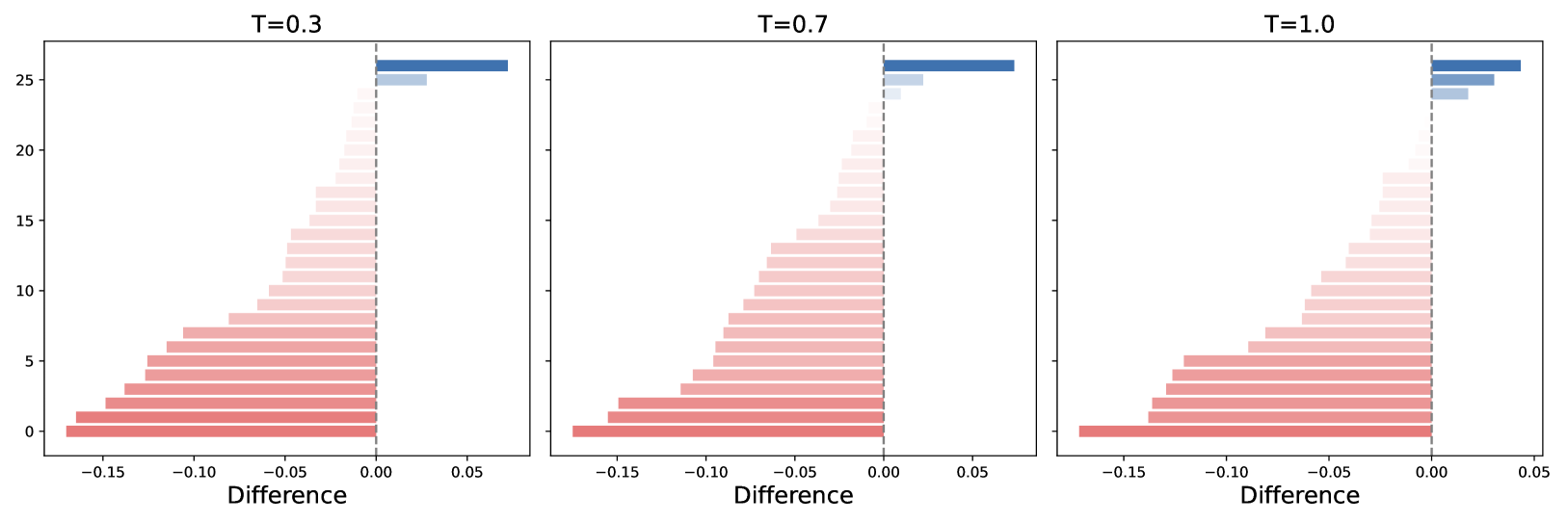
The image contains three horizontally stacked bar charts comparing the distribution of "Difference" values across three threshold conditions (T=0.3, T=0.7, T=1.0). Each chart uses a vertical axis labeled "Difference" (ranging from -0.15 to 0.05) and a horizontal axis representing count (0–25+). Bars are color-coded: red for negative differences and blue for positive differences. The charts show a clear trend of increasing positive differences and decreasing negative differences as T increases.
### Components/Axes
- **Vertical Axis (Y-axis)**:
- Label: "Difference"
- Scale: -0.15 (bottom) to 0.05 (top), with intermediate markers at -0.10, -0.05, 0.00
- **Horizontal Axis (X-axis)**:
- Label: "Count" (implicit, no explicit label)
- Scale: 0 to 25+ (approximate, based on bar lengths)
- **Legend**:
- No explicit legend box, but color coding is consistent:
- **Red**: Negative differences (left of 0.00)
- **Blue**: Positive differences (right of 0.00)
- **Threshold Labels**:
- Top of each chart: "T=0.3", "T=0.7", "T=1.0"
### Detailed Analysis
#### T=0.3
- **Negative Differences (Red Bars)**:
- Longest bar at -0.15 (count ≈25 ±2)
- Gradual decrease to -0.05 (count ≈10 ±1)
- **Positive Differences (Blue Bars)**:
- Single bar at 0.05 (count ≈25 ±2)
#### T=0.7
- **Negative Differences (Red Bars)**:
- Longest bar at -0.15 (count ≈20 ±1)
- Decrease to -0.05 (count ≈15 ±1)
- **Positive Differences (Blue Bars)**:
- Two bars: 0.00 (count ≈22 ±1) and 0.05 (count ≈22 ±1)
#### T=1.0
- **Negative Differences (Red Bars)**:
- Longest bar at -0.15 (count ≈18 ±1)
- Decrease to -0.05 (count ≈12 ±1)
- **Positive Differences (Blue Bars)**:
- Three bars: 0.00 (count ≈20 ±1), 0.025 (count ≈20 ±1), and 0.05 (count ≈20 ±1)
### Key Observations
1. **Positive Differences Dominate at Higher T**:
- At T=0.3, only 0.05 has significant positive counts (25).
- At T=1.0, positive differences span 0.00–0.05 with equal counts (~20 each).
2. **Negative Differences Decrease with T**:
- Red bars shrink in length and count as T increases (25 → 18 at -0.15).
3. **Threshold Sensitivity**:
- T=0.3 shows the most extreme negative skew.
- T=1.0 exhibits the most balanced distribution.
### Interpretation
The data suggests that increasing the threshold T shifts the system toward positive outcomes. At T=0.3, negative differences dominate, but by T=1.0, positive differences become prevalent and evenly distributed across the 0.00–0.05 range. This implies T acts as a stabilizing parameter, reducing variability in negative outcomes while amplifying positive ones. The uniformity of blue bars at T=1.0 indicates a threshold effect where outcomes cluster near the upper bound of the difference scale. No anomalies are observed; trends align with expected threshold-driven behavior.