\n
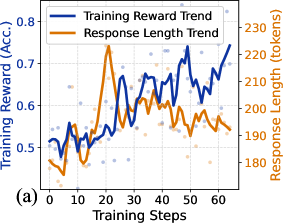
## Dual-Axis Line Chart: Training Reward vs. Response Length
### Overview
The image is a dual-axis line chart labeled "(a)" in the bottom-left corner. It plots two trends—"Training Reward Trend" and "Response Length Trend"—against a common x-axis of "Training Steps." The chart includes scattered data points behind the smoothed trend lines, suggesting raw data with overlaid moving averages or fitted curves. The overall purpose appears to be visualizing the relationship between a model's performance (reward/accuracy) and the length of its generated responses during a training process.
### Components/Axes
* **X-Axis (Bottom):**
* **Label:** "Training Steps"
* **Scale:** Linear, from 0 to 60, with major tick marks every 10 steps (0, 10, 20, 30, 40, 50, 60).
* **Primary Y-Axis (Left):**
* **Label:** "Training Reward (Acc.)"
* **Scale:** Linear, from 0.5 to 0.8, with major tick marks every 0.1 (0.5, 0.6, 0.7, 0.8).
* **Associated Data Series:** Blue line and blue scattered points.
* **Secondary Y-Axis (Right):**
* **Label:** "Response Length (tokens)"
* **Scale:** Linear, from 180 to 230, with major tick marks every 10 tokens (180, 190, 200, 210, 220, 230).
* **Associated Data Series:** Orange line and orange scattered points.
* **Legend (Top-Left):**
* Positioned inside the plot area, near the top-left corner.
* **Blue Line:** "Training Reward Trend"
* **Orange Line:** "Response Length Trend"
### Detailed Analysis
**1. Training Reward Trend (Blue Line & Points):**
* **Trend Verification:** The blue line shows a clear, albeit volatile, upward trend over the 60 training steps. It starts near the bottom of its axis range and ends near the top.
* **Data Points & Values (Approximate):**
* **Start (Step 0):** ~0.50
* **Early Phase (Steps 0-20):** Fluctuates between ~0.50 and ~0.55.
* **Mid Phase (Steps 20-40):** Begins a more sustained climb, reaching ~0.65 by step 40.
* **Late Phase (Steps 40-60):** Continues rising with significant volatility, peaking at approximately **0.75-0.76** near step 60.
* **Scattered Points:** Blue dots are densely clustered around the trend line, indicating the raw reward values for individual steps or episodes. The spread suggests high variance in reward at any given step.
**2. Response Length Trend (Orange Line & Points):**
* **Trend Verification:** The orange line exhibits a distinct, non-linear pattern: a sharp initial increase to a peak, followed by a general decline.
* **Data Points & Values (Approximate):**
* **Start (Step 0):** ~185 tokens.
* **Sharp Peak:** Rises rapidly to a maximum of approximately **225-228 tokens** around **Training Step 20**.
* **Post-Peak Decline:** After step 20, the trend generally decreases, falling to ~200 tokens by step 40 and settling around **190-195 tokens** by step 60.
* **Scattered Points:** Orange dots show the raw token length per step. The variance appears highest around the peak (step 20) and decreases somewhat in the later stages.
### Key Observations
1. **Inverse Correlation Post-Peak:** After the initial 20 steps, the two trends move in opposite directions. As the Training Reward (blue) steadily increases, the Response Length (orange) generally decreases.
2. **Critical Inflection Point:** **Training Step 20** is a key moment. It marks the peak of response length and coincides with a period where the reward trend begins its sustained ascent from a relatively flat start.
3. **Volatility:** The reward metric (blue) shows much higher step-to-step volatility than the response length metric (orange), especially in the later training stages.
4. **Convergence of Raw Data:** The scattered points for both metrics appear to become slightly less dispersed in the final 10-15 steps compared to the middle phase, suggesting the training process may be stabilizing.
### Interpretation
This chart likely illustrates a common dynamic in training generative AI models, such as language models or reinforcement learning agents.
* **What the Data Suggests:** The model initially explores by generating longer responses (increasing token count up to step 20), which may correspond to a trial-and-error phase. The subsequent decline in length alongside rising reward indicates the model is learning to achieve its objective (higher accuracy/reward) more efficiently, using fewer tokens. This is a sign of optimization—producing more concise, effective outputs.
* **Relationship Between Elements:** The dual-axis design directly invites comparison between efficiency (length) and effectiveness (reward). The data demonstrates that these two goals are not always aligned in the short term (hence the peak) but can become synergistic in the long run as training progresses.
* **Notable Anomaly/Pattern:** The sharp, singular peak in response length is the most striking feature. It suggests a specific phase in training where the policy or strategy shifted dramatically, possibly due to a change in learning rate, the introduction of a new penalty for length, or the model discovering a temporarily successful but verbose strategy before refining it.
* **Underlying Implication:** The chart provides evidence that the training process successfully incentivizes the model to "get to the point" without sacrificing performance. The final state (high reward, moderate length) is likely the desired outcome, balancing quality and efficiency.