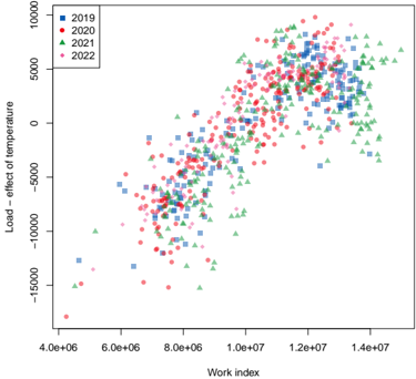
## Scatter Plot: Load – Effect of Temperature vs. Work Index
### Overview
The image is a scatter plot comparing the relationship between "Work index" (x-axis) and "Load – effect of temperature" (y-axis) across four years: 2019, 2020, 2021, and 2022. Each year is represented by distinct colored markers (blue squares, red circles, green triangles, pink diamonds) and plotted against logarithmic scales for both axes.
### Components/Axes
- **X-axis (Work index)**: Logarithmic scale ranging from **4.0e6** to **1.4e7**.
- **Y-axis (Load – effect of temperature)**: Logarithmic scale ranging from **-15000** to **10000**.
- **Legend**: Located in the **top-left corner**, with the following mappings:
- **Blue squares**: 2019
- **Red circles**: 2020
- **Green triangles**: 2021
- **Pink diamonds**: 2022
### Detailed Analysis
- **2019 (Blue Squares)**:
- Data points cluster between **Work index = 4.0e6–1.0e7** and **Load = -10000–5000**.
- Slight upward trend, with some outliers at higher Work index values.
- **2020 (Red Circles)**:
- Data points span **Work index = 5.0e6–1.2e7** and **Load = -10000–8000**.
- More dispersed than 2019, with a noticeable concentration near **Work index = 1.0e7**.
- **2021 (Green Triangles)**:
- Data points extend to **Work index = 1.4e7** and **Load = -5000–10000**.
- Stronger upward trend, with higher Load values at elevated Work index.
- **2022 (Pink Diamonds)**:
- Data points dominate the upper-right quadrant (**Work index = 1.0e7–1.4e7**, **Load = 5000–10000**).
- Highest Load values observed, with a steep upward trajectory.
### Key Observations
1. **Upward Trend**: All years show a general increase in Load as Work index rises, with 2022 exhibiting the steepest slope.
2. **Yearly Differences**:
- 2022 has the highest Load values, suggesting a significant increase in the "effect of temperature" over time.
- 2019 and 2020 show more variability, with some negative Load values (e.g., -15000).
3. **Outliers**:
- A single pink diamond (2022) at **Work index = 4.0e6** and **Load = -15000** deviates from the trend, possibly an anomaly.
- Green triangles (2021) at **Work index = 1.4e7** and **Load = 10000** represent the upper bound of the dataset.
### Interpretation
The data suggests a **positive correlation** between Work index and Load – effect of temperature, with the relationship strengthening over time. The consistent upward trend across all years implies that higher Work index (possibly linked to industrial activity or energy consumption) is associated with increased temperature-related Load. The 2022 data points, particularly in the upper-right quadrant, indicate a marked escalation in this effect, which could reflect environmental or operational changes. The outlier at **Work index = 4.0e6** (2022) warrants further investigation, as it contradicts the general trend.
**Note**: The logarithmic scales compress the data range, emphasizing proportional changes rather than absolute values. The absence of error bars or confidence intervals limits the ability to quantify uncertainty in the trends.