## Scatter Plot: Music Genre Distribution
### Overview
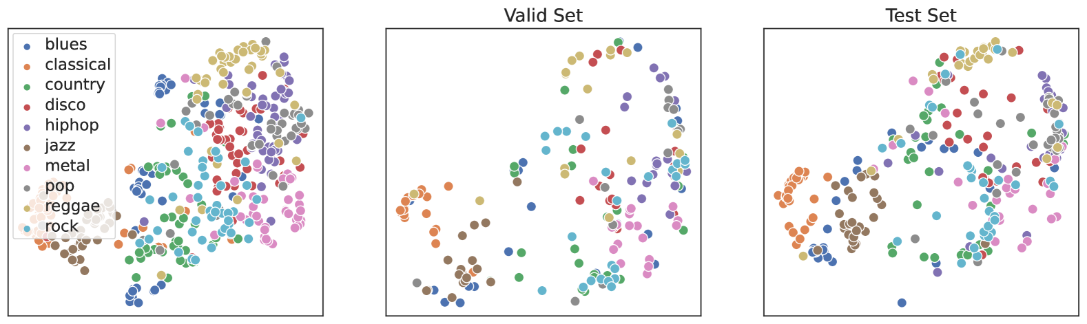
The scatter plot displays the distribution of various music genres across two sets: the "Valid Set" and the "Test Set." Each genre is represented by a different color, and the size of each dot corresponds to the number of tracks in that genre within the respective set.
### Components/Axes
- **X-axis**: Represents the number of tracks in each genre.
- **Y-axis**: Represents the genre itself.
- **Legend**: Located on the left side, it maps the colors to the corresponding genres.
- **Title**: "Valid Set" and "Test Set" are labeled at the top of each subplot.
### Detailed Analysis
- **Valid Set**: The dots are more densely packed, indicating a higher concentration of tracks in each genre. The genres with the highest number of tracks are "blues" and "rock."
- **Test Set**: The dots are more spread out, suggesting a more diverse distribution of genres. The genres with the highest number of tracks are "pop" and "reggae."
### Key Observations
- **Genre Diversity**: The "Test Set" shows a wider variety of genres compared to the "Valid Set."
- **Track Concentration**: The "Valid Set" has a more concentrated distribution of tracks, while the "Test Set" has a more even distribution.
### Interpretation
The scatter plot suggests that the "Valid Set" is a more representative sample of the music genre distribution, with a higher concentration of tracks in specific genres. The "Test Set," while more diverse, may not be as representative due to the more even distribution of genres. This could indicate that the "Valid Set" is a more controlled and curated sample, possibly used for training a model, while the "Test Set" is used for evaluating the model's performance on a more diverse set of data.