## Chart Type: Combined Histogram and Line Graph
### Overview
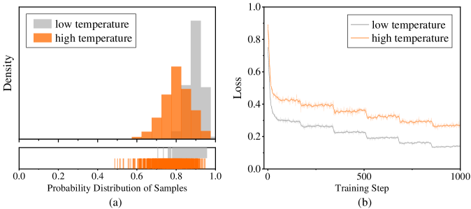
The image presents two subplots: (a) a histogram showing the probability distribution of samples at low and high temperatures, and (b) a line graph illustrating the loss during training steps for both low and high temperatures.
### Components/Axes
**Subplot (a): Histogram**
* **Title:** Probability Distribution of Samples
* **X-axis:** Probability Distribution of Samples, ranging from 0.0 to 1.0 with increments of 0.2.
* **Y-axis:** Density
* **Legend (Top-Left):**
* Gray: low temperature
* Orange: high temperature
* **Rug Plot:** A rug plot is displayed below the histogram, showing individual data points for both low and high temperatures.
**Subplot (b): Line Graph**
* **Title:** (None)
* **X-axis:** Training Step, ranging from 0 to 1000 with an increment at 500.
* **Y-axis:** Loss, ranging from 0.0 to 1.0 with increments of 0.2.
* **Legend (Top-Left):**
* Gray: low temperature
* Orange: high temperature
### Detailed Analysis
**Subplot (a): Histogram**
* **low temperature (Gray):** The distribution is centered around 0.9, with most values concentrated between 0.8 and 1.0.
* **high temperature (Orange):** The distribution is broader, with values ranging from approximately 0.6 to 1.0, peaking around 0.8.
**Subplot (b): Line Graph**
* **low temperature (Gray):** The loss starts around 0.5 and decreases rapidly initially, then plateaus around 0.2 after approximately 500 training steps. The line shows a stepped decrease.
* **high temperature (Orange):** The loss starts around 0.9 and decreases rapidly initially, then plateaus around 0.4 after approximately 500 training steps. The line shows a stepped decrease.
### Key Observations
* The probability distribution of samples differs significantly between low and high temperatures.
* The loss decreases with training steps for both temperatures, but the high-temperature model consistently exhibits higher loss values.
* Both loss curves show a stepped decrease, suggesting discrete updates or learning rate adjustments during training.
### Interpretation
The histogram suggests that at low temperatures, the model's samples are more concentrated around higher probability values compared to high temperatures, where the samples are more dispersed. This could indicate that the model is more confident or certain in its predictions at low temperatures.
The line graph demonstrates the learning process of the model under different temperature conditions. The higher loss values for high temperatures suggest that the model finds it more challenging to learn or make accurate predictions in this condition. The stepped decrease in loss indicates that the learning rate or some other training parameter was adjusted at specific intervals during training, leading to noticeable drops in the loss function. The model appears to converge after approximately 500 training steps, as the loss plateaus for both temperatures.