TECHNICAL ASSET FINGERPRINT
c4dbdbea3cb973f6db08d3a5
Click to view fullscreen
Press ESC or click to close
FOUND IN PAPERS
EXPERT: healer-alpha-free VERSION 1
RUNTIME: free/openrouter/healer-alpha
INTEL_VERIFIED
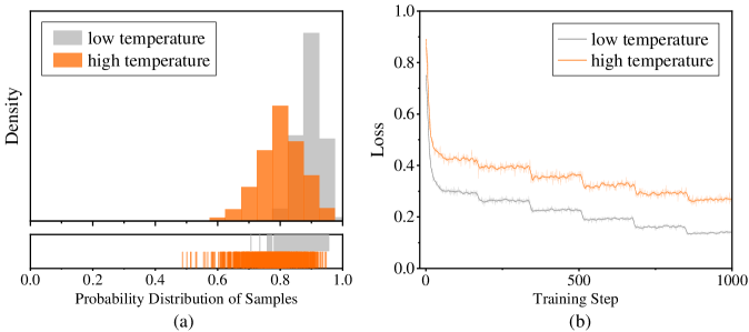
## Histogram and Line Chart: Temperature Effects on Sample Probability and Training Loss
### Overview
The image contains two adjacent subplots, labeled (a) and (b), presenting a comparative analysis of two experimental conditions: "low temperature" and "high temperature." Subplot (a) is a histogram with an accompanying rug plot, visualizing the probability distribution of samples. Subplot (b) is a line graph, tracking the training loss over 1000 steps. The overall figure appears to be from a technical document, likely a research paper or report, as indicated by the page number "Seite 6" (German for "Page 6") in the bottom-right corner.
### Components/Axes
**Subplot (a): Histogram**
* **Type:** Histogram with a rug plot below.
* **X-Axis:** Labeled "Probability Distribution of Samples". Scale ranges from 0.0 to 1.0, with major tick marks at 0.0, 0.2, 0.4, 0.6, 0.8, and 1.0.
* **Y-Axis:** Labeled "Density". Scale is not numerically marked, but the height of the bars represents density.
* **Legend:** Positioned in the top-left corner. Contains two entries:
* A gray rectangle labeled "low temperature".
* An orange rectangle labeled "high temperature".
* **Data Series:**
* **Low Temperature (Gray):** A distribution skewed towards higher probabilities. The highest density bar is located approximately between 0.85 and 0.95. The distribution appears to start around 0.5 and extends to 1.0.
* **High Temperature (Orange):** A distribution centered around a lower probability compared to the low temperature series. The peak density is approximately between 0.7 and 0.8. The distribution spans roughly from 0.4 to 0.95.
* **Rug Plot:** Located directly below the histogram, sharing the same x-axis. It displays individual data points as vertical lines. The orange lines (high temperature) are densely clustered between approximately 0.5 and 0.9. The gray lines (low temperature) are clustered more towards the right, between approximately 0.7 and 1.0.
**Subplot (b): Line Chart**
* **Type:** Line chart.
* **X-Axis:** Labeled "Training Step". Scale ranges from 0 to 1000, with major tick marks at 0, 500, and 1000.
* **Y-Axis:** Labeled "Loss". Scale ranges from 0.0 to 1.0, with major tick marks at 0.0, 0.2, 0.4, 0.6, 0.8, and 1.0.
* **Legend:** Positioned in the top-right corner. Contains two entries:
* A gray line labeled "low temperature".
* An orange line labeled "high temperature".
* **Data Series:**
* **Low Temperature (Gray Line):** The line starts at a very high loss (approximately 0.8-0.9) at step 0. It shows a steep initial decline, followed by a more gradual, stepwise decrease. By step 1000, the loss has decreased to approximately 0.15.
* **High Temperature (Orange Line):** The line starts at a lower initial loss (approximately 0.4-0.5) at step 0. It exhibits a more gradual decline with noticeable fluctuations and plateaus throughout the training. By step 1000, the loss is approximately 0.25-0.3.
### Detailed Analysis
**Subplot (a) - Distribution Analysis:**
* **Trend Verification:** The gray histogram (low temperature) slopes upward to the right, indicating a concentration of samples with high predicted probabilities. The orange histogram (high temperature) has a central peak, indicating samples are concentrated around a medium-high probability.
* **Key Data Points (Approximate):**
* **Low Temperature Peak:** Highest density at probability ~0.9.
* **High Temperature Peak:** Highest density at probability ~0.75.
* **Range:** Low temperature samples are primarily found between 0.7 and 1.0. High temperature samples are primarily found between 0.5 and 0.9.
**Subplot (b) - Training Loss Analysis:**
* **Trend Verification:** The gray line (low temperature) has a strong downward slope, especially at the beginning, indicating rapid convergence. The orange line (high temperature) has a gentler downward slope with more noise, indicating slower and less stable convergence.
* **Key Data Points (Approximate):**
* **Start (Step 0):** Low Temp Loss ~0.85; High Temp Loss ~0.45.
* **Middle (Step 500):** Low Temp Loss ~0.2; High Temp Loss ~0.35.
* **End (Step 1000):** Low Temp Loss ~0.15; High Temp Loss ~0.28.
### Key Observations
1. **Inverse Relationship in Starting Points:** In the histogram (a), the low temperature condition produces samples with higher confidence (probability). In the loss chart (b), the low temperature condition starts with a much higher error (loss).
2. **Convergence Behavior:** The low temperature training (gray line) converges faster and to a lower final loss value compared to the high temperature training.
3. **Distribution Shape:** The probability distribution for the low temperature condition is more skewed and concentrated at the high end, while the high temperature distribution is more symmetric and centered.
4. **Fluctuations:** The high temperature loss curve shows more step-like plateaus and fluctuations during training, suggesting more exploration or instability in the optimization process.
### Interpretation
The data suggests a trade-off or a specific dynamic between the "temperature" parameter and model behavior. In machine learning, "temperature" often controls the randomness of predictions. A **low temperature** makes the model more deterministic and confident. This is reflected in histogram (a), where the model assigns very high probabilities to its samples. However, this confidence does not initially align with the ground truth, as shown by the very high starting loss in chart (b). The model then learns rapidly from its confident mistakes.
Conversely, a **high temperature** makes the model's predictions more random and less confident. This results in a more spread-out, medium-confidence probability distribution in (a) and a lower initial loss in (b), as the model's predictions are less extreme and thus less wrong at the start. However, this condition leads to slower and less effective learning, as the model's updates are noisier.
The relationship between the two charts is complementary. They show that the condition leading to high model confidence (low temperature) also leads to high initial error but fast learning. The condition leading to lower confidence (high temperature) leads to lower initial error but slower learning. This could imply that a certain level of model confidence, even if initially misplaced, is beneficial for rapid convergence during training. The outlier is the starting point of the loss curves, which is inversely related to the final confidence of the samples.
DECODING INTELLIGENCE...