## Histogram and Line Graph: Probability Distribution and Loss Trends Across Temperature Conditions
### Overview
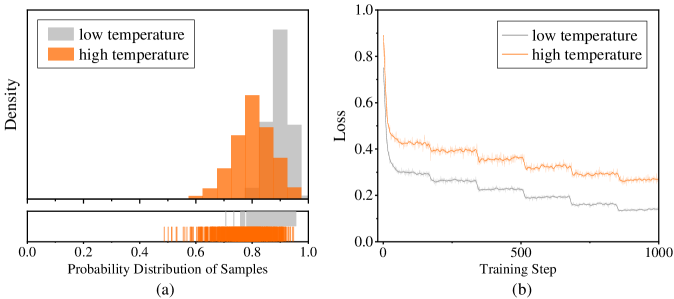
The image contains two visualizations comparing low and high temperature conditions:
1. **Histogram (a)**: Probability distribution of samples for low (gray) and high (orange) temperatures.
2. **Line Graph (b)**: Loss values over training steps for low (gray) and high (orange) temperatures.
### Components/Axes
#### Histogram (a)
- **X-axis**: "Probability Distribution of Samples" (0.0 to 1.0).
- **Y-axis**: "Density" (no explicit scale, but normalized).
- **Legend**: Top-left corner, with gray = low temperature, orange = high temperature.
- **Inset**: Raw data points (vertical bars) for both conditions.
#### Line Graph (b)
- **X-axis**: "Training Step" (0 to 1000).
- **Y-axis**: "Loss" (0.0 to 1.0).
- **Legend**: Top-left corner, matching colors to histogram.
### Detailed Analysis
#### Histogram (a)
- **High Temperature (Orange)**:
- Peaks at ~0.7–0.8 probability.
- Density decreases sharply beyond 0.8.
- Inset shows ~15–20 samples clustered between 0.7–0.9.
- **Low Temperature (Gray)**:
- Peaks at ~0.5–0.6 probability.
- Broader distribution with smaller density values.
- Inset shows ~10–15 samples clustered between 0.4–0.6.
#### Line Graph (b)
- **High Temperature (Orange)**:
- Starts at ~0.8 loss at step 0.
- Rapid decline to ~0.4 by step 500, then plateaus.
- Minor fluctuations (~0.02–0.05) after step 500.
- **Low Temperature (Gray)**:
- Starts at ~0.7 loss at step 0.
- Gradual decline to ~0.3 by step 1000.
- Smoother trend with fewer fluctuations.
### Key Observations
1. **Probability Distribution**: High temperature samples are more concentrated toward higher probabilities (0.7–0.9) compared to low temperature (0.4–0.6).
2. **Loss Trends**: High temperature achieves lower loss faster (~0.4 vs. ~0.3 at step 1000) but plateaus earlier. Low temperature shows slower but steadier improvement.
3. **Data Consistency**: The histogram’s higher probability for high temperature aligns with its faster loss reduction in the line graph.
### Interpretation
- **Efficiency of High Temperature**: The sharper loss decline suggests high temperature optimizes training dynamics, possibly due to better exploration of high-probability regions in the sample distribution.
- **Trade-offs**: While high temperature converges faster, its plateau may indicate diminishing returns or overfitting risks. Low temperature’s gradual improvement might reflect more stable but slower learning.
- **Data Granularity**: The histogram’s inset reveals raw sample distributions, supporting the density plot’s trends. The line graph’s fluctuations highlight the stochastic nature of training.
No textual content in other languages detected. All labels and trends are extracted with approximate values based on visual inspection.