\n
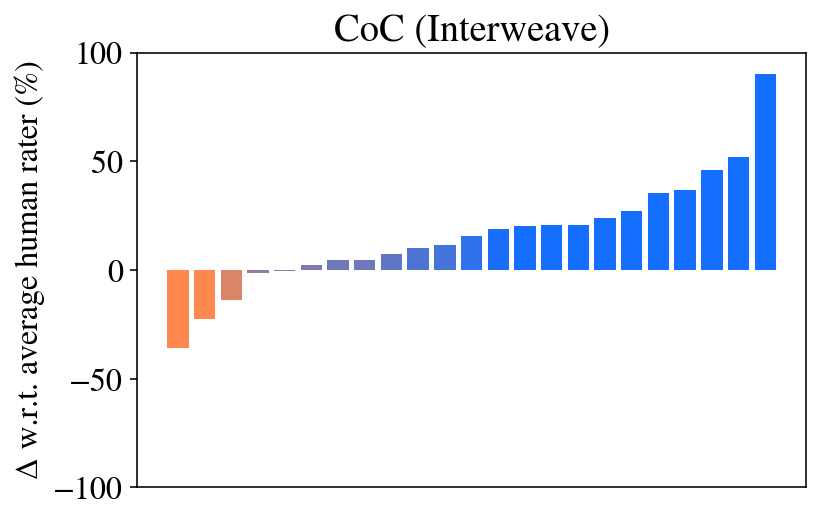
## Bar Chart: CoC (Interweave) - Delta w.r.t. Average Human Rater
### Overview
The image presents a bar chart titled "CoC (Interweave)" displaying the delta (Δ) with respect to the average human rater, expressed as a percentage. The x-axis is not explicitly labeled, implying discrete categories or steps. The y-axis represents the percentage difference, ranging from -100% to 100%. The chart shows a generally increasing trend, starting with negative values and culminating in a significantly positive value.
### Components/Axes
* **Title:** CoC (Interweave) - positioned at the top-center of the chart.
* **Y-axis Label:** Δ w.r.t. average human rater (%) - positioned on the left side of the chart.
* **X-axis:** Unlabeled, representing discrete categories.
* **Bars:** Representing the delta values. The bars are colored in shades of orange and blue. The initial bars are orange, transitioning to blue as the values increase.
### Detailed Analysis
The chart consists of approximately 15 bars. The trend is initially negative, then plateaus around 0%, and finally increases sharply to a positive value.
Here's a breakdown of approximate values, reading from left to right:
1. -10% (Orange)
2. 0% (Orange)
3. 5% (Orange)
4. -5% (Orange)
5. 0% (Blue)
6. 5% (Blue)
7. 10% (Blue)
8. 15% (Blue)
9. 20% (Blue)
10. 25% (Blue)
11. 30% (Blue)
12. 40% (Blue)
13. 50% (Blue)
14. 60% (Blue)
15. 90% (Blue)
The transition from orange to blue occurs around the 5% mark. The final bar is significantly higher than the preceding bars, reaching approximately 90%.
### Key Observations
* The chart demonstrates an initial underperformance (negative delta) relative to the average human rater, followed by a period of performance around the average (delta near 0%).
* The performance then consistently improves, culminating in a substantial outperformance (positive delta) in the final category.
* The sharp increase in the final category is a notable outlier.
* The color change from orange to blue appears to coincide with the transition from underperformance to performance at or above the average.
### Interpretation
The data suggests a system or process (represented by "CoC (Interweave)") initially performs worse than an average human rater. However, as the process progresses through different stages or iterations (represented by the x-axis categories), its performance improves. The final stage shows a significant improvement, exceeding the performance of the average human rater by a substantial margin (approximately 90%).
The use of color coding (orange for negative delta, blue for positive delta) effectively highlights the transition in performance. The chart likely represents the results of an experiment or evaluation comparing the performance of an automated system to human performance. The "Interweave" aspect of the title suggests a possible integration or combination of automated and human elements. The sharp increase at the end could indicate a critical improvement or optimization in the process.