\n
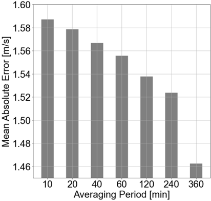
## Bar Chart: Mean Absolute Error vs. Averaging Period
### Overview
This image presents a bar chart illustrating the relationship between the averaging period and the mean absolute error. The chart displays how the mean absolute error changes as the averaging period increases.
### Components/Axes
* **X-axis:** Averaging Period [min]. Marked with values: 10, 20, 40, 60, 120, 240, 360.
* **Y-axis:** Mean Absolute Error [m/s]. Scale ranges from approximately 1.46 to 1.60.
* **Bars:** Represent the mean absolute error for each corresponding averaging period. All bars are the same color (grey).
* **Gridlines:** Horizontal gridlines are present to aid in reading the Y-axis values.
### Detailed Analysis
The chart shows a decreasing trend in mean absolute error as the averaging period increases.
* **Averaging Period = 10 min:** Mean Absolute Error ≈ 1.59 m/s
* **Averaging Period = 20 min:** Mean Absolute Error ≈ 1.58 m/s
* **Averaging Period = 40 min:** Mean Absolute Error ≈ 1.56 m/s
* **Averaging Period = 60 min:** Mean Absolute Error ≈ 1.55 m/s
* **Averaging Period = 120 min:** Mean Absolute Error ≈ 1.54 m/s
* **Averaging Period = 240 min:** Mean Absolute Error ≈ 1.52 m/s
* **Averaging Period = 360 min:** Mean Absolute Error ≈ 1.46 m/s
The highest mean absolute error is observed at an averaging period of 10 minutes, while the lowest is at 360 minutes. The decrease is not linear, with a steeper decline observed between 10 and 60 minutes, and a more gradual decline thereafter.
### Key Observations
* The mean absolute error decreases consistently with increasing averaging period.
* The most significant reduction in error occurs within the first 60 minutes of averaging.
* There is a noticeable drop in error between 240 and 360 minutes.
### Interpretation
The data suggests that increasing the averaging period reduces the mean absolute error. This implies that the measurement or prediction becomes more stable and accurate as more data is averaged over a longer time interval. This is a common phenomenon in signal processing and data analysis, where averaging can help to reduce the impact of noise and random fluctuations. The diminishing returns observed at longer averaging periods (beyond 60 minutes) suggest that there is a limit to the benefit of further averaging, potentially due to the underlying process becoming more time-dependent or non-stationary. The chart demonstrates the trade-off between temporal resolution (shorter averaging periods) and accuracy (longer averaging periods). The optimal averaging period would depend on the specific application and the relative importance of these two factors.