## Bar Chart: Mean Absolute Error vs. Averaging Period
### Overview
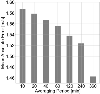
This is a vertical bar chart illustrating the relationship between the averaging period (in minutes) and the resulting mean absolute error (in meters per second, m/s). The chart demonstrates a clear inverse relationship: as the averaging period increases, the mean absolute error decreases.
### Components/Axes
* **Chart Type:** Vertical Bar Chart.
* **X-Axis (Horizontal):**
* **Label:** "Averaging Period [min]"
* **Categories/Markers:** 10, 20, 40, 60, 120, 240, 360. These represent discrete time intervals in minutes.
* **Y-Axis (Vertical):**
* **Label:** "Mean Absolute Error [m/s]"
* **Scale:** Linear scale ranging from 1.46 to 1.60, with major gridlines at intervals of 0.02 (1.46, 1.48, 1.50, 1.52, 1.54, 1.56, 1.58, 1.60).
* **Data Series:** A single series represented by seven gray bars, one for each averaging period category.
* **Legend:** Not present. The single data series is directly labeled by the y-axis.
* **Spatial Layout:** The chart area is bounded by a light gray grid. The x-axis label is centered below the axis. The y-axis label is rotated 90 degrees and centered to the left of the axis.
### Detailed Analysis
The height of each bar corresponds to the mean absolute error for that specific averaging period. Values are approximate, read from the y-axis scale.
| Averaging Period (min) | Approximate Mean Absolute Error (m/s) | Visual Trend Description |
| :--- | :--- | :--- |
| 10 | ~1.587 | Tallest bar, highest error. |
| 20 | ~1.579 | Slightly shorter than the 10-min bar. |
| 40 | ~1.567 | Continues the downward trend. |
| 60 | ~1.556 | Error falls below 1.56. |
| 120 | ~1.538 | Error falls below 1.54. |
| 240 | ~1.524 | Error falls below 1.53. |
| 360 | ~1.463 | Shortest bar, lowest error. Shows the most significant single drop from the previous period (240 min). |
**Trend Verification:** The data series shows a consistent, monotonic downward trend. Each successive bar is shorter than the previous one, confirming that error decreases as the averaging window lengthens.
### Key Observations
1. **Consistent Inverse Relationship:** There is a strict, monotonic decrease in mean absolute error as the averaging period increases from 10 to 360 minutes.
2. **Non-Linear Decrease:** The rate of error reduction is not constant. The decrease between consecutive periods appears relatively steady from 10 to 240 minutes, but the drop from 240 to 360 minutes is visually the largest.
3. **Magnitude of Change:** The total reduction in error from the shortest (10 min) to the longest (360 min) averaging period is approximately 0.124 m/s (from ~1.587 to ~1.463).
4. **No Outliers:** All data points follow the established trend without deviation.
### Interpretation
This chart presents a classic trade-off in signal processing or measurement systems: **temporal resolution versus accuracy**.
* **What the data suggests:** Using a shorter averaging period (e.g., 10 or 20 minutes) provides more frequent, timely updates but results in a higher mean absolute error (~1.58-1.59 m/s). Conversely, employing a much longer averaging period (e.g., 360 minutes or 6 hours) smooths out short-term fluctuations and noise, yielding a significantly more accurate estimate (error ~1.46 m/s), but at the cost of temporal detail and responsiveness.
* **How elements relate:** The x-axis (Averaging Period) is the independent control variable. The y-axis (Mean Absolute Error) is the dependent outcome variable. The bars visually quantify the cost (in error) of choosing a specific time resolution.
* **Notable Implication:** The most dramatic improvement in accuracy occurs when extending the averaging period from 240 to 360 minutes. This suggests that for this particular system, very long-term averaging (6 hours) is particularly effective at suppressing the sources of error. The choice of optimal averaging period would depend on the specific application's need for timely data versus its tolerance for error.