## Bar Chart: Model Performance Across Training Sample Sizes
### Overview
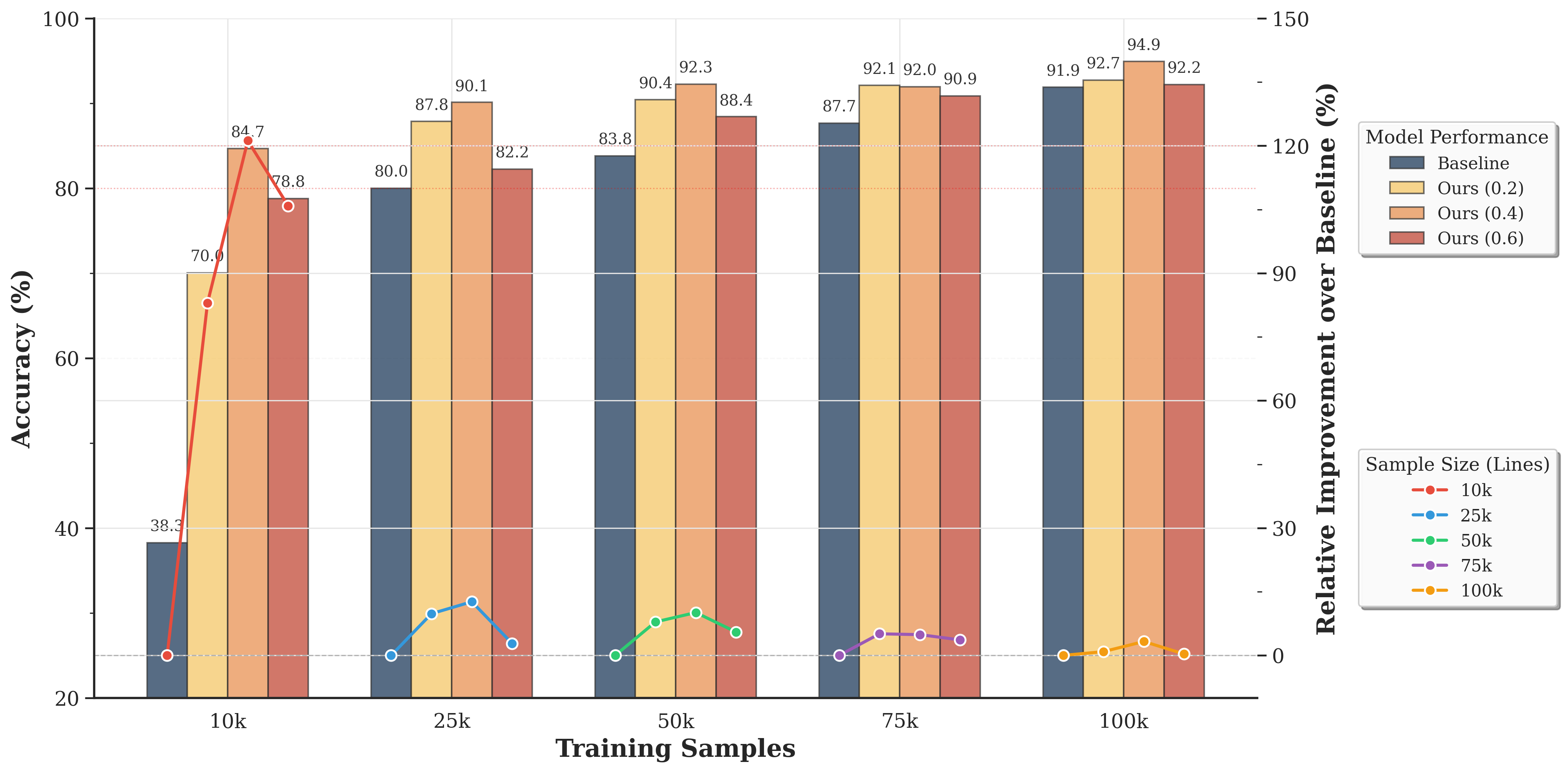
The chart compares the accuracy of four machine learning models (Baseline, Ours (0.2), Ours (0.4), Ours (0.6)) across five training sample sizes (10k, 25k, 50k, 75k, 100k). It includes both absolute accuracy percentages and relative improvement over the Baseline model, visualized through grouped bars and line plots.
### Components/Axes
- **X-axis (Training Samples)**: Categorical scale with labels: 10k, 25k, 50k, 75k, 100k.
- **Y-axis (Accuracy %)**: Linear scale from 20% to 100%.
- **Legend**: Located on the right, with four entries:
- **Baseline**: Dark blue bars.
- **Ours (0.2)**: Yellow bars.
- **Ours (0.4)**: Light orange bars.
- **Ours (0.6)**: Red bars.
- **Line Plots**: Five colored lines (red, blue, green, purple, yellow) representing relative improvement over Baseline for each sample size (10k, 25k, 50k, 75k, 100k).
### Detailed Analysis
#### Absolute Accuracy (%)
| Sample Size | Baseline | Ours (0.2) | Ours (0.4) | Ours (0.6) |
|-------------|----------|------------|------------|------------|
| 10k | 38.3 | 70.0 | 84.7 | 78.8 |
| 25k | 80.0 | 87.8 | 90.1 | 82.2 |
| 50k | 83.8 | 90.4 | 92.3 | 88.4 |
| 75k | 87.7 | 92.1 | 92.0 | 90.9 |
| 100k | 91.9 | 92.7 | 94.9 | 92.2 |
#### Relative Improvement Over Baseline (%)
- **10k (Red line)**: Peaks at ~30% improvement (Baseline: 38.3%, Ours (0.6): 78.8%).
- **25k (Blue line)**: Peaks at ~10% improvement (Baseline: 80.0%, Ours (0.6): 82.2%).
- **50k (Green line)**: Peaks at ~7% improvement (Baseline: 83.8%, Ours (0.6): 88.4%).
- **75k (Purple line)**: Peaks at ~3% improvement (Baseline: 87.7%, Ours (0.6): 90.9%).
- **100k (Yellow line)**: Minimal improvement (~0.8%) (Baseline: 91.9%, Ours (0.6): 92.2%).
### Key Observations
1. **Model Performance Trends**:
- All "Ours" models outperform the Baseline across all sample sizes.
- Accuracy increases with larger training samples for all models.
- The gap between "Ours" models and Baseline narrows as sample size increases.
2. **Relative Improvement**:
- Largest improvement occurs at 10k samples (~30% for Ours (0.6)).
- Improvement diminishes significantly at larger sample sizes (near 0% at 100k).
3. **Model Consistency**:
- Ours (0.6) consistently achieves the highest accuracy across all sample sizes.
- Ours (0.2) and Ours (0.4) show similar performance, with slight variations.
### Interpretation
The data demonstrates that:
- **Larger datasets improve model performance**, but the relative benefit of additional samples diminishes as sample size grows (diminishing returns).
- The "Ours" models (0.2, 0.4, 0.6) are more effective than the Baseline, with Ours (0.6) providing the strongest performance.
- At 100k samples, all models converge to similar accuracy levels (~92-95%), suggesting that further scaling beyond this point may yield minimal gains.
- The line plots confirm that the most significant relative improvement occurs at smaller sample sizes, highlighting the importance of efficient model design for low-data regimes.
### Spatial Grounding & Trend Verification
- **Legend Placement**: Right-aligned, clearly mapping colors to models.
- **Bar Grouping**: Each sample size cluster contains four bars (one per model), ordered by legend sequence.
- **Line Plot Alignment**: Lines are anchored to their respective sample size markers (e.g., red line for 10k samples starts at the 10k cluster).
### Language Note
All text in the chart is in English. No non-English content is present.