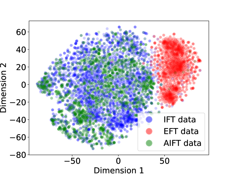
## Scatter Plot: Dimensionality Reduction of Three Data Series
### Overview
The image is a 2D scatter plot visualizing three distinct datasets projected into a two-dimensional space defined by "Dimension 1" (x-axis) and "Dimension 2" (y-axis). The plot reveals the clustering and separation patterns of the data points, which are colored according to their source dataset.
### Components/Axes
* **Chart Type:** 2D Scatter Plot.
* **X-Axis:** Labeled "Dimension 1". The axis spans from approximately -80 to +80, with major tick marks at -50, 0, and 50.
* **Y-Axis:** Labeled "Dimension 2". The axis spans from approximately -80 to +60, with major tick marks at -80, -60, -40, -20, 0, 20, 40, and 60.
* **Legend:** Located in the bottom-right quadrant of the chart area. It contains three entries:
* A blue circle labeled "IFT data".
* A red circle labeled "EFT data".
* A green circle labeled "AIFT data".
* **Data Points:** Thousands of semi-transparent circular markers, colored blue, red, or green, plotted according to their (Dimension 1, Dimension 2) coordinates.
### Detailed Analysis
* **Spatial Distribution & Clustering:**
* **EFT data (Red):** Forms a dense, distinct cluster primarily located on the right side of the plot. Its center of mass is approximately at Dimension 1 = +50, Dimension 2 = +20. The cluster spans roughly from Dimension 1 = +20 to +80 and Dimension 2 = -20 to +60.
* **IFT data (Blue) & AIFT data (Green):** These two datasets are heavily intermingled and form a large, diffuse cloud occupying the left and central portions of the plot. Their combined mass spans roughly from Dimension 1 = -80 to +30 and Dimension 2 = -80 to +60. There is no clear visual boundary separating the blue and green points within this cloud.
* **Trend Verification:**
* The **EFT (red)** series shows a clear trend of being separated from the other two series along the Dimension 1 axis.
* The **IFT (blue)** and **AIFT (green)** series show a trend of significant overlap and similar distribution, indicating they occupy a similar region in this 2D projection.
* **Density:** The red (EFT) cluster appears denser than the combined blue/green cloud, suggesting a more concentrated distribution in this reduced-dimensional space.
### Key Observations
1. **Primary Separation:** The most prominent feature is the clear separation of the "EFT data" (red) cluster from the combined "IFT data" (blue) and "AIFT data" (green) cloud along the first dimension (x-axis).
2. **High Overlap:** The "IFT data" and "AIFT data" points are thoroughly mixed, showing no distinct sub-clustering or separation between them in this visualization.
3. **Cluster Shape:** The EFT cluster is relatively compact and roughly elliptical. The IFT/AIFT cloud is more amorphous and spread out.
4. **Outliers:** A few scattered red points appear within the main blue/green cloud, and vice-versa, but these are exceptions to the strong general separation.
### Interpretation
This scatter plot likely results from a dimensionality reduction technique (like t-SNE or UMAP) applied to high-dimensional data from three sources: IFT, EFT, and AIFT. The visualization suggests a fundamental difference in the underlying structure or features of the **EFT data** compared to the other two. The **IFT and AIFT data** appear to be very similar to each other in this projected space, implying they may share common characteristics or originate from related processes.
The clear separation of the red cluster indicates that the algorithm has found a meaningful way to distinguish EFT samples based on their core attributes. The overlap of blue and green points suggests that, for the features captured by this projection, IFT and AIFT data are not readily distinguishable. This could mean they are drawn from the same population, represent similar phenomena, or that the current projection method is not sensitive to the differences between them. The plot provides strong visual evidence for a categorical distinction between EFT and the (IFT/AIFT) group.