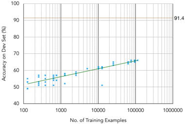
## Scatter Plot with Trend Line: Accuracy vs. Training Examples
### Overview
The image is a technical scatter plot chart illustrating the relationship between the quantity of training data and model performance. It plots "Accuracy on Dev Set (%)" against the "No. of Training Examples" on a semi-logarithmic scale (logarithmic x-axis, linear y-axis). A green trend line is fitted to the blue data points, and a horizontal reference line marks a specific accuracy threshold.
### Components/Axes
* **Chart Type:** Scatter plot with a linear trend line on a semi-log plot.
* **X-Axis:**
* **Label:** "No. of Training Examples"
* **Scale:** Logarithmic (base 10).
* **Range & Markers:** Major ticks at 100, 1000, 10000, 100000, and 1000000. Minor gridlines are present between major ticks.
* **Y-Axis:**
* **Label:** "Accuracy on Dev Set (%)"
* **Scale:** Linear.
* **Range & Markers:** Ticks from 40 to 100 in increments of 10. Gridlines are present at these intervals.
* **Data Series:**
* **Blue Dots:** Represent individual data points showing measured accuracy for a given number of training examples.
* **Green Line:** A straight trend line fitted to the data points on this semi-log plot, indicating a logarithmic relationship between training examples and accuracy.
* **Reference Line:**
* A solid, horizontal, brownish-orange line is drawn at **91.4%** accuracy, extending across the full width of the plot area. The value "91.4" is annotated in black text just to the right of the plot area, aligned with this line.
* **Spatial Layout:** The plot area is enclosed by a black border. Axis labels are centered below the x-axis and to the left of the y-axis (rotated 90 degrees). The 91.4% reference line and its annotation are positioned in the upper region of the chart.
### Detailed Analysis
* **Trend Verification:** The data points (blue dots) show a clear, consistent upward trend from left to right. As the number of training examples increases (moving right on the log-scale x-axis), the accuracy on the dev set increases (moving up on the linear y-axis). The green trend line slopes upward, confirming this positive correlation.
* **Data Point Extraction (Approximate):**
* At ~100 examples: Accuracy clusters between ~48% and ~55%.
* At ~1,000 examples: Accuracy clusters between ~52% and ~58%.
* At ~10,000 examples: Accuracy clusters between ~58% and ~64%. One notable outlier point sits lower, at approximately 50% accuracy.
* At ~100,000 examples: Accuracy clusters tightly between ~64% and ~66%.
* **Trend Line Interpretation:** The green trend line is linear on this semi-log plot. This indicates that accuracy improves linearly with the *logarithm* of the number of training examples. The line starts at approximately 51% accuracy at 100 examples and rises to approximately 66% accuracy at 100,000 examples.
* **Reference Line Context:** The horizontal line at 91.4% represents a performance target or benchmark. The current trend line, even when extrapolated to 1,000,000 examples, remains far below this threshold (visually extrapolating the green line suggests it would reach only ~71-72% at 1,000,000 examples).
### Key Observations
1. **Consistent Logarithmic Improvement:** Model accuracy improves predictably with more data, but the rate of improvement slows down (diminishing returns) as each order-of-magnitude increase in data yields a smaller absolute gain in accuracy.
2. **Performance Gap:** There is a significant gap (~25 percentage points at 100,000 examples) between the observed performance trend and the 91.4% reference line.
3. **Low-Data Variance:** At lower training example counts (100-1000), the variance in accuracy (spread of blue dots) appears higher than at higher counts (10,000-100,000), where points cluster more tightly around the trend line.
4. **Potential Outlier:** One data point near 10,000 examples shows anomalously low accuracy (~50%), deviating from the cluster of points in that region.
### Interpretation
This chart demonstrates a classic **power-law scaling relationship** between dataset size and model performance, common in machine learning. The key insight is that while more data consistently helps, achieving high accuracy (like the 91.4% target) requires an exponentially larger amount of data. The linear trend on the semi-log plot quantifies this: to gain a fixed percentage point increase in accuracy, the required increase in data multiplies.
The 91.4% line acts as a **performance ceiling or goal**. The chart suggests that simply scaling the current approach with more data of the same type is unlikely to reach this target efficiently. To bridge the gap, one might need to consider:
* **Model Architecture Improvements:** A more capable model could shift the entire trend line upward.
* **Data Quality/Curation:** Higher-quality or more diverse training examples might improve the efficiency of learning.
* **Algorithmic Innovations:** New training techniques could change the fundamental scaling law.
The chart effectively communicates that the project is on a predictable improvement trajectory but highlights the need for a strategic shift to achieve the desired high-accuracy benchmark.