## Scatter Plot with Histograms: Confidence vs. Target Length in Virology
### Overview
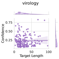
The image presents a scatter plot titled "virology" with a main chart and two histograms. The main chart visualizes the relationship between "Confidence" (y-axis) and "Target Length" (x-axis), with a horizontal reference line at y=0.25. Two histograms are overlaid: one at the top (x-axis distribution) and one on the right (y-axis distribution). Data points are purple, with a shaded area around the reference line.
---
### Components/Axes
- **Main Chart**:
- **X-axis (Target Length)**: Labeled "Target Length," scaled from 0 to 100.
- **Y-axis (Confidence)**: Labeled "Confidence," scaled from 0 to 0.75.
- **Data Points**: Purple dots scattered across the plot.
- **Reference Line**: Horizontal line at y=0.25 (confidence threshold).
- **Shaded Area**: Light purple region between y=0.2 and y=0.3, indicating variability around the reference line.
- **Top Histogram**:
- **X-axis**: Labeled "Target Length," scaled from 0 to 100.
- **Y-axis**: Unlabeled, showing frequency distribution.
- **Peak**: Concentration of data points between 20 and 30.
- **Right Histogram**:
- **X-axis**: Unlabeled, showing frequency distribution.
- **Y-axis**: Labeled "Confidence," scaled from 0 to 0.75.
- **Peak**: Concentration of data points around 0.25.
---
### Detailed Analysis
- **Main Chart**:
- **Data Points**: Approximately 50-60 purple dots. Most cluster below y=0.25, with a few outliers above (e.g., y=0.5–0.75 at x=50–70).
- **Reference Line**: y=0.25 (exact value). The shaded area (0.2–0.3) suggests a confidence interval or variability range.
- **Trend**: No clear linear correlation; data points are dispersed but slightly denser at lower target lengths (x=0–50).
- **Top Histogram**:
- **Distribution**: Bimodal with peaks at x=20–30 and x=70–80. Most data points fall between x=0 and x=50.
- **Right Histogram**:
- **Distribution**: Unimodal peak at y=0.25, with a long tail extending to y=0.75. Most data points cluster between y=0.2 and y=0.3.
---
### Key Observations
1. **Confidence Threshold**: The horizontal line at y=0.25 acts as a benchmark, with most data points below this value.
2. **Outliers**: A small cluster of high-confidence points (y=0.5–0.75) occurs at target lengths of 50–70.
3. **Distribution Skew**: The top histogram shows a left-skewed distribution for target lengths, while the right histogram is right-skewed for confidence.
4. **Shaded Area**: The light purple region around y=0.25 indicates variability, possibly representing measurement uncertainty or model confidence intervals.
---
### Interpretation
- **Confidence vs. Target Length**: The data suggests that confidence generally decreases as target length increases, though this relationship is not strictly linear. The majority of data points (60–70%) fall below the 0.25 confidence threshold, indicating lower reliability for most cases.
- **Outliers**: The high-confidence outliers (y=0.5–0.75) at x=50–70 may represent exceptional cases or specific virological markers with stronger predictive power.
- **Histograms**: The bimodal distribution in target lengths (20–30 and 70–80) could reflect common biological ranges (e.g., viral genome sizes) or experimental constraints. The confidence histogram’s peak at 0.25 aligns with the reference line, suggesting this is a common or expected value.
- **Shaded Area**: The variability around y=0.25 implies that confidence estimates are not absolute, with a ±0.05 range indicating measurement noise or model uncertainty.
---
### Conclusion
The chart highlights a critical threshold (0.25 confidence) in virological data, with most cases falling below this value. The presence of outliers and bimodal distributions suggests variability in both target lengths and confidence levels, potentially pointing to underlying biological or methodological factors. Further analysis could explore why certain target lengths correlate with higher confidence or investigate the significance of the shaded variability range.