## Heatmap Pair: Parameter Sensitivity Analysis
### Overview
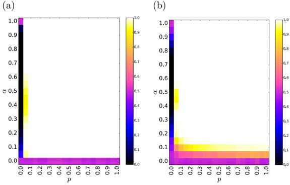
The image displays two side-by-side heatmaps, labeled (a) and (b), which visualize the relationship between two parameters, **p** (x-axis) and **α** (y-axis), and a third, unnamed dependent variable represented by color intensity. Both plots share identical axes and color scales, allowing for direct comparison of the data distributions.
### Components/Axes
* **Plot Labels:** The left heatmap is labeled "(a)" and the right heatmap is labeled "(b)".
* **X-Axis (Both Plots):**
* **Label:** `p`
* **Scale:** Linear, ranging from 0.0 to 1.0.
* **Tick Marks:** 0.0, 0.1, 0.2, 0.3, 0.4, 0.5, 0.6, 0.7, 0.8, 0.9, 1.0.
* **Y-Axis (Both Plots):**
* **Label:** `α` (Greek letter alpha)
* **Scale:** Linear, ranging from 0.0 to 1.0.
* **Tick Marks:** 0.0, 0.1, 0.2, 0.3, 0.4, 0.5, 0.6, 0.7, 0.8, 0.9, 1.0.
* **Color Bar (Both Plots):**
* **Position:** Right side of each heatmap.
* **Scale:** Linear, ranging from 0.0 (dark blue/black) to 1.0 (bright yellow).
* **Tick Marks:** 0.0, 0.1, 0.2, 0.3, 0.4, 0.5, 0.6, 0.7, 0.8, 0.9, 1.0.
* **Color Gradient:** The scale transitions from dark blue/black (0.0) through blue, purple, magenta, orange, to bright yellow (1.0).
### Detailed Analysis
**Plot (a):**
* **Trend:** The highest values (bright yellow, ~1.0) are concentrated in a narrow, L-shaped region along the very left edge (p ≈ 0.0) and the very bottom edge (α ≈ 0.0).
* **Data Points:**
* At `p = 0.0`, the value is ~1.0 for all `α` from 0.0 to 1.0.
* At `α = 0.0`, the value is ~1.0 for all `p` from 0.0 to 1.0.
* For any combination where both `p > 0.0` and `α > 0.0`, the value drops sharply to near 0.0 (dark blue/black). There is a very faint, narrow band of intermediate values (light blue/purple, ~0.1-0.3) immediately adjacent to the axes, but it is not prominent.
**Plot (b):**
* **Trend:** Similar to (a), the highest values are concentrated near the axes, but the region of high values is significantly broader and more diffuse, especially in the lower-left corner.
* **Data Points:**
* At `p = 0.0`, the value is ~1.0 for all `α`.
* At `α = 0.0`, the value is ~1.0 for all `p`.
* The region of high values (yellow/orange, >0.5) extends further into the plot. For example, at `p = 0.1` and `α = 0.1`, the value is still high (~0.7-0.8). The transition from high to low values is more gradual, creating a visible "fan" or "wedge" of intermediate values (purple/magenta, ~0.3-0.6) spreading from the origin (0,0).
### Key Observations
1. **Critical Axes:** In both plots, the parameter space where either `p=0` or `α=0` yields the maximum value of the dependent variable (1.0).
2. **Phase Transition:** Both plots suggest a sharp phase transition or critical threshold. Moving away from the axes (increasing both `p` and `α` simultaneously) causes the dependent variable to collapse towards zero.
3. **Primary Difference:** The key distinction between (a) and (b) is the **width of the critical region**. Plot (a) shows an extremely narrow, almost discontinuous transition. Plot (b) shows a broader, more continuous transition zone, indicating that the system in (b) is more robust or has a larger basin of attraction for the high-value state when parameters are small but non-zero.
4. **Symmetry:** Both heatmaps appear roughly symmetric about the diagonal line where `p = α`.
### Interpretation
These heatmaps likely represent the output of a model or simulation studying a system's behavior under two control parameters, `p` and `α`. The dependent variable (color) could represent a measure like **success probability, system efficiency, order parameter, or survival rate**.
* **What the data suggests:** The system exhibits a "winner-takes-all" or "all-or-nothing" behavior. It functions optimally (value=1.0) only when at least one of the controlling parameters is completely suppressed (set to zero). The introduction of both parameters simultaneously, even at low levels, causes a rapid degradation of performance.
* **How elements relate:** `p` and `α` appear to be competing or interfering parameters. Their joint presence is detrimental, while the absence of one is sufficient for optimal function. This is characteristic of systems with **redundant failure modes** or **competing mechanisms**.
* **Notable anomaly/insight:** The difference between (a) and (b) is the most critical observation. It implies that a change in the underlying model or system configuration (the difference between condition 'a' and 'b') has **widened the stability region**. In condition (b), the system can tolerate small, non-zero values of both `p` and `α` before performance collapses. This could be due to increased noise, a different interaction kernel, or a change in network topology in the model that generated plot (b). The investigation would focus on what model parameter was altered to produce this broadening effect.