## Line Graph: Statistical Distribution of Channel Data
### Overview
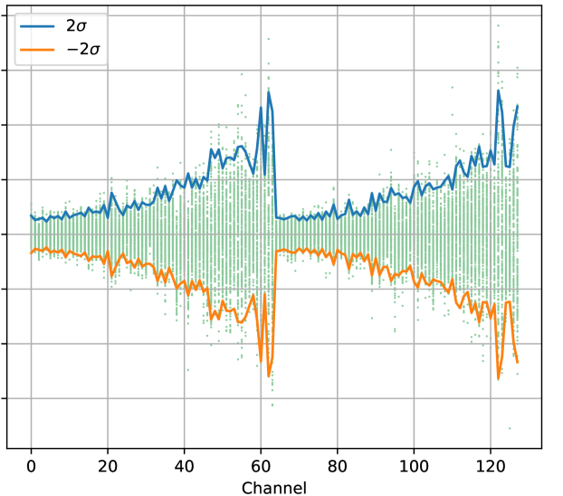
The image depicts a line graph with two primary data series (blue and orange lines) and scattered green data points. The x-axis represents "Channel" (0–120), while the y-axis is unlabeled but includes grid lines. The graph shows periodic peaks and troughs in both lines, with green points distributed around them.
### Components/Axes
- **X-axis**: Labeled "Channel," ranging from 0 to 120 in increments of 20.
- **Y-axis**: Unlabeled, with grid lines suggesting a numerical scale (approximate range: -2 to +2 based on line extremities).
- **Legend**: Located in the top-left corner.
- Blue line: "2σ" (positive two standard deviations).
- Orange line: "-2σ" (negative two standard deviations).
- **Data Points**: Green dots scattered across the graph, denser near the blue and orange lines.
### Detailed Analysis
1. **Blue Line (2σ)**:
- Peaks at channels ~60 and ~120, reaching approximately +1.5 and +1.2 on the y-axis, respectively.
- Smaller oscillations between channels 0–40 and 80–100, with values fluctuating between ~0.5 and ~1.0.
- Sharp drop near channel 80, dipping to ~0.3 before rising again.
2. **Orange Line (-2σ)**:
- Troughs at channels ~60 and ~120, reaching approximately -1.5 and -1.2 on the y-axis, respectively.
- Oscillations between channels 0–40 and 80–100, with values fluctuating between ~-0.5 and ~-0.8.
- Sharp rise near channel 80, peaking at ~-0.3 before declining.
3. **Green Data Points**:
- Clustered around the blue and orange lines, with higher density near peaks/troughs.
- Spread between ~-1.0 and +1.0 on the y-axis, suggesting variability within ±1σ.
### Key Observations
- **Symmetry**: The blue and orange lines mirror each other in magnitude but opposite in sign, consistent with ±2σ boundaries.
- **Peaks at Channels 60 and 120**: Both lines exhibit pronounced extrema at these points, indicating potential anomalies or events.
- **Data Point Distribution**: Green points are concentrated near the ±2σ lines, implying most measurements fall within this range.
- **Channel 80 Behavior**: Both lines show a transitional dip/rise at this channel, suggesting a shift in the underlying distribution.
### Interpretation
The graph likely represents a statistical analysis of channel data, where:
- The **blue and orange lines** define ±2σ boundaries, framing the expected range of data variability.
- The **green points** are individual measurements, with their clustering near the ±2σ lines indicating that most values lie within this range.
- The **peaks at channels 60 and 120** suggest localized anomalies or heightened activity, as their magnitudes exceed typical fluctuations.
- The **symmetry** between the lines reinforces the assumption of a normal or Gaussian-like distribution, where extreme values are equally likely in both directions.
The unlabeled y-axis implies the data may represent normalized or dimensionless quantities (e.g., deviations from a mean). The absence of a mean line (e.g., 0σ) limits direct interpretation of central tendency but emphasizes variability.
This visualization could apply to fields like signal processing, quality control, or environmental monitoring, where identifying deviations from expected behavior is critical.