## Time Series Charts: Resource Allocation
### Overview
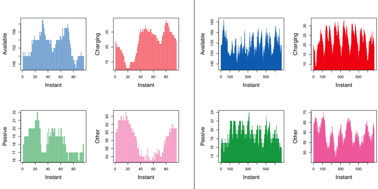
The image presents four pairs of time series charts, each pair displaying the allocation of resources across four categories: Available, Charging, Passive, and Other. The left set of charts covers a shorter time span (0-80 "Instant") with less frequent fluctuations, while the right set covers a longer time span (0-500 "Instant") with more rapid fluctuations. The y-axes represent the quantity of resources in each category.
### Components/Axes
**General:**
* **X-axis:** Labeled "Instant" in all charts, representing time or a sequence of events.
* **Y-axes:** Represent the quantity of resources. Each chart has a different scale on the y-axis, tailored to the range of values for that category.
**Left Charts (Short Time Span):**
* **Available:** Y-axis ranges from 148 to 156. The data is represented by a light blue color.
* **Charging:** Y-axis ranges from 15 to 25. The data is represented by a light red color.
* **Passive:** Y-axis ranges from 16 to 22. The data is represented by a light green color.
* **Other:** Y-axis ranges from 54 to 64. The data is represented by a light pink color.
* **X-axis:** Ranges from 0 to 80.
**Right Charts (Long Time Span):**
* **Available:** Y-axis ranges from 145 to 165. The data is represented by a dark blue color.
* **Charging:** Y-axis ranges from 10 to 30. The data is represented by a dark red color.
* **Passive:** Y-axis ranges from 14 to 24. The data is represented by a dark green color.
* **Other:** Y-axis ranges from 50 to 70. The data is represented by a dark pink color.
* **X-axis:** Ranges from 0 to 500.
### Detailed Analysis
**Left Charts (Short Time Span):**
* **Available (Light Blue):** Starts around 149, increases to a peak around 155 at instant 40, then decreases to around 150 at instant 50, and increases again to around 154 at instant 60, before decreasing to around 149 at instant 80.
* **Charging (Light Red):** Starts around 15, decreases to a minimum around 14 at instant 20, then increases to a peak around 24 at instant 60, before decreasing to around 20 at instant 80.
* **Passive (Light Green):** Starts around 16, increases to a peak around 22 at instant 30, then decreases to around 17 at instant 40, and increases again to around 20 at instant 60, before decreasing to around 17 at instant 80.
* **Other (Light Pink):** Starts around 62, decreases to a minimum around 54 at instant 40, then increases to around 58 at instant 60, before decreasing to around 54 at instant 80.
**Right Charts (Long Time Span):**
* **Available (Dark Blue):** Fluctuates rapidly between approximately 145 and 165 throughout the entire time span.
* **Charging (Dark Red):** Fluctuates rapidly between approximately 10 and 30 throughout the entire time span.
* **Passive (Dark Green):** Fluctuates rapidly between approximately 14 and 24 throughout the entire time span.
* **Other (Dark Pink):** Fluctuates rapidly between approximately 50 and 70 throughout the entire time span.
### Key Observations
* The left charts show a smoother, slower variation in resource allocation compared to the right charts.
* The right charts exhibit high-frequency fluctuations, suggesting more dynamic resource allocation over the longer time span.
* The "Available" resource generally has the highest quantity, while "Charging" has the lowest.
* The ranges of the y-axes vary significantly between the categories, indicating different scales of resource allocation.
### Interpretation
The charts likely represent the allocation of resources in a system where resources can be in one of four states: Available, Charging, Passive, or Other. The left charts might represent a system with less frequent changes in resource allocation, while the right charts represent a system with more dynamic and frequent changes. The fluctuations in the right charts could be due to a higher workload, more frequent events, or a different management strategy. The data suggests that the "Available" resource is generally the most abundant, while "Charging" is the least. The "Passive" and "Other" resources fall in between, with their relative quantities varying over time. The different time scales provide insights into both short-term and long-term resource allocation patterns.