TECHNICAL ASSET FINGERPRINT
c691d7ea1cfd905f294be411
Click to view fullscreen
Press ESC or click to close
FOUND IN PAPERS
EXPERT: healer-alpha-free VERSION 1
RUNTIME: free/openrouter/healer-alpha
INTEL_VERIFIED
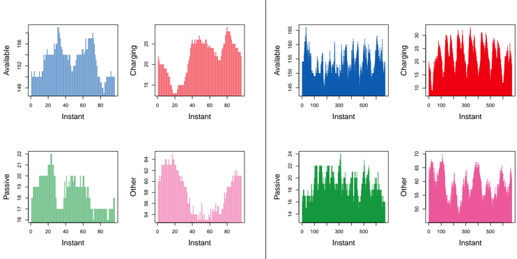
## Bar Charts: System State Metrics Over Time
### Overview
The image displays eight bar charts arranged in a 2x4 grid, divided into two distinct sections by a vertical line. Each section contains four charts representing the same four categories ("Available," "Charging," "Passive," "Other") but plotted over different time scales. The left section shows data over a shorter "Instant" range (0-80), while the right section shows data over a longer range (0-500). The charts use color coding to distinguish categories, with lighter shades on the left and darker, more saturated shades on the right.
### Components/Axes
* **Chart Type:** Bar charts (histograms/time-series).
* **Layout:** Two main panels (Left and Right), each containing a 2x2 grid of charts.
* **Y-Axis Labels (Titles):** Each chart has a title on the y-axis indicating the measured state:
* Top-Left Chart: "Available"
* Top-Right Chart: "Charging"
* Bottom-Left Chart: "Passive"
* Bottom-Right Chart: "Other"
* **X-Axis Label:** All eight charts share the same x-axis label: "Instant".
* **X-Axis Scale:**
* **Left Panel Charts:** Range from 0 to approximately 80.
* **Right Panel Charts:** Range from 0 to approximately 500.
* **Y-Axis Scales:** Vary per chart (see detailed analysis).
* **Color Legend (Implied):** The category is indicated by the y-axis title and a consistent color scheme:
* Available: Blue (Light on left, Dark on right)
* Charging: Red (Light on left, Dark on right)
* Passive: Green (Light on left, Dark on right)
* Other: Pink/Magenta (Light on left, Dark on right)
### Detailed Analysis
**Left Panel (Instant 0-80):**
1. **Available (Light Blue):**
* **Trend:** Fluctuating with two broad peaks.
* **Values:** Y-axis ranges from ~148 to ~156. The series starts around 149, peaks near 156 around Instant 30, dips to ~150 around Instant 50, and rises to another peak near 155 around Instant 70 before declining.
2. **Charging (Light Red):**
* **Trend:** A sharp initial decline followed by a strong, sustained increase.
* **Values:** Y-axis ranges from ~15 to ~25. Starts near 22, drops to a minimum of ~15 around Instant 20, then climbs steadily to a peak of ~25 around Instant 80.
3. **Passive (Light Green):**
* **Trend:** An early peak followed by a general decline with a minor recovery.
* **Values:** Y-axis ranges from ~16 to ~22. Peaks at ~22 around Instant 25, declines to a low of ~16 around Instant 70, with a small rise to ~18 near Instant 80.
4. **Other (Light Pink):**
* **Trend:** A steep decline followed by a gradual recovery.
* **Values:** Y-axis ranges from ~24 to ~34. Starts high at ~34, plummets to a minimum of ~24 around Instant 40, then gradually increases back to ~30 by Instant 80.
**Right Panel (Instant 0-500):**
1. **Available (Dark Blue):**
* **Trend:** Highly volatile/oscillatory with no strong long-term trend.
* **Values:** Y-axis ranges from ~145 to ~165. The data oscillates rapidly, mostly between 150 and 160, with frequent spikes reaching up to ~165 and dips down to ~145.
2. **Charging (Dark Red):**
* **Trend:** Strong, regular oscillations (cyclical pattern).
* **Values:** Y-axis ranges from ~10 to ~30. The series shows a consistent wave-like pattern, oscillating between troughs of ~10 and peaks of ~30.
3. **Passive (Dark Green):**
* **Trend:** Volatile oscillations with a slightly lower average than "Charging."
* **Values:** Y-axis ranges from ~14 to ~24. Oscillates between ~14 and ~24, with a dense, noisy pattern.
4. **Other (Dark Pink):**
* **Trend:** Regular oscillations at a higher value range.
* **Values:** Y-axis ranges from ~50 to ~70. Shows a cyclical pattern oscillating between ~50 and ~70.
### Key Observations
1. **Time Scale Discrepancy:** The most significant difference is the x-axis scale. The left panel (0-80) appears to be a "zoomed-in" view of a shorter period, revealing clearer directional trends. The right panel (0-500) is a "zoomed-out" view over a longer period, revealing the underlying cyclical and oscillatory nature of the data.
2. **Color Consistency:** The color scheme is consistent across panels for each category, aiding comparison. The right panel uses more saturated versions of the same hues.
3. **Pattern Revelation:** The short-term trends visible on the left (e.g., the dip and recovery in "Other") are likely segments of the larger oscillatory cycles visible on the right.
4. **Value Range Consistency:** The y-axis value ranges for each category are roughly consistent between the two panels (e.g., "Available" is always ~145-165, "Charging" ~10-30), confirming they measure the same metrics.
### Interpretation
This visualization likely represents the state of a system (e.g., a fleet of batteries, server nodes, or vehicles) over time. The four categories—"Available," "Charging," "Passive," and "Other"—suggest a classification of operational states.
* **What the data suggests:** The system exhibits strong cyclical behavior. The "Charging" and "Other" states show the most regular and pronounced oscillations, suggesting scheduled or periodic activities (e.g., daily charge/discharge cycles, shift changes). The "Available" state is more volatile but remains within a band, indicating a managed resource level. The "Passive" state also oscillates, possibly representing idle periods between active cycles.
* **Relationship between elements:** The states are likely interdependent. For example, a rise in "Charging" might correlate with a dip in "Available" (as resources are committed) or "Passive." The inverse relationship between the "Charging" dip and "Other" peak in the left panel around Instant 20-40 hints at such a trade-off.
* **Notable anomalies:** The left panel's "Other" category shows a dramatic, non-cyclical drop and recovery within the 0-80 instant window. This could indicate a specific event or anomaly not part of the regular cycle, warranting investigation. The right panel confirms this is part of a larger pattern, but the depth of that particular trough is notable.
* **Peircean Investigative Reading:** The charts move from **Iconic** representation (simple bars showing quantity) to **Indexical** evidence (the trends point to underlying cyclical processes). The final **Symbolic** interpretation is that this is a system under rhythmic, possibly automated, control where resources transition between active, charging, and idle states in a predictable, wave-like manner. The difference between the two panels highlights the importance of temporal scale in understanding system behavior—what looks like a trend in the short term is revealed as part of a cycle in the long term.
DECODING INTELLIGENCE...