## Histogram Grid: State Distribution Over Time Intervals
### Overview
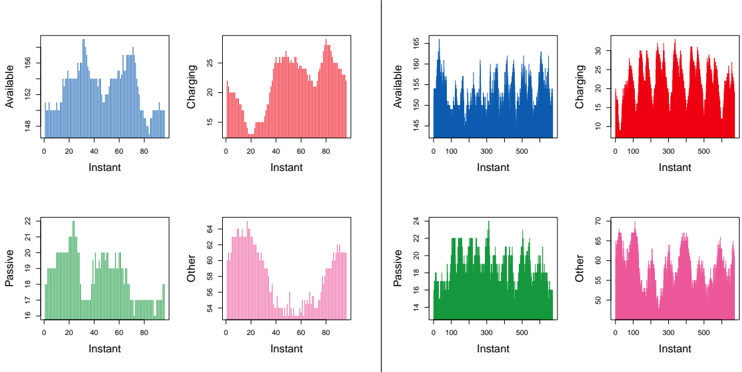
The image displays a 2x2 grid of histogram charts comparing four states ("Available," "Charging," "Passive," "Other") across two time intervals labeled "Instant." Each chart uses distinct colors (blue, red, green, pink) to represent state distributions. The x-axis represents time intervals (0-80 for top charts, 0-500 for bottom charts), while the y-axis shows count values specific to each state.
### Components/Axes
- **X-axis**: Labeled "Instant" with values:
- Top charts: 0-80 (linear scale)
- Bottom charts: 0-500 (linear scale)
- **Y-axis**: State-specific counts:
- Available: 0-160
- Charging: 0-30
- Passive: 0-24
- Other: 0-64
- **Legend**: Located on the left, mapping colors to states:
- Blue = Available
- Red = Charging
- Green = Passive
- Pink = Other
### Detailed Analysis
1. **Available (Blue)**
- *Top chart (0-80)*: Peaks at ~150 (x=20), ~140 (x=40), ~130 (x=60). Gradual decline after x=80.
- *Bottom chart (0-500)*: Consistent ~140-150 range with minor fluctuations. No clear peaks.
2. **Charging (Red)**
- *Top chart (0-80)*: Sharp peak at ~25 (x=40), secondary peak at ~20 (x=60). Low values at x=0 and x=80.
- *Bottom chart (0-500)*: Sustained high values (~25-30) across entire range with periodic spikes.
3. **Passive (Green)**
- *Top chart (0-80)*: Single peak at ~22 (x=20). Rapid decline after x=40.
- *Bottom chart (0-500)*: Bimodal distribution: ~20 (x=100), ~22 (x=300), ~18 (x=500).
4. **Other (Pink)**
- *Top chart (0-80)*: Peak at ~55 (x=40), secondary peak at ~50 (x=60). Low values at x=0 and x=80.
- *Bottom chart (0-500)*: V-shaped pattern: ~60 (x=0), ~50 (x=200), ~64 (x=500).
### Key Observations
- **Temporal Scaling**: Top charts (0-80) show concentrated activity, while bottom charts (0-500) reveal broader trends.
- **State Dynamics**:
- "Available" maintains stability in longer intervals but shows variability in short bursts.
- "Charging" exhibits sustained activity in longer intervals but sporadic peaks in short intervals.
- "Other" demonstrates inverse correlation with "Passive" in longer intervals (V-shape).
- **Anomalies**:
- "Passive" top chart has abrupt drop after x=40 despite initial peak.
- "Other" bottom chart shows unexpected recovery at x=500 after mid-range dip.
### Interpretation
The data suggests state behavior varies significantly across time scales:
1. **Short Intervals (0-80)**:
- "Available" and "Charging" dominate with distinct peaks, indicating transient states.
- "Other" shows bimodal distribution, possibly representing transitional states between "Passive" and active states.
2. **Long Intervals (0-500)**:
- "Charging" maintains consistent activity, suggesting persistent operational states.
- "Other" exhibits V-shaped pattern, potentially indicating cyclical behavior between active and passive states.
- "Passive" bimodal distribution may reflect periodic maintenance or standby phases.
3. **System Implications**:
- The inverse relationship between "Passive" and "Other" in long intervals suggests resource allocation dynamics.
- "Available" stability in long intervals implies reliable system readiness despite short-term fluctuations.
- "Charging" persistence in long intervals indicates critical operational dependency.
The charts collectively demonstrate how system states manifest differently across temporal resolutions, with short-term volatility contrasting long-term stability patterns. The "Other" category's unique distribution warrants further investigation into transitional state behavior.