\n
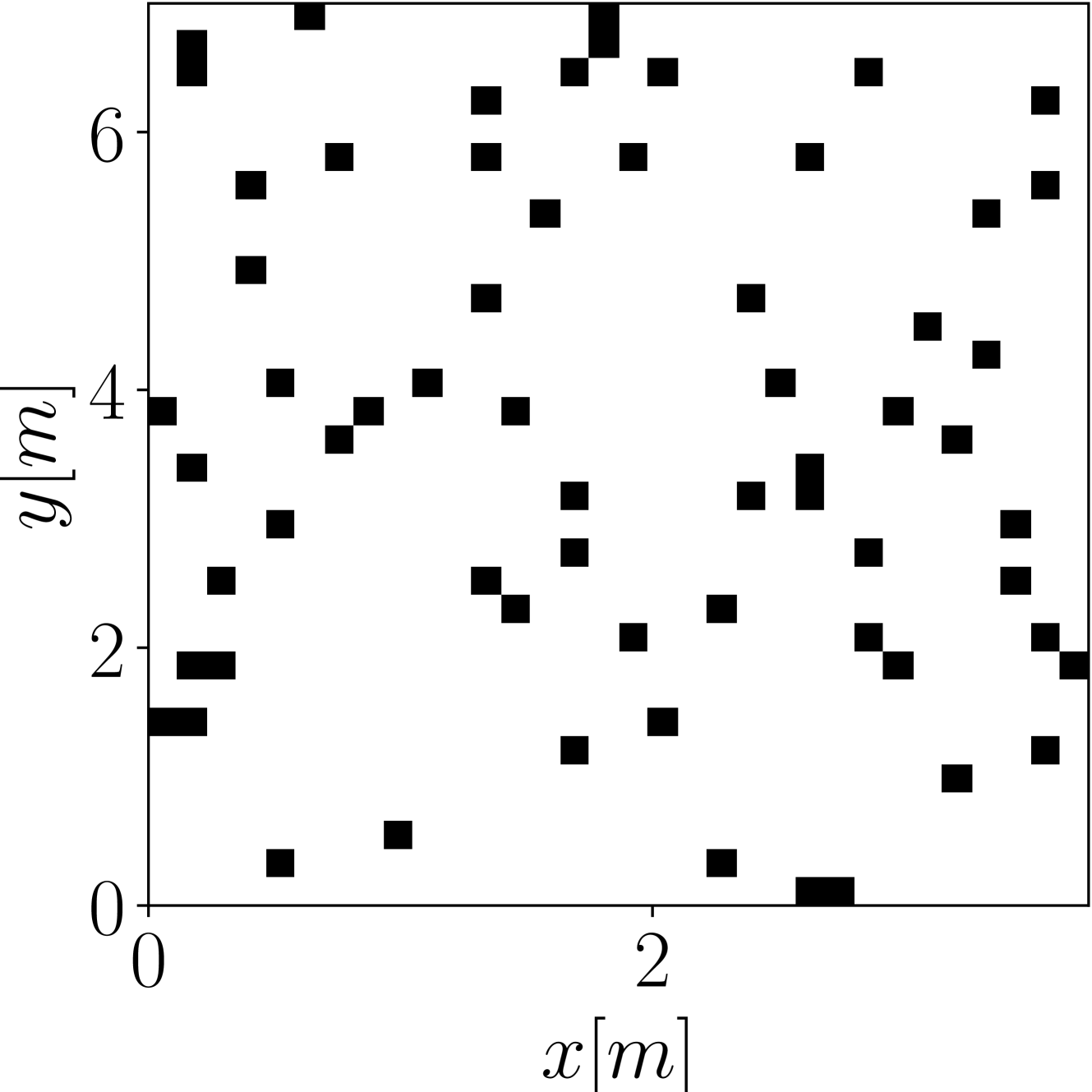
## Scatter Plot: Distribution of Points in a 2D Space
### Overview
The image presents a scatter plot displaying the distribution of approximately 70 data points in a two-dimensional space. The plot utilizes a Cartesian coordinate system with labeled axes representing 'x' and 'y' coordinates, both measured in meters (m). The points are represented by filled black squares. There are no explicit data series or legends.
### Components/Axes
* **X-axis:** Labeled "x [m]", ranging from approximately 0 to 3 meters. The scale appears linear.
* **Y-axis:** Labeled "y [m]", ranging from approximately 0 to 7 meters. The scale appears linear.
* **Data Points:** Approximately 70 black square markers scattered throughout the plot area.
### Detailed Analysis
The data points are distributed across the plot area, with a higher concentration of points in the region where both x and y values are between 1 and 5 meters. There is a noticeable lack of points in the bottom-left corner (x < 1m, y < 2m).
Here's an approximate listing of the coordinates of some of the points, noting the inherent difficulty in precise extraction from the image:
* (0.2, 1.2)
* (0.4, 3.5)
* (0.6, 6.2)
* (0.8, 4.8)
* (1.0, 2.0)
* (1.2, 5.5)
* (1.4, 3.0)
* (1.6, 4.2)
* (1.8, 1.8)
* (2.0, 6.8)
* (2.2, 2.5)
* (2.4, 4.0)
* (2.6, 3.8)
* (2.8, 5.0)
* (3.0, 1.0)
It's important to note that this is a small sample, and a complete listing would be extremely tedious and prone to error given the image resolution. The points appear to be randomly distributed, with no obvious linear or curved trends.
### Key Observations
* **Density:** The density of points is not uniform across the plot.
* **Range:** The x-values are more constrained than the y-values.
* **Clustering:** There is a slight tendency for points to cluster around y = 4m.
* **Sparse Regions:** The lower-left quadrant is relatively sparse.
### Interpretation
The scatter plot likely represents a set of measurements or observations where the x and y coordinates represent spatial positions in meters. The lack of a clear trend suggests that there is no strong correlation between the x and y values. The higher density of points in the central region could indicate a preference for those locations, or it could be a result of the data collection process. The sparse lower-left quadrant might indicate a physical constraint or a limitation in the data collection area. Without additional context, it is difficult to determine the specific meaning of the data. The plot could represent the distribution of objects, the trajectory of particles, or any other phenomenon where two spatial coordinates are relevant. The randomness suggests a stochastic process or a lack of deterministic factors influencing the positions.