TECHNICAL ASSET FINGERPRINT
c69733c6e98c0ee2215ad238
Click to view fullscreen
Press ESC or click to close
FOUND IN PAPERS
EXPERT: gemini-2.0-flash VERSION 1
RUNTIME: nugit/gemini/gemini-2.0-flash
INTEL_VERIFIED
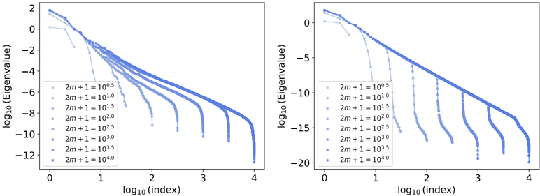
## Chart Type: Log-Log Eigenvalue Decay Plots
### Overview
The image contains two log-log plots showing the decay of eigenvalues as a function of index for different values of the parameter "2m+1". The plots display the logarithm base 10 of the eigenvalue versus the logarithm base 10 of the index. Each plot contains multiple curves, each corresponding to a different value of "2m+1", ranging from 10^0.5 to 10^4.0. The plots appear to show the eigenvalue decay for two different systems or conditions.
### Components/Axes
* **X-axis (Horizontal):** log₁₀(index). The x-axis ranges from 0 to 4 in both plots.
* **Y-axis (Vertical):** log₁₀(Eigenvalue). The y-axis ranges from approximately -12 to 2 in the left plot and from -20 to 0 in the right plot.
* **Legend (Left Side of Left Plot and Right Plot):** The legend identifies each curve by the value of "2m+1". The values are:
* 2m + 1 = 10⁰.⁵
* 2m + 1 = 10¹.⁰
* 2m + 1 = 10¹.⁵
* 2m + 1 = 10².⁰
* 2m + 1 = 10².⁵
* 2m + 1 = 10³.⁰
* 2m + 1 = 10³.⁵
* 2m + 1 = 10⁴.⁰
### Detailed Analysis
**Left Plot:**
* **2m + 1 = 10⁰.⁵ (Lightest Blue):** Starts at approximately log₁₀(Eigenvalue) = 1.8 at log₁₀(index) = 0, decreases to approximately -2 at log₁₀(index) = 1, then drops off rapidly.
* **2m + 1 = 10¹.⁰:** Starts at approximately log₁₀(Eigenvalue) = 0.5 at log₁₀(index) = 0, decreases to approximately -4 at log₁₀(index) = 1.5, then drops off rapidly.
* **2m + 1 = 10¹.⁵:** Starts at approximately log₁₀(Eigenvalue) = -1 at log₁₀(index) = 0, decreases to approximately -6 at log₁₀(index) = 2, then drops off rapidly.
* **2m + 1 = 10².⁰:** Starts at approximately log₁₀(Eigenvalue) = -2.5 at log₁₀(index) = 0, decreases to approximately -8 at log₁₀(index) = 2.5, then drops off rapidly.
* **2m + 1 = 10².⁵:** Starts at approximately log₁₀(Eigenvalue) = -4 at log₁₀(index) = 0, decreases to approximately -9 at log₁₀(index) = 3, then drops off rapidly.
* **2m + 1 = 10³.⁰:** Starts at approximately log₁₀(Eigenvalue) = -5.5 at log₁₀(index) = 0, decreases to approximately -10 at log₁₀(index) = 3.3, then drops off rapidly.
* **2m + 1 = 10³.⁵:** Starts at approximately log₁₀(Eigenvalue) = -7 at log₁₀(index) = 0, decreases to approximately -11 at log₁₀(index) = 3.6, then drops off rapidly.
* **2m + 1 = 10⁴.⁰ (Darkest Blue):** Starts at approximately log₁₀(Eigenvalue) = -8.5 at log₁₀(index) = 0, decreases to approximately -12 at log₁₀(index) = 3.8, then drops off rapidly.
**Right Plot:**
* **2m + 1 = 10⁰.⁵ (Lightest Blue):** Starts at approximately log₁₀(Eigenvalue) = 0 at log₁₀(index) = 0, decreases to approximately -4 at log₁₀(index) = 1, then drops off rapidly.
* **2m + 1 = 10¹.⁰:** Starts at approximately log₁₀(Eigenvalue) = -2 at log₁₀(index) = 0, decreases to approximately -6 at log₁₀(index) = 1.5, then drops off rapidly.
* **2m + 1 = 10¹.⁵:** Starts at approximately log₁₀(Eigenvalue) = -4 at log₁₀(index) = 0, decreases to approximately -8 at log₁₀(index) = 2, then drops off rapidly.
* **2m + 1 = 10².⁰:** Starts at approximately log₁₀(Eigenvalue) = -6 at log₁₀(index) = 0, decreases to approximately -10 at log₁₀(index) = 2.5, then drops off rapidly.
* **2m + 1 = 10².⁵:** Starts at approximately log₁₀(Eigenvalue) = -8 at log₁₀(index) = 0, decreases to approximately -12 at log₁₀(index) = 3, then drops off rapidly.
* **2m + 1 = 10³.⁰:** Starts at approximately log₁₀(Eigenvalue) = -10 at log₁₀(index) = 0, decreases to approximately -14 at log₁₀(index) = 3.3, then drops off rapidly.
* **2m + 1 = 10³.⁵:** Starts at approximately log₁₀(Eigenvalue) = -12 at log₁₀(index) = 0, decreases to approximately -16 at log₁₀(index) = 3.6, then drops off rapidly.
* **2m + 1 = 10⁴.⁰ (Darkest Blue):** Starts at approximately log₁₀(Eigenvalue) = -14 at log₁₀(index) = 0, decreases to approximately -18 at log₁₀(index) = 3.8, then drops off rapidly.
### Key Observations
* In both plots, as "2m+1" increases, the starting log₁₀(Eigenvalue) decreases.
* In both plots, the curves initially decay gradually, then exhibit a sharp drop-off at a certain index.
* The index at which the sharp drop-off occurs increases as "2m+1" increases.
* The right plot shows a steeper initial decay compared to the left plot.
* The range of log₁₀(Eigenvalue) is different between the two plots, suggesting different scales or properties of the systems being analyzed.
### Interpretation
The plots illustrate the eigenvalue decay behavior for different values of the parameter "2m+1". The parameter "2m+1" appears to control the magnitude of the eigenvalues and the point at which the eigenvalues rapidly decay. The two plots likely represent different systems or conditions, as evidenced by the different ranges of the y-axis and the varying steepness of the initial decay. The rapid drop-off in eigenvalues suggests a transition or cutoff point in the system's behavior. The data suggests that increasing "2m+1" leads to a suppression of higher-index eigenvalues, potentially indicating a change in the system's complexity or dimensionality. The plots are useful for understanding how the parameter "2m+1" influences the eigenvalue spectrum and, consequently, the properties of the system being modeled.
DECODING INTELLIGENCE...
EXPERT: gemma-3-27b-it-free VERSION 1
RUNTIME: google-free/gemma-3-27b-it
INTEL_VERIFIED
## Chart: Eigenvalue Spectrum
### Overview
The image presents two charts displaying the eigenvalue spectrum, likely related to a matrix or operator. Both charts share the same axes and general structure, but differ in the range of the y-axis (log10(Eigenvalue)). Each chart plots several curves, each representing a different value of the parameter '2m+1'. The charts visualize how the distribution of eigenvalues changes with varying '2m+1' values.
### Components/Axes
* **X-axis:** log10(Index). Scale ranges from approximately 0 to 4.
* **Y-axis (Left Chart):** log10(Eigenvalue). Scale ranges from approximately 2 to -12.
* **Y-axis (Right Chart):** log10(Eigenvalue). Scale ranges from approximately 2 to -20.
* **Legend (Left Chart):** Located in the top-right corner. Labels are:
* 2m+1 = 10^0.5
* 2m+1 = 10^1.0
* 2m+1 = 10^1.5
* 2m+1 = 10^2.0
* 2m+1 = 10^2.5
* 2m+1 = 10^3.0
* 2m+1 = 10^3.5
* 2m+1 = 10^4.0
* **Legend (Right Chart):** Located in the top-right corner. Labels are:
* 2m+1 = 10^0.5
* 2m+1 = 10^1.0
* 2m+1 = 10^1.5
* 2m+1 = 10^2.0
* 2m+1 = 10^2.5
* 2m+1 = 10^3.0
* 2m+1 = 10^3.5
* 2m+1 = 10^4.0
### Detailed Analysis or Content Details
**Left Chart:**
* **2m+1 = 10^0.5 (Lightest Blue):** The curve starts at approximately log10(Eigenvalue) = 1.8 and decreases monotonically, reaching approximately log10(Eigenvalue) = -11.5 at log10(Index) = 4.
* **2m+1 = 10^1.0:** Starts at approximately log10(Eigenvalue) = 1.7 and decreases to approximately log10(Eigenvalue) = -11.8 at log10(Index) = 4.
* **2m+1 = 10^1.5:** Starts at approximately log10(Eigenvalue) = 1.6 and decreases to approximately log10(Eigenvalue) = -11.9 at log10(Index) = 4.
* **2m+1 = 10^2.0:** Starts at approximately log10(Eigenvalue) = 1.5 and decreases to approximately log10(Eigenvalue) = -12.0 at log10(Index) = 4.
* **2m+1 = 10^2.5:** Starts at approximately log10(Eigenvalue) = 1.4 and decreases to approximately log10(Eigenvalue) = -12.1 at log10(Index) = 4.
* **2m+1 = 10^3.0:** Starts at approximately log10(Eigenvalue) = 1.3 and decreases to approximately log10(Eigenvalue) = -12.2 at log10(Index) = 4.
* **2m+1 = 10^3.5:** Starts at approximately log10(Eigenvalue) = 1.2 and decreases to approximately log10(Eigenvalue) = -12.3 at log10(Index) = 4.
* **2m+1 = 10^4.0 (Darkest Blue):** Starts at approximately log10(Eigenvalue) = 1.1 and decreases to approximately log10(Eigenvalue) = -12.4 at log10(Index) = 4.
**Right Chart:**
* **2m+1 = 10^0.5 (Lightest Blue):** The curve starts at approximately log10(Eigenvalue) = 1.8 and decreases monotonically, reaching approximately log10(Eigenvalue) = -19.5 at log10(Index) = 4.
* **2m+1 = 10^1.0:** Starts at approximately log10(Eigenvalue) = 1.7 and decreases to approximately log10(Eigenvalue) = -19.8 at log10(Index) = 4.
* **2m+1 = 10^1.5:** Starts at approximately log10(Eigenvalue) = 1.6 and decreases to approximately log10(Eigenvalue) = -19.9 at log10(Index) = 4.
* **2m+1 = 10^2.0:** Starts at approximately log10(Eigenvalue) = 1.5 and decreases to approximately log10(Eigenvalue) = -20.0 at log10(Index) = 4.
* **2m+1 = 10^2.5:** Starts at approximately log10(Eigenvalue) = 1.4 and decreases to approximately log10(Eigenvalue) = -20.1 at log10(Index) = 4.
* **2m+1 = 10^3.0:** Starts at approximately log10(Eigenvalue) = 1.3 and decreases to approximately log10(Eigenvalue) = -20.2 at log10(Index) = 4.
* **2m+1 = 10^3.5:** Starts at approximately log10(Eigenvalue) = 1.2 and decreases to approximately log10(Eigenvalue) = -20.3 at log10(Index) = 4.
* **2m+1 = 10^4.0 (Darkest Blue):** Starts at approximately log10(Eigenvalue) = 1.1 and decreases to approximately log10(Eigenvalue) = -20.4 at log10(Index) = 4.
In both charts, all curves exhibit a similar downward trend, indicating a decreasing eigenvalue magnitude as the index increases. The curves are relatively parallel, suggesting that the overall shape of the eigenvalue spectrum remains consistent across different values of '2m+1'.
### Key Observations
* The eigenvalue spectrum consistently decreases as the index increases.
* Increasing the value of '2m+1' shifts the entire spectrum downwards, meaning that the eigenvalues become smaller in magnitude.
* The right chart has a much larger range on the y-axis, allowing for a more detailed view of the lower eigenvalues.
* The curves are closely spaced, indicating a relatively smooth distribution of eigenvalues.
### Interpretation
The charts likely represent the eigenvalue spectrum of a Hamiltonian operator or a related quantum mechanical system. The parameter '2m+1' could be related to the mass or potential strength in the system. The downward trend in the eigenvalue spectrum indicates that the energy levels become more closely spaced as the index increases. The shift in the spectrum with increasing '2m+1' suggests that increasing the mass or potential strength lowers the energy levels.
The difference in the y-axis range between the two charts highlights the importance of choosing an appropriate scale for visualizing data. The right chart provides a more detailed view of the lower eigenvalues, which may be important for understanding the system's behavior at low energies. The parallel nature of the curves suggests that the qualitative features of the eigenvalue spectrum are not significantly affected by changes in '2m+1', but rather the overall energy scale is shifted. This could indicate a robust relationship between the system's parameters and its energy levels.
DECODING INTELLIGENCE...
EXPERT: healer-alpha-free VERSION 1
RUNTIME: free/openrouter/healer-alpha
INTEL_VERIFIED
## [Log-Log Plot Pair]: Eigenvalue Decay Analysis
### Overview
The image displays two side-by-side log-log plots. Both plots visualize the relationship between the base-10 logarithm of an eigenvalue's index (x-axis) and the base-10 logarithm of the eigenvalue itself (y-axis). Each plot contains multiple data series, distinguished by shades of blue, corresponding to different values of a parameter labeled "2m + 1". The general trend in both plots is a downward slope, indicating that eigenvalues decrease in magnitude as their index increases. The right plot shows a significantly steeper and deeper decay compared to the left plot.
### Components/Axes
* **Plot Layout:** Two separate plots arranged horizontally.
* **X-Axis (Both Plots):**
* **Label:** `log10(index)`
* **Scale:** Linear scale from 0 to 4.
* **Tick Marks:** Major ticks at 0, 1, 2, 3, 4.
* **Y-Axis (Left Plot):**
* **Label:** `log10(Eigenvalue)`
* **Scale:** Linear scale from -12 to 2.
* **Tick Marks:** Major ticks at -12, -10, -8, -6, -4, -2, 0, 2.
* **Y-Axis (Right Plot):**
* **Label:** `log10(Eigenvalue)`
* **Scale:** Linear scale from -20 to 2.
* **Tick Marks:** Major ticks at -20, -15, -10, -5, 0, 5 (Note: The top tick appears to be mislabeled as '5' but logically should be '2' based on the axis range and the left plot. This is likely a plotting artifact or error).
* **Legend (Both Plots, Bottom-Left Corner):**
* **Title/Parameter:** `2m + 1`
* **Entries (8 total, from lightest to darkest blue):**
1. `2m + 1 = 10^0.5`
2. `2m + 1 = 10^1.0`
3. `2m + 1 = 10^1.5`
4. `2m + 1 = 10^2.0`
5. `2m + 1 = 10^2.5`
6. `2m + 1 = 10^3.0`
7. `2m + 1 = 10^3.5`
8. `2m + 1 = 10^4.0`
* **Visual Mapping:** Lighter blue shades correspond to smaller values of `2m + 1`. Darker blue shades correspond to larger values.
### Detailed Analysis
**Left Plot:**
* **Trend Verification:** All data series show a downward trend. The slope becomes progressively steeper as the value of `2m + 1` increases (i.e., as the line color darkens).
* **Data Series Analysis (Approximate):**
* For `2m + 1 = 10^0.5` (lightest blue): The line starts near (0, 0.5) and decays slowly, ending near (4, -10).
* For `2m + 1 = 10^4.0` (darkest blue): The line starts near (0, 1.8) and decays very rapidly, dropping off the chart (below -12) before `log10(index)` reaches 2.5.
* Intermediate series show a clear progression: higher `2m + 1` values lead to a higher starting point on the y-axis at `log10(index)=0` and a much faster rate of decay.
**Right Plot:**
* **Trend Verification:** Similar to the left plot, all series trend downward. The decay is dramatically more pronounced for all series compared to the left plot.
* **Data Series Analysis (Approximate):**
* For `2m + 1 = 10^0.5` (lightest blue): Starts near (0, 1.5), decays to about (4, -18).
* For `2m + 1 = 10^4.0` (darkest blue): Starts near (0, 1.8), plummets almost vertically, reaching values below -20 before `log10(index)` is 1.5.
* The separation between the curves is more extreme. The curves for higher `2m + 1` values appear as nearly vertical drops after an initial short decay.
### Key Observations
1. **Parameter-Dependent Decay:** The rate of eigenvalue decay is strongly controlled by the parameter `2m + 1`. Larger values cause exponentially faster decay.
2. **Plot Comparison:** The right plot demonstrates a scenario where eigenvalues vanish much more rapidly than in the left plot. This could indicate a change in a system property (e.g., increased regularization, different matrix conditioning) between the two visualized cases.
3. **Initial Value:** For a given plot (left or right), the starting eigenvalue magnitude (at `log10(index) ≈ 0`) is similar across all `2m + 1` values, clustering between 0 and 2 on the log scale.
4. **Cutoff Behavior:** The curves for high `2m + 1` values exhibit a sharp "cutoff" or "cliff," where the eigenvalue drops precipitously after a certain index. This cutoff index decreases as `2m + 1` increases.
5. **Axis Anomaly:** The top tick label on the right plot's y-axis reads '5', which is inconsistent with the axis range (-20 to 2) and the left plot. The intended label is almost certainly '2'.
### Interpretation
These plots are characteristic of **eigenvalue spectra** for large matrices or operators, often encountered in numerical linear algebra, machine learning (e.g., kernel methods, neural tangent kernels), or physics. The `log10(index)` vs. `log10(Eigenvalue)` format is used to analyze the **decay rate** of eigenvalues.
* **What the data suggests:** The parameter `2m + 1` likely represents a measure of **system size, complexity, or regularization strength**. The plots demonstrate that increasing this parameter leads to a **more rapidly decaying eigenvalue spectrum**. A faster decay implies the matrix/operator is effectively of lower rank, as fewer significant eigenvalues capture most of its action.
* **Relationship between elements:** The left and right plots likely compare two different regimes or models. The right plot's extreme decay suggests a system that is either much more heavily regularized, has a stronger inductive bias, or is inherently lower-dimensional than the system in the left plot.
* **Notable patterns:** The consistent starting point suggests the leading eigenvalue magnitude is relatively stable, while the tail behavior is highly sensitive to `2m + 1`. The sharp cutoffs for high `2m + 1` values indicate a clear separation between "signal" (the first few eigenvalues) and "noise" (the rapidly decaying tail), which is a desirable property for approximation and generalization.
* **Peircean investigative reading:** The visual evidence points to a controlled experiment where a single parameter (`2m + 1`) is varied to observe its effect on spectral properties. The practitioner is likely investigating how model scale or complexity influences the spectral bias, which in turn affects learning dynamics and generalization. The stark difference between the two plots underscores that this relationship is not linear and can lead to qualitatively different spectral behaviors.
DECODING INTELLIGENCE...
EXPERT: nemotron-free VERSION 1
RUNTIME: free/nvidia/nemotron-nano-12b-v2-vl:free
INTEL_VERIFIED
## Line Graphs: Eigenvalue Trends vs. Index (log10 Scale)
### Overview
The image contains two side-by-side line graphs comparing the logarithmic scale of eigenvalues (log₁₀(Eigenvalue)) against the logarithmic scale of an index (log₁₀(index)). Each graph displays multiple data series, differentiated by the parameter "2m + 1" (e.g., 10⁰.⁵, 10¹.⁰, ..., 10⁴.⁰). The left graph shows a steeper decline in eigenvalues for higher "2m + 1" values, while the right graph exhibits a more gradual decline with secondary drops.
---
### Components/Axes
- **X-axis (log₁₀(index))**: Ranges from 0 to 4 (log₁₀ scale), representing the index values from 10⁰ to 10⁴.
- **Y-axis (log₁₀(Eigenvalue))**: Ranges from 0 to -20 (log₁₀ scale), representing eigenvalues from 1 to 10⁻²⁰.
- **Legends**:
- **Left Graph**: Legend positioned at the bottom-left, listing "2m + 1 = 10⁰.⁵" to "2m + 1 = 10⁴.⁰" with corresponding line styles.
- **Right Graph**: Legend positioned at the bottom-right, listing the same "2m + 1" values with matching line styles.
---
### Detailed Analysis
#### Left Graph
- **Data Series**:
- Lines for "2m + 1 = 10⁰.⁵" to "2m + 1 = 10⁴.⁰" are plotted.
- All lines start near 0 on the y-axis and decline sharply as the index increases.
- Higher "2m + 1" values (e.g., 10³.⁰, 10⁴.⁰) show steeper slopes, indicating faster eigenvalue decay.
- Some lines (e.g., "2m + 1 = 10².⁵") exhibit a secondary drop near log₁₀(index) ≈ 2.5.
#### Right Graph
- **Data Series**:
- Lines for "2m + 1 = 10⁰.⁵" to "2m + 1 = 10⁴.⁰" are plotted.
- Lines start near 0 and decline gradually compared to the left graph.
- Secondary drops occur at log₁₀(index) ≈ 1.5, 2.5, and 3.5 for higher "2m + 1" values (e.g., 10³.⁰, 10⁴.⁰).
- The decline is less steep overall, with eigenvalues remaining higher for longer index ranges.
---
### Key Observations
1. **Eigenvalue Decay**:
- Higher "2m + 1" values correlate with faster eigenvalue decay (left graph) or more pronounced secondary drops (right graph).
- The right graph shows eigenvalues persisting at higher magnitudes for longer index ranges.
2. **Secondary Drops**:
- Observed in both graphs but more frequent and pronounced in the right graph, suggesting threshold effects or phase transitions.
3. **Scale Sensitivity**:
- Logarithmic scaling emphasizes exponential trends, making small differences in "2m + 1" values visually significant.
---
### Interpretation
The data suggests that the parameter "2m + 1" critically influences the eigenvalue behavior of a system. In the left graph, the steeper decay implies a more sensitive or unstable system for higher "2m + 1" values. The right graph’s secondary drops may indicate discrete transitions or resonances at specific index thresholds. The logarithmic scaling highlights exponential relationships, which could relate to phenomena like damping, resonance, or stability thresholds in physical or mathematical systems. The divergence in trends between the two graphs might reflect different modeling assumptions or experimental conditions.
DECODING INTELLIGENCE...