# Technical Data Extraction: Coverage Ratio Analysis
## 1. Image Classification and Overview
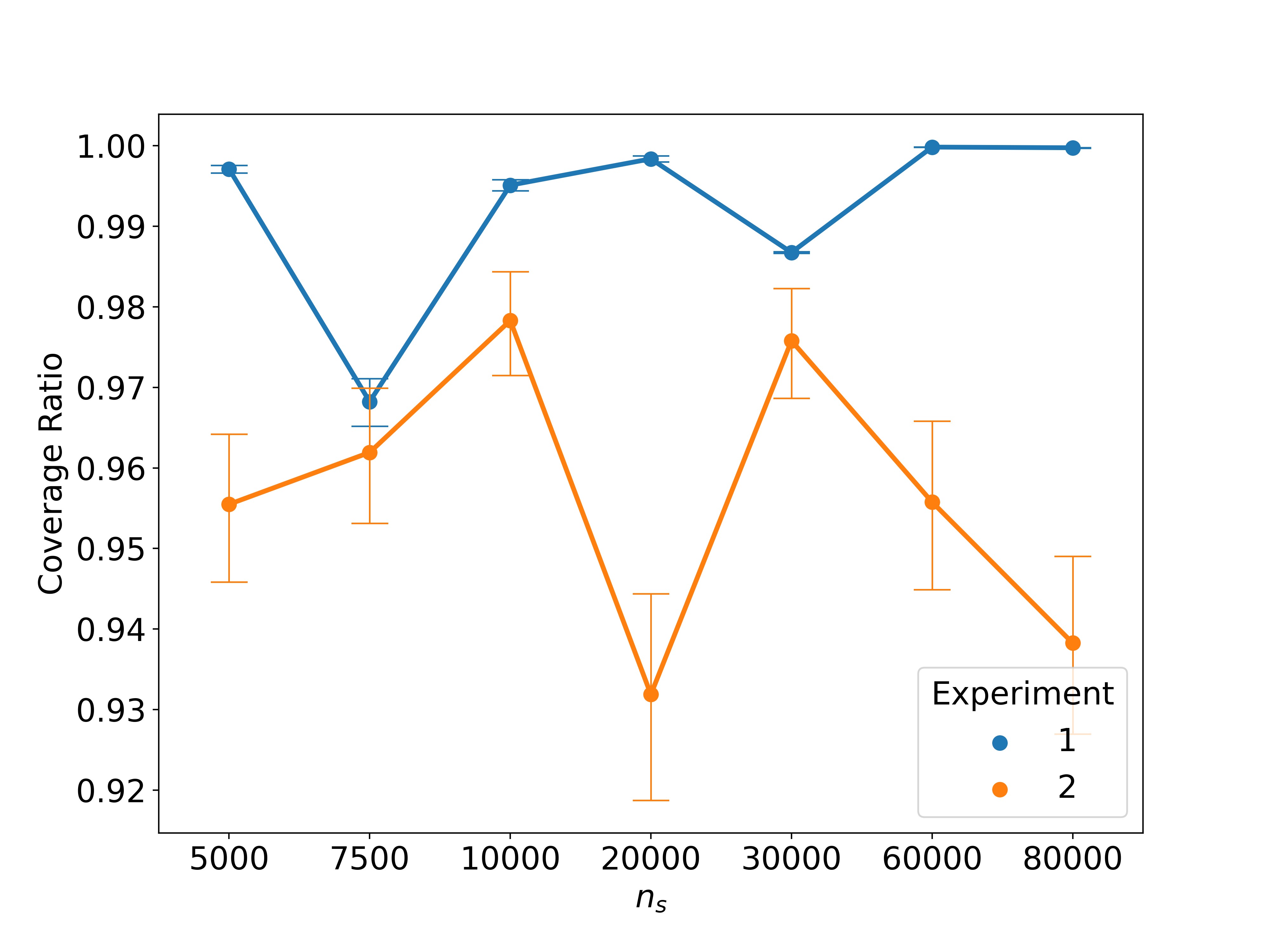
This image is a line graph with error bars comparing two experimental datasets. It plots the **Coverage Ratio** (y-axis) against a variable denoted as **$n_s$** (x-axis).
## 2. Component Isolation
### Header/Title
* No explicit title is present in the image.
### Main Chart Area
* **X-Axis Label:** $n_s$
* **X-Axis Markers (Categorical/Discrete):** 5000, 7500, 10000, 20000, 30000, 60000, 80000. Note: The spacing between markers is uniform, indicating $n_s$ is treated as a categorical variable or a non-linear scale.
* **Y-Axis Label:** Coverage Ratio
* **Y-Axis Markers (Linear):** 0.92, 0.93, 0.94, 0.95, 0.96, 0.97, 0.98, 0.99, 1.00.
### Legend (Spatial Grounding: Bottom Right [x $\approx$ 0.8, y $\approx$ 0.2])
* **Title:** Experiment
* **Series 1 (Blue Circle):** Labeled "1"
* **Series 2 (Orange Circle):** Labeled "2"
---
## 3. Data Series Analysis
### Series 1 (Blue Line)
* **Trend Verification:** The blue line starts high, drops sharply at $n_s=7500$, recovers to near-maximum levels, dips slightly at $n_s=30000$, and plateaus at 1.00 for the final two data points. It consistently maintains a higher coverage ratio than Series 2.
* **Error Bars:** Very small vertical error bars, indicating high precision/low variance.
| $n_s$ | Coverage Ratio (Approx.) |
| :--- | :--- |
| 5000 | 0.997 |
| 7500 | 0.968 |
| 10000 | 0.995 |
| 20000 | 0.998 |
| 30000 | 0.987 |
| 60000 | 1.000 |
| 80000 | 1.000 |
### Series 2 (Orange Line)
* **Trend Verification:** The orange line exhibits significant volatility. It starts at a moderate level, rises slightly, drops sharply to its lowest point at $n_s=20000$, recovers significantly at $n_s=30000$, and then follows a downward trend for the remainder of the scale.
* **Error Bars:** Substantial vertical error bars, indicating lower precision/higher variance compared to Series 1.
| $n_s$ | Coverage Ratio (Approx.) |
| :--- | :--- |
| 5000 | 0.955 |
| 7500 | 0.962 |
| 10000 | 0.978 |
| 20000 | 0.932 |
| 30000 | 0.976 |
| 60000 | 0.956 |
| 80000 | 0.938 |
---
## 4. Comparative Summary
* **Performance:** Experiment 1 (Blue) outperforms Experiment 2 (Orange) at every measured interval of $n_s$.
* **Stability:** Experiment 1 reaches a perfect coverage ratio (1.00) at higher values of $n_s$ (60000+), whereas Experiment 2 shows a decline in performance in the same range.
* **Reliability:** The error bars suggest that the results for Experiment 1 are much more consistent across trials than those for Experiment 2.