## Bar Chart: TransCoder-IR dataset
### Overview
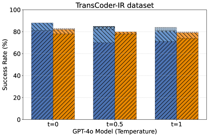
The image is a bar chart comparing the success rate (%) of a model (GPT-4o) on the TransCoder-IR dataset at different temperature settings (t=0, t=0.5, t=1). The chart displays two bars for each temperature setting, with the blue bar representing one condition and the orange bar representing another. The bars are diagonally hatched.
### Components/Axes
* **Title:** TransCoder-IR dataset
* **X-axis:** GPT-4o Model (Temperature) with labels t=0, t=0.5, and t=1.
* **Y-axis:** Success Rate (%) with scale from 0 to 100, incrementing by 20.
* **Legend:** There is no explicit legend, but the two bar types are blue and orange. The blue bar is consistently higher than the orange bar at each temperature.
### Detailed Analysis
The chart presents success rates for two conditions (blue and orange bars) at three different temperature settings (t=0, t=0.5, t=1).
* **At t=0:**
* The blue bar reaches approximately 88%.
* The orange bar reaches approximately 82%.
* **At t=0.5:**
* The blue bar reaches approximately 85%.
* The orange bar reaches approximately 80%.
* **At t=1:**
* The blue bar reaches approximately 84%.
* The orange bar reaches approximately 80%.
### Key Observations
* The blue bar consistently shows a higher success rate than the orange bar at all temperature settings.
* The success rate for both conditions decreases slightly as the temperature increases from t=0 to t=1.
* The difference in success rate between the blue and orange bars is smallest at t=1.
### Interpretation
The bar chart illustrates the performance of the GPT-4o model on the TransCoder-IR dataset under different temperature conditions. The blue bar consistently outperforming the orange bar suggests that the condition represented by the blue bar is more favorable for the model's success. The slight decrease in success rate as temperature increases may indicate that higher temperatures introduce more randomness or noise, negatively impacting the model's ability to perform accurately. The convergence of the blue and orange bars at t=1 could imply that the temperature increase affects both conditions similarly, reducing the performance gap between them.