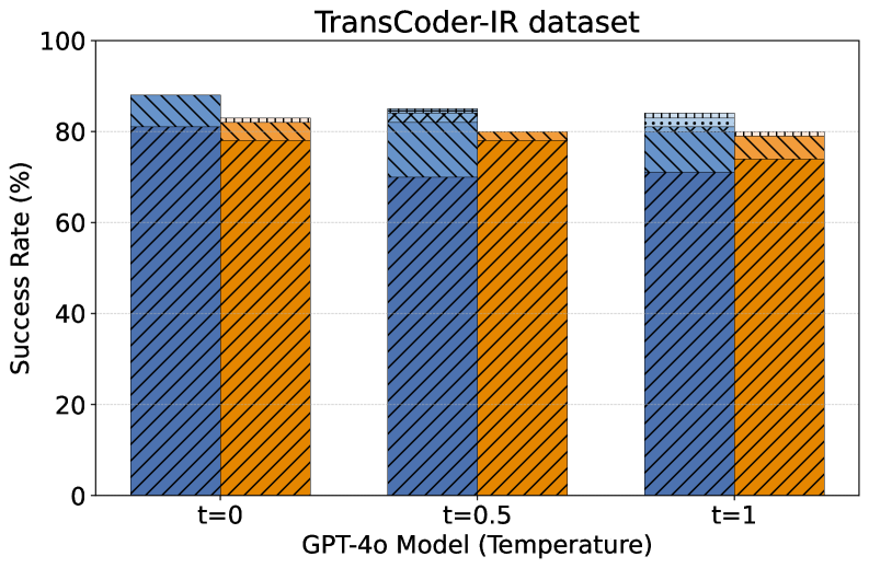
## Bar Chart: TransCoder-IR Dataset Success Rate by GPT-4o Temperature
### Overview
The image is a grouped bar chart displaying the performance of two different methods or models on the "TransCoder-IR dataset." The performance metric is "Success Rate (%)" measured across three different temperature settings for the GPT-4o model.
### Components/Axes
* **Title:** "TransCoder-IR dataset" (centered at the top).
* **Y-Axis:** Labeled "Success Rate (%)". The scale runs from 0 to 100 in increments of 20 (0, 20, 40, 60, 80, 100).
* **X-Axis:** Labeled "GPT-4o Model (Temperature)". It features three categorical groups:
* `t=0`
* `t=0.5`
* `t=1`
* **Data Series:** Two distinct bar series are present for each temperature group, differentiated by color and hatching pattern.
* **Series 1 (Blue):** A medium blue bar with a diagonal hatching pattern (lines sloping down from left to right).
* **Series 2 (Orange):** A bright orange bar with a different diagonal hatching pattern (lines sloping up from left to right).
* **Legend:** **CRITICAL NOTE:** There is no legend present in the image to identify what the blue and orange bars represent. This is a significant omission for full technical understanding.
### Detailed Analysis
The chart compares the success rates of the two unidentified series across increasing model temperature.
**Data Points (Approximate Values):**
* **At t=0:**
* Blue Bar: ~88%
* Orange Bar: ~82%
* **At t=0.5:**
* Blue Bar: ~85%
* Orange Bar: ~80%
* **At t=1:**
* Blue Bar: ~84%
* Orange Bar: ~79%
**Trend Verification:**
* **Blue Series Trend:** The height of the blue bars shows a slight but consistent downward trend as temperature increases from 0 to 1.
* **Orange Series Trend:** The height of the orange bars also shows a consistent downward trend as temperature increases, mirroring the blue series.
* **Relative Performance:** At every temperature point, the blue bar is taller than the orange bar, indicating a consistently higher success rate for the method represented by blue.
### Key Observations
1. **Negative Correlation with Temperature:** Both measured methods show a decrease in success rate as the GPT-4o model's temperature parameter increases.
2. **Consistent Performance Gap:** The performance gap between the two methods remains relatively stable across all temperature settings, with the blue method outperforming the orange method by approximately 4-6 percentage points.
3. **High Baseline Performance:** Both methods achieve success rates near or above 80% at the lowest temperature (t=0), suggesting strong baseline performance on the TransCoder-IR dataset.
4. **Missing Legend:** The most critical missing information is the identity of the two data series. Without a legend, it is impossible to know what techniques, models, or conditions the blue and orange bars represent.
### Interpretation
The data suggests that for the task evaluated on the TransCoder-IR dataset, increasing the randomness (temperature) of the GPT-4o model's outputs leads to a modest but reliable decrease in success rate for both approaches tested. This implies that more deterministic (lower temperature) settings are preferable for maximizing performance on this specific task.
The consistent performance gap indicates that one method (blue) has a fundamental advantage over the other (orange) that is independent of the temperature setting. This could be due to differences in prompting strategy, model architecture, preprocessing, or another controlled variable.
**Primary Uncertainty:** The core finding is clear (performance degrades with temperature), but the *significance* of the comparison is entirely obscured by the missing legend. The chart effectively shows that "Method A" is better than "Method B," but without knowing what A and B are, the practical implications for a technical document are severely limited. To be actionable, this chart must be paired with its legend or accompanying text that defines the series.