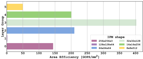
## Horizontal Bar Chart: Area Efficiency by Layer Group and IFM Shape
### Overview
This image is a horizontal bar chart comparing the "Area Efficiency" (measured in GOPS/mm²) across five different "Layer Groups" (0 through 4). Each bar represents a specific "IFM shape," identified by a unique color and dimension label in the legend. The chart visualizes how computational efficiency varies by layer and hardware configuration.
### Components/Axes
* **Chart Type:** Horizontal Bar Chart.
* **Y-Axis (Vertical):** Labeled "Layer Group." It contains five categorical groups, numbered from 0 at the bottom to 4 at the top.
* **X-Axis (Horizontal):** Labeled "Area Efficiency (GOPS/mm²)." It is a linear numerical scale starting at 0 and marked at intervals of 50, up to 400.
* **Legend:** Located in the bottom-right quadrant of the chart area. It is titled "IFM shape" and maps colors to specific dimension configurations:
* **Purple/Maroon:** `256x32x3`
* **Light Green:** `32x32x128`
* **Blue:** `128x128x64`
* **Yellow:** `16x16x256`
* **Dark Green:** `64x64x144`
* **Light Blue:** `8x8x512`
* **Grid:** A light gray grid is present, with vertical lines corresponding to the x-axis tick marks (0, 50, 100, etc.).
### Detailed Analysis
The chart displays one bar per Layer Group. The color of each bar corresponds to a specific IFM shape from the legend.
1. **Layer Group 0 (Bottom Bar):**
* **Color/IFM Shape:** Purple/Maroon (`256x32x3`).
* **Trend & Value:** The bar extends from 0 to approximately **145 GOPS/mm²**. It ends just before the 150 grid line.
2. **Layer Group 1:**
* **Color/IFM Shape:** Light Blue (`8x8x512`).
* **Trend & Value:** This is the longest bar. It extends from 0 past the 400 mark on the x-axis. Its endpoint is not visible on the chart, indicating a value **greater than 400 GOPS/mm²**.
3. **Layer Group 2:**
* **Color/IFM Shape:** Blue (`128x128x64`).
* **Trend & Value:** The bar extends from 0 to approximately **215 GOPS/mm²**. It ends between the 200 and 250 grid lines, closer to 200.
4. **Layer Group 3:**
* **Color/IFM Shape:** Dark Green (`64x64x144`).
* **Trend & Value:** The bar extends from 0 to approximately **200 GOPS/mm²**. It ends exactly on the 200 grid line.
5. **Layer Group 4 (Top Bar):**
* **Color/IFM Shape:** Yellow (`16x16x256`).
* **Trend & Value:** This is the shortest bar. It extends from 0 to approximately **50 GOPS/mm²**. It ends exactly on the 50 grid line.
### Key Observations
* **Highest Efficiency:** Layer Group 1, using the `8x8x512` IFM shape, demonstrates the highest area efficiency, exceeding the chart's scale (>400 GOPS/mm²).
* **Lowest Efficiency:** Layer Group 4, using the `16x16x256` IFM shape, shows the lowest efficiency at ~50 GOPS/mm².
* **Mid-Range Performance:** Layer Groups 0, 2, and 3 cluster in a mid-range between ~145 and ~215 GOPS/mm².
* **IFM Shape Distribution:** The chart does not show a simple linear relationship between IFM shape dimensions and efficiency. The highest efficiency comes from a shape with a very small spatial dimension (8x8) but a very large channel dimension (512). The lowest efficiency comes from a shape with moderate spatial (16x16) and channel (256) dimensions.
### Interpretation
This chart likely compares the computational throughput per unit of silicon area for different data partitioning strategies (IFM shapes) across various layers of a neural network or similar computational graph. The "Layer Group" probably corresponds to different stages or types of layers in the model.
The data suggests that **data partitioning strategy has a dramatic impact on hardware efficiency**. The `8x8x512` configuration (Layer Group 1) is exceptionally efficient, implying that for that specific layer type, processing small spatial patches with very deep channels is highly optimal for the underlying hardware architecture. Conversely, the `16x16x256` configuration (Layer Group 4) is inefficient for its layer group.
The variation across layer groups indicates that **no single IFM shape is universally optimal**. An efficient system would likely need to dynamically select or be designed with different data layouts for different layers to maximize overall area efficiency. The chart provides a technical basis for making such hardware-software co-design decisions.