## Line Chart: Accuracy vs. Thinking Compute
### Overview
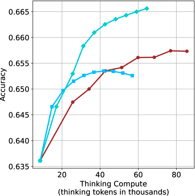
This image presents a line chart illustrating the relationship between "Thinking Compute" (measured in thousands of tokens) and "Accuracy". Three distinct data series are plotted, each represented by a different colored line. The chart appears to demonstrate how accuracy changes as the amount of thinking compute increases.
### Components/Axes
* **X-axis Title:** "Thinking Compute (thinking tokens in thousands)"
* Scale: 0 to 80 (in thousands of tokens)
* Markers: 0, 20, 40, 60, 80
* **Y-axis Title:** "Accuracy"
* Scale: 0.635 to 0.665
* Markers: 0.635, 0.640, 0.645, 0.650, 0.655, 0.660, 0.665
* **Data Series:**
* Line 1: Teal/Cyan (appears to be the highest performing)
* Line 2: Dark Blue
* Line 3: Maroon/Dark Red (appears to be the lowest performing)
* **Gridlines:** Present, providing a visual aid for reading values.
### Detailed Analysis
* **Teal/Cyan Line:** This line shows a rapid increase in accuracy from approximately 0.637 at 0 tokens to around 0.664 at 60 tokens, then plateaus slightly, reaching approximately 0.666 at 80 tokens.
* (0, 0.637)
* (20, 0.656)
* (40, 0.662)
* (60, 0.664)
* (80, 0.666)
* **Dark Blue Line:** This line starts at approximately 0.638 at 0 tokens, increases steadily to around 0.654 at 40 tokens, then plateaus, reaching approximately 0.655 at 80 tokens.
* (0, 0.638)
* (20, 0.648)
* (40, 0.654)
* (60, 0.655)
* (80, 0.655)
* **Maroon/Dark Red Line:** This line begins at approximately 0.636 at 0 tokens, increases to around 0.649 at 20 tokens, then plateaus, reaching approximately 0.656 at 80 tokens.
* (0, 0.636)
* (20, 0.649)
* (40, 0.651)
* (60, 0.655)
* (80, 0.656)
### Key Observations
* The Teal/Cyan line consistently demonstrates the highest accuracy across all values of "Thinking Compute".
* The Maroon/Dark Red line consistently demonstrates the lowest accuracy across all values of "Thinking Compute".
* All three lines exhibit diminishing returns in accuracy as "Thinking Compute" increases beyond 40 tokens. The rate of accuracy improvement slows down significantly.
* The Dark Blue line falls between the Teal/Cyan and Maroon/Dark Red lines in terms of accuracy.
### Interpretation
The chart suggests a positive correlation between "Thinking Compute" and "Accuracy", but with diminishing returns. Increasing the amount of "Thinking Compute" initially leads to significant gains in accuracy, but beyond a certain point (around 40-60 thousand tokens), the improvement in accuracy becomes marginal. This could indicate that the models are reaching a point of saturation where additional compute resources do not translate into substantial performance improvements. The differences between the three lines could represent different model architectures, training datasets, or optimization strategies. The Teal/Cyan line's superior performance suggests it is the most effective in utilizing "Thinking Compute" to achieve higher accuracy. The plateauing effect observed in all lines implies that other factors, such as model capacity or data quality, may become limiting factors beyond a certain level of compute.