## Line Chart: Accuracy vs. Thinking Compute
### Overview
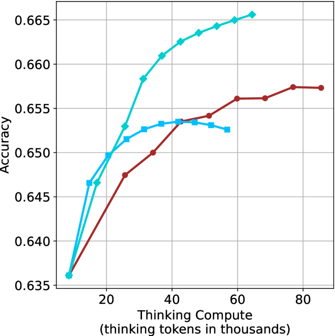
This is a line chart plotting model accuracy against computational effort, measured in "thinking tokens." It compares the performance of three distinct models or methods, represented by three colored lines with different markers. The chart demonstrates how accuracy scales with increased compute for each approach.
### Components/Axes
* **X-Axis (Horizontal):** Labeled "Thinking Compute (thinking tokens in thousands)". The scale runs from approximately 10 to 85, with major gridlines and numerical markers at 20, 40, 60, and 80.
* **Y-Axis (Vertical):** Labeled "Accuracy". The scale runs from 0.635 to 0.665, with major gridlines and numerical markers at 0.635, 0.640, 0.645, 0.650, 0.655, 0.660, and 0.665.
* **Data Series (Legend inferred from visual markers and colors):**
1. **Cyan line with diamond markers:** Positioned as the top-performing series.
2. **Cyan line with square markers:** Positioned as the middle-performing series initially, which later plateaus.
3. **Brown line with circle markers:** Positioned as the lowest-performing series initially, which shows steady growth.
### Detailed Analysis
**Series 1: Cyan Line with Diamond Markers**
* **Trend:** Shows the steepest and most consistent upward slope, indicating the strongest positive correlation between compute and accuracy. It achieves the highest overall accuracy.
* **Approximate Data Points:**
* (10, 0.636)
* (15, 0.647)
* (20, 0.650)
* (25, 0.653)
* (30, 0.658)
* (35, 0.661)
* (40, 0.663)
* (45, 0.664)
* (50, 0.665)
* (55, 0.666)
* (60, 0.667)
**Series 2: Cyan Line with Square Markers**
* **Trend:** Increases rapidly at low compute levels (10-25k tokens), then the rate of improvement slows significantly, forming a plateau between 30k and 55k tokens.
* **Approximate Data Points:**
* (10, 0.636)
* (15, 0.647)
* (20, 0.650)
* (25, 0.652)
* (30, 0.653)
* (35, 0.6535)
* (40, 0.6535)
* (45, 0.6535)
* (50, 0.653)
* (55, 0.6525)
**Series 3: Brown Line with Circle Markers**
* **Trend:** Shows a steady, approximately linear upward slope. It starts at the same point as the others but improves at a slower, more constant rate, never surpassing the cyan diamond line.
* **Approximate Data Points:**
* (10, 0.636)
* (25, 0.6475)
* (35, 0.650)
* (45, 0.6535)
* (50, 0.6545)
* (55, 0.656)
* (60, 0.656)
* (70, 0.6575)
* (80, 0.6575)
### Key Observations
1. **Common Origin:** All three models begin at the same accuracy point (~0.636) at the lowest compute level (~10k tokens).
2. **Diverging Paths:** Performance diverges immediately after the starting point. The cyan diamond model pulls ahead decisively.
3. **Plateau Effect:** The cyan square model exhibits a clear performance plateau, suggesting diminishing returns or a capacity limit beyond ~30k thinking tokens.
4. **Steady Growth:** The brown circle model demonstrates reliable, linear scaling without signs of plateauing within the observed range, but at a lower rate of return than the top model.
5. **Peak Performance:** The highest accuracy on the chart (~0.667) is achieved by the cyan diamond model at ~60k thinking tokens.
### Interpretation
This chart likely illustrates a benchmark comparing different AI reasoning or "thinking" architectures. The data suggests that the method represented by the **cyan diamond line** is the most efficient and effective, converting additional computational resources (thinking tokens) into accuracy gains more successfully than the alternatives.
The **cyan square line** may represent a model that hits a fundamental bottleneck or reaches its optimal performance threshold relatively early. Investing more compute beyond ~30k tokens yields negligible benefit for this approach.
The **brown circle line** represents a stable, predictable model that scales reliably but is less compute-efficient than the top performer. It might be a simpler or more constrained architecture.
The key takeaway is that not all "thinking" compute is equal. The architecture or method (indicated by the line/color) has a profound impact on how effectively additional computational resources can be leveraged to improve task accuracy. The chart argues for the superiority of the "cyan diamond" approach for maximizing performance when scaling compute.