## Bar Chart: Effective Efficiency (%) Across Configurations
### Overview
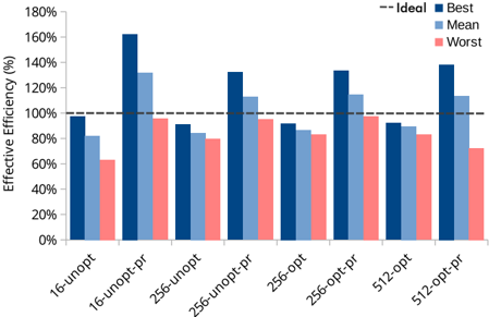
The image is a grouped bar chart comparing the effective efficiency (%) of different configurations across three performance metrics: Best, Mean, and Worst. The chart includes eight categories on the x-axis (e.g., "16-unopt," "16-unopt-pr," etc.) and a y-axis labeled "Effective Efficiency (%)" ranging from 0% to 180%. A dashed horizontal line at 100% is labeled "Ideal," serving as a reference point. The legend at the top right associates colors with the three metrics: Best (dark blue), Mean (light blue), and Worst (red).
### Components/Axes
- **X-axis**: Categories (e.g., "16-unopt," "16-unopt-pr," "256-unopt," "256-unopt-pr," "256-opt," "256-opt-pr," "512-opt," "512-opt-pr").
- **Y-axis**: Effective Efficiency (%) with increments of 20% (0% to 180%).
- **Legend**: Positioned at the top right, with three entries:
- **Best** (dark blue)
- **Mean** (light blue)
- **Worst** (red)
- **Ideal Line**: A dashed horizontal line at 100% labeled "Ideal."
### Detailed Analysis
- **Best (Dark Blue)**:
- All bars exceed 100%, with values ranging from ~95% (16-unopt) to ~160% (16-unopt-pr).
- The highest value is observed in "16-unopt-pr" (~160%), followed by "512-opt-pr" (~140%).
- **Mean (Light Blue)**:
- Bars cluster around 100–120%, with "16-unopt-pr" (~130%) and "512-opt-pr" (~115%) as the highest.
- "16-unopt" (~80%) and "256-unopt" (~90%) are the lowest.
- **Worst (Red)**:
- All bars are below 100%, except "16-unopt-pr" (exactly 100%).
- Values range from ~60% (16-unopt) to ~85% (256-opt-pr).
### Key Observations
1. **Best vs. Ideal**: All "Best" configurations outperform the 100% Ideal line, with "16-unopt-pr" showing the largest deviation (+60%).
2. **Worst vs. Ideal**: Most "Worst" configurations fall significantly below 100%, except "16-unopt-pr" (exactly 100%).
3. **Mean Trends**: The "Mean" metric generally aligns closer to the Ideal line than the "Worst" metric but remains below the "Best" values.
4. **Category Variability**:
- "16-unopt-pr" has the highest "Best" efficiency and the only "Worst" value at 100%.
- "512-opt-pr" shows the highest "Best" efficiency (~140%) and the second-highest "Mean" (~115%).
### Interpretation
The chart demonstrates that configurations labeled "Best" consistently exceed the Ideal efficiency threshold, suggesting optimized performance. The "Worst" configurations underperform, with only "16-unopt-pr" matching the Ideal line. The "Mean" metric reflects a middle ground, indicating variability in performance across the dataset. The outlier in "16-unopt-pr" (Worst = 100%) may indicate a unique case where even the worst-case scenario meets the baseline. This could imply that certain configurations are robust across performance metrics, while others exhibit extreme variability. The data highlights the importance of configuration optimization to achieve or exceed the Ideal efficiency.