## Network Diagram: Comparison of Two Networks
### Overview
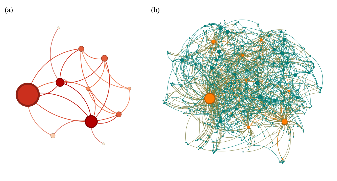
The image presents two network diagrams, labeled (a) and (b), side-by-side. Each diagram consists of nodes (represented by circles) and edges (represented by lines) connecting the nodes. The size and color of the nodes appear to indicate some property or attribute of the nodes, and the lines represent relationships between them. Diagram (a) is a sparser network with fewer nodes and edges, while diagram (b) is a denser network with many more nodes and edges.
### Components/Axes
* **Nodes:** Represented by circles of varying sizes and colors. In diagram (a), the nodes range in color from light peach to dark red, with larger nodes being darker red. In diagram (b), the nodes are either teal or orange, with larger nodes being brighter orange.
* **Edges:** Represented by curved lines connecting the nodes. In diagram (a), the edges are shades of red, corresponding to the node colors. In diagram (b), the edges are teal and orange, corresponding to the node colors.
* **Labels:** The diagrams are labeled (a) and (b) in the top-left corner of each network.
### Detailed Analysis or ### Content Details
**Diagram (a):**
* **Node Count:** Approximately 8 nodes.
* **Edge Count:** Approximately 12 edges.
* **Node Size:** Node sizes vary, with one large node in the bottom center and another large node in the top-left.
* **Node Color:** Nodes range from light peach to dark red. The largest nodes are dark red.
* **Edge Color:** Edges are shades of red, matching the connected nodes.
* **Network Structure:** The network is relatively sparse, with a few central nodes connected to several peripheral nodes.
**Diagram (b):**
* **Node Count:** Approximately 100 nodes.
* **Edge Count:** Significantly more edges than diagram (a), estimated to be over 200.
* **Node Size:** Node sizes vary, with one very large orange node near the center.
* **Node Color:** Nodes are either teal or orange.
* **Edge Color:** Edges are teal and orange, matching the connected nodes.
* **Network Structure:** The network is dense and complex, with many interconnected nodes. There appears to be a central cluster of nodes with connections radiating outwards.
### Key Observations
* Diagram (a) represents a simpler network with fewer connections and a clear hierarchy of node importance (indicated by size and color).
* Diagram (b) represents a more complex network with many more connections and a less clear hierarchy.
* The color of the nodes and edges seems to be a key attribute differentiating the nodes in both networks.
* The size of the nodes appears to indicate the importance or degree of the node within the network.
### Interpretation
The two network diagrams likely represent different types of networks or the same network at different stages of development or under different conditions. Diagram (a) could represent a small social network or a simple biological pathway, while diagram (b) could represent a large social network, a complex biological network, or a technological network. The differences in node color and size likely represent different attributes of the nodes, such as their influence, activity, or type. The density of connections in diagram (b) suggests a higher degree of interaction and interdependence between the nodes compared to diagram (a). The diagrams could be used to compare the structure and properties of different networks or to visualize changes in a network over time.