\n
## Network Diagrams: Comparison of Two Network Structures
### Overview
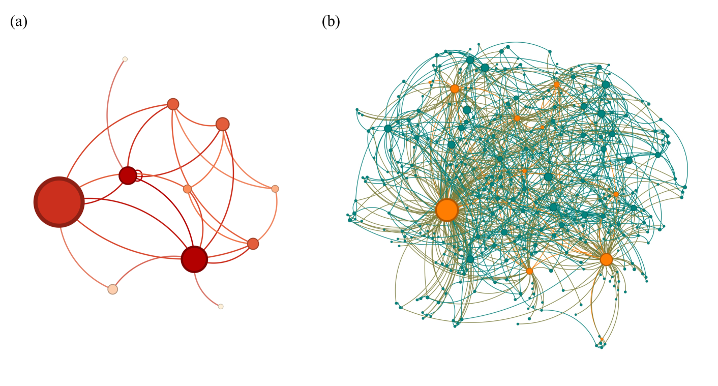
The image presents two network diagrams, labeled (a) and (b). Both diagrams depict nodes connected by edges, representing relationships or interactions within a network. Diagram (a) is sparser and features nodes of varying sizes, with a clear central node. Diagram (b) is much denser, with a larger number of nodes and edges, and nodes are more uniformly sized. There are no axis labels or numerical data present. The diagrams appear to be visual representations of network topology, potentially illustrating different network characteristics or stages of development.
### Components/Axes
There are no explicit axes or scales. The diagrams consist of:
* **Nodes:** Represented by circles.
* **Edges:** Represented by lines connecting the nodes.
* **Node Size:** Varies in diagram (a), indicating potentially different importance or degree.
* **Node Color:** Red/Orange in diagram (a), Teal/Orange in diagram (b).
* **Labels:** (a) and (b) are the only labels present.
### Detailed Analysis or Content Details
**Diagram (a):**
* **Central Node:** A large, dark red node is positioned towards the top-left.
* **Secondary Nodes:** Several medium-sized red nodes are distributed around the central node.
* **Peripheral Nodes:** Smaller, lighter orange nodes are located on the periphery of the network.
* **Connections:** Edges connect the central node to the secondary nodes, and the secondary nodes to both the central node and the peripheral nodes. There is a degree of interconnectedness between the secondary nodes themselves.
* **Approximate Node Count:** ~15 nodes.
* **Approximate Edge Count:** ~25 edges.
**Diagram (b):**
* **Node Distribution:** Nodes are more evenly distributed throughout the diagram.
* **Node Size:** Nodes are generally of a similar size, with a few larger orange nodes.
* **Connections:** The network is highly interconnected, with a dense web of edges.
* **Approximate Node Count:** ~80 nodes.
* **Approximate Edge Count:** ~200 edges.
* **Central Nodes:** Several larger orange nodes appear to act as hubs, with many connections radiating outwards.
### Key Observations
* **Density:** Diagram (b) is significantly denser than diagram (a).
* **Node Importance:** Diagram (a) clearly distinguishes nodes based on size, suggesting varying degrees of importance or centrality. Diagram (b) has less visual distinction in node importance.
* **Complexity:** Diagram (b) represents a more complex network structure.
* **Hubs:** Diagram (b) has multiple hubs, while diagram (a) has a single dominant central node.
### Interpretation
The two diagrams likely represent different network structures or stages of network evolution. Diagram (a) could represent an early-stage network with a clear hierarchy and a central authority (the large red node). The smaller nodes represent peripheral actors connected to the central authority. The orange nodes could represent less important or newly added elements.
Diagram (b) represents a more mature and complex network with multiple hubs and a high degree of interconnectedness. This suggests a more decentralized structure where information and influence can flow through multiple pathways. The increased density indicates a greater number of relationships and interactions.
The comparison suggests a possible transition from a centralized, hierarchical network (a) to a decentralized, complex network (b). This could represent the growth of a social network, the evolution of a communication system, or the development of a biological network. Without further context, it is difficult to determine the specific meaning of these diagrams, but they clearly illustrate the differences between two distinct network topologies. The lack of quantitative data limits a more precise analysis.