## Network Diagrams: Sparse vs. Dense Connectivity
### Overview
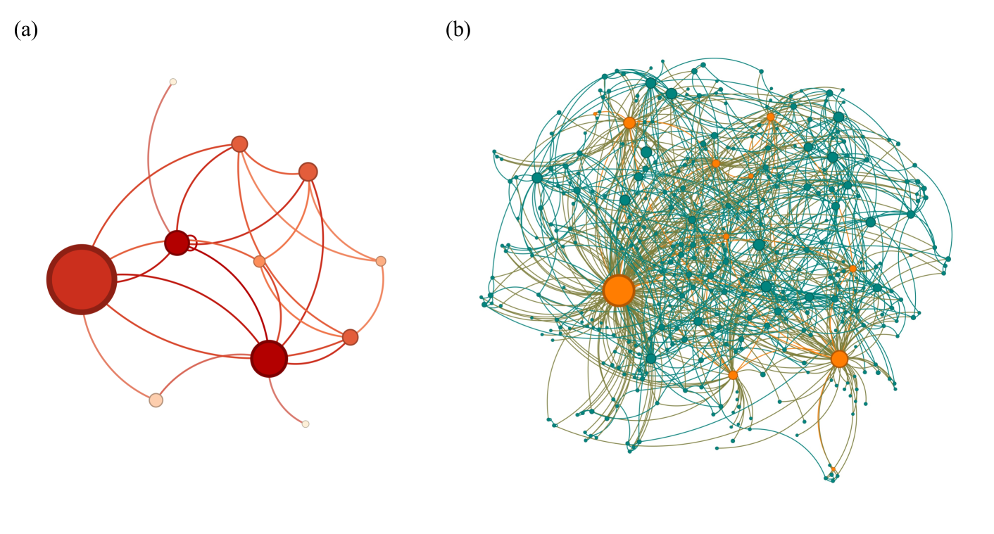
The image displays two distinct network diagrams, labeled (a) and (b), presented side-by-side on a white background. These are visual representations of nodes (circles) connected by edges (lines), illustrating relational structures. Diagram (a) shows a sparse, clustered network, while diagram (b) depicts a highly dense, complex network. No numerical data, axis titles, or legends are present. The only embedded text consists of the labels "(a)" and "(b)".
### Components/Axes
* **Labels:** The text "(a)" is positioned in the top-left corner above the left diagram. The text "(b)" is positioned in the top-left corner above the right diagram.
* **Nodes:** Represented as circles of varying sizes and colors.
* **Edges:** Represented as curved lines connecting the nodes.
* **Color Schemes:**
* **Diagram (a):** Uses a monochromatic red/pink palette. Node colors range from dark red to light pink. Edge colors are shades of red.
* **Diagram (b):** Uses a dual-color scheme. Nodes are primarily teal/dark cyan, with several prominent nodes in orange. Edges are a mix of teal and a brownish-gold color.
### Detailed Analysis
#### Diagram (a): Sparse Network
* **Structure:** A relatively simple, hierarchical-looking network with clear clusters.
* **Node Analysis:**
* One very large, dark red node is positioned on the left side, acting as a major hub.
* A second large, dark red node is positioned towards the bottom-center.
* Several medium-sized nodes (in medium red/orange) are connected to these hubs.
* Numerous small nodes (in light pink) are connected to the medium nodes or directly to the large hubs.
* **Edge Analysis:** Connections are clearly visible and not overly tangled. The edges form distinct pathways between the major hubs and the peripheral nodes. The network appears to have a core-periphery structure.
#### Diagram (b): Dense Network
* **Structure:** An extremely complex and densely interconnected network, resembling a "hairball" graph common in large-scale network visualization.
* **Node Analysis:**
* Hundreds of small teal nodes form the vast majority of the network.
* Approximately 8-12 larger orange nodes are scattered throughout the structure, acting as significant hubs. One particularly large orange node is located in the lower-left quadrant.
* **Edge Analysis:** The connections are so numerous and overlapping that they create a dense, textured web. The teal and gold edges are interwoven, making it difficult to trace individual connections. The overall shape is roughly spherical or globular.
### Key Observations
1. **Contrast in Scale and Complexity:** The primary observation is the stark contrast between the two networks. Diagram (a) is simple and interpretable, while diagram (b) is complex and opaque at first glance.
2. **Hub Identification:** Both networks feature hub nodes (large circles), but their prominence and number differ. Diagram (a) has 2-3 dominant hubs, while diagram (b) has multiple significant hubs (orange nodes) embedded within a sea of smaller nodes.
3. **Color Function:** In diagram (a), color (shade of red) appears to correlate with node size/importance. In diagram (b), color (orange vs. teal) is used to categorically distinguish hub nodes from peripheral nodes.
4. **Spatial Layout:** Diagram (a) has an open layout with visible white space. Diagram (b) is compact and fills its allotted space, indicating a much higher node and edge count.
### Interpretation
These diagrams are likely used to visually communicate fundamental concepts in network science, such as scale-free networks, small-world properties, or the difference between simple and complex systems.
* **Diagram (a)** could represent a small social group, a simple organizational chart, or a basic food web. Its structure suggests clear lines of influence or communication flowing through central hubs.
* **Diagram (b)** is characteristic of large, real-world networks like the internet, a protein-protein interaction network, a large social media platform, or a citation network. The presence of multiple hubs (orange nodes) suggests a "scale-free" property, where a few nodes have very high connectivity. The dense interconnectivity implies robustness (the network can withstand many random failures) but also potential for rapid spread of information or contagion.
The side-by-side comparison is a powerful visual tool to demonstrate how network properties change with size and complexity, moving from a system that is easily understood to one that requires computational analysis to decipher its patterns. The absence of specific labels or data indicates the image's purpose is conceptual illustration rather than presenting specific empirical findings.