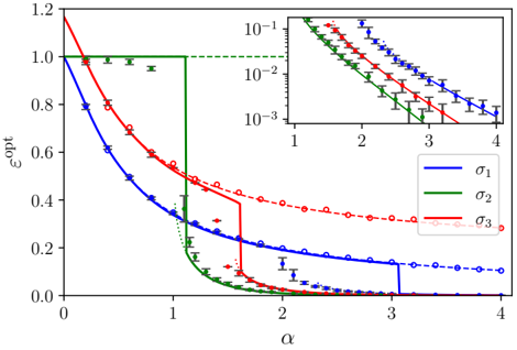
## Chart: Optimal Error vs. Alpha
### Overview
The image presents a line chart illustrating the relationship between the optimal error (εopt) and a parameter alpha (α). Three different curves, labeled σ1, σ2, and σ3, are plotted, each representing a different scenario or condition. The y-axis is on a linear scale, while the inset chart shows the same data on a logarithmic scale for the y-axis. Error bars are present for each data point, indicating the uncertainty in the measurements.
### Components/Axes
* **X-axis:** Labeled "α" (alpha), ranging from approximately 0 to 4.
* **Y-axis:** Labeled "εopt" (optimal error), ranging from approximately 0 to 1.2. The scale is linear.
* **Inset Chart Y-axis:** Logarithmic scale, ranging from 10^-3 to 10^-1.
* **Legend:** Located in the bottom-right corner, identifying the three curves:
* σ1 (Blue solid line)
* σ2 (Green solid line)
* σ3 (Red dashed line)
* **Error Bars:** Vertical lines indicating the uncertainty associated with each data point.
### Detailed Analysis
**σ1 (Blue Line):**
The blue line starts at approximately εopt = 0.8 at α = 0, and decreases rapidly to approximately εopt = 0.1 at α = 1. It then continues to decrease, leveling off around εopt = 0.02 at α = 3, and remains relatively constant until α = 4.
* (0, 0.8) ± 0.1
* (1, 0.1) ± 0.02
* (2, 0.05) ± 0.01
* (3, 0.02) ± 0.005
* (4, 0.02) ± 0.005
**σ2 (Green Line):**
The green line remains relatively constant at approximately εopt = 1.0 across the entire range of α, with some minor fluctuations indicated by the error bars.
* (0, 1.0) ± 0.1
* (1, 1.0) ± 0.1
* (2, 1.0) ± 0.1
* (3, 1.0) ± 0.1
* (4, 1.0) ± 0.1
**σ3 (Red Line):**
The red line starts at approximately εopt = 1.2 at α = 0 and decreases rapidly to approximately εopt = 0.4 at α = 1. It continues to decrease, reaching approximately εopt = 0.05 at α = 2, and then levels off around εopt = 0.02 at α = 3 and α = 4.
* (0, 1.2) ± 0.1
* (1, 0.4) ± 0.05
* (2, 0.05) ± 0.01
* (3, 0.02) ± 0.005
* (4, 0.02) ± 0.005
### Key Observations
* The optimal error (εopt) decreases with increasing alpha (α) for both σ1 and σ3.
* σ2 remains constant at a high error value, suggesting that the corresponding condition does not benefit from increasing alpha.
* σ3 initially has a much higher optimal error than σ1, but both converge to similar low values at higher alpha values.
* The inset chart provides a clearer view of the decreasing trends for all three curves, especially at lower error values.
### Interpretation
The chart demonstrates how the optimal error changes as the parameter alpha is varied under three different conditions (σ1, σ2, and σ3). The decreasing trend of εopt with increasing α for σ1 and σ3 suggests that increasing alpha improves the performance or reduces the error in these scenarios. However, the constant high error for σ2 indicates that increasing alpha does not lead to any improvement in that specific condition. The convergence of σ1 and σ3 at higher alpha values suggests that the conditions represented by these two curves become more similar as alpha increases. The logarithmic scale in the inset chart highlights the rapid decrease in error at lower alpha values and the leveling off at higher alpha values. This could indicate diminishing returns from increasing alpha beyond a certain point. The error bars provide a measure of the uncertainty in the optimal error values, which is important for assessing the reliability of the results.