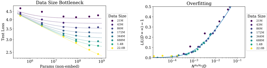
## Chart Type: Data Size Bottleneck and Overfitting Charts
### Overview
The image presents two charts side-by-side. The left chart, titled "Data Size Bottleneck," shows the relationship between the number of parameters (non-embed) and the test loss for different data sizes. The right chart, titled "Overfitting," illustrates the relationship between a normalized loss metric (L/L(D=∞) - 1) and a normalized parameter count (N^(a_N/a_0)/D) for different data sizes. Both charts use a consistent color scheme to represent different data sizes, as indicated by the legend.
### Components/Axes
**Left Chart: Data Size Bottleneck**
* **Title:** Data Size Bottleneck
* **X-axis:** Params (non-embed) - Logarithmic scale from 10^6 to 10^9
* **Y-axis:** Test Loss - Linear scale from 2.5 to 4.5
* **Legend (right side):** Data Size, with the following categories and colors:
* 21M (Dark Purple)
* 43M (Purple)
* 86M (Dark Blue)
* 172M (Blue)
* 344M (Teal)
* 688M (Green)
* 1.4B (Lime Green)
* 22.0B (Yellow)
**Right Chart: Overfitting**
* **Title:** Overfitting
* **X-axis:** N^(a_N/a_0)/D - Logarithmic scale from 10^-4 to 10^-1
* **Y-axis:** L/L(D=∞) - 1 - Linear scale from 0.0 to 0.5
* **Legend (right side):** Data Size, with the same categories and colors as the left chart:
* 21M (Dark Purple)
* 43M (Purple)
* 86M (Dark Blue)
* 172M (Blue)
* 344M (Teal)
* 688M (Green)
* 1.4B (Lime Green)
* 22.0B (Yellow)
### Detailed Analysis
**Left Chart: Data Size Bottleneck**
* **Trend:** For each data size, the test loss generally decreases as the number of parameters increases. The rate of decrease diminishes as the number of parameters increases.
* **Data Points:**
* **21M (Dark Purple):** Starts at approximately 4.5 test loss at 10^6 parameters, decreasing to approximately 4.25 at 10^9 parameters.
* **43M (Purple):** Starts at approximately 4.4 test loss at 10^6 parameters, decreasing to approximately 4.1 at 10^9 parameters.
* **86M (Dark Blue):** Starts at approximately 4.3 test loss at 10^6 parameters, decreasing to approximately 3.9 at 10^9 parameters.
* **172M (Blue):** Starts at approximately 4.2 test loss at 10^6 parameters, decreasing to approximately 3.7 at 10^9 parameters.
* **344M (Teal):** Starts at approximately 4.0 test loss at 10^6 parameters, decreasing to approximately 3.4 at 10^9 parameters.
* **688M (Green):** Starts at approximately 3.9 test loss at 10^6 parameters, decreasing to approximately 3.2 at 10^9 parameters.
* **1.4B (Lime Green):** Starts at approximately 3.8 test loss at 10^6 parameters, decreasing to approximately 2.9 at 10^9 parameters.
* **22.0B (Yellow):** Starts at approximately 4.2 test loss at 10^6 parameters, decreasing to approximately 2.5 at 10^9 parameters.
**Right Chart: Overfitting**
* **Trend:** The normalized loss metric (L/L(D=∞) - 1) generally increases as the normalized parameter count (N^(a_N/a_0)/D) increases. The rate of increase accelerates as the normalized parameter count increases.
* **Data Points:**
* **21M (Dark Purple):** Starts near 0.0 at 10^-4, increasing to approximately 0.5 at 10^-1.
* **43M (Purple):** Starts near 0.0 at 10^-4, increasing to approximately 0.45 at 10^-1.
* **86M (Dark Blue):** Starts near 0.0 at 10^-4, increasing to approximately 0.3 at 10^-1.
* **172M (Blue):** Starts near 0.0 at 10^-4, increasing to approximately 0.2 at 10^-1.
* **344M (Teal):** Starts near 0.0 at 10^-4, increasing to approximately 0.1 at 10^-1.
* **688M (Green):** Starts near 0.0 at 10^-4, increasing to approximately 0.05 at 10^-1.
* **1.4B (Lime Green):** Starts near 0.0 at 10^-4, increasing to approximately 0.02 at 10^-1.
* **22.0B (Yellow):** Starts near 0.0 at 10^-4, increasing to approximately 0.01 at 10^-1.
### Key Observations
* In the "Data Size Bottleneck" chart, larger data sizes generally result in lower test loss for a given number of parameters.
* In the "Overfitting" chart, larger data sizes generally result in lower normalized loss metric for a given normalized parameter count.
* The "Data Size Bottleneck" chart shows diminishing returns in reducing test loss as the number of parameters increases, especially for smaller data sizes.
* The "Overfitting" chart shows an accelerating increase in the normalized loss metric as the normalized parameter count increases, indicating a potential for overfitting.
### Interpretation
The charts suggest that increasing the data size can help to reduce both the test loss and the potential for overfitting. The "Data Size Bottleneck" chart demonstrates that, for a fixed number of parameters, larger datasets lead to better performance (lower test loss). The "Overfitting" chart shows that larger datasets are less prone to overfitting, as indicated by the lower normalized loss metric for a given normalized parameter count. The diminishing returns observed in the "Data Size Bottleneck" chart suggest that there may be a point beyond which increasing the number of parameters provides little additional benefit, especially for smaller datasets. The accelerating increase in the "Overfitting" chart highlights the importance of regularization techniques to prevent overfitting, particularly when using large numbers of parameters.