## Charts: Data Size Bottleneck and Overfitting Scaling Laws
### Overview
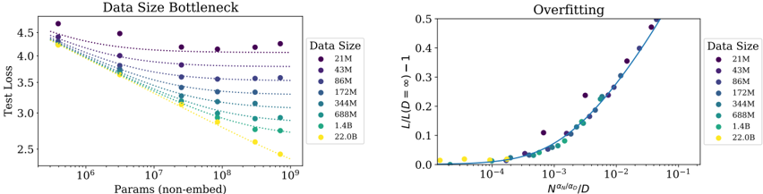
The image contains two side-by-side scientific charts analyzing the relationship between model size, data size, and performance (test loss) in machine learning. The left chart, "Data Size Bottleneck," plots test loss against model parameter count for different dataset sizes. The right chart, "Overfitting," shows a normalized loss metric against a scaled parameter-to-data ratio, demonstrating a universal scaling law.
### Components/Axes
**Left Chart: "Data Size Bottleneck"**
* **Title:** Data Size Bottleneck
* **Y-Axis:** Label: "Test Loss". Scale: Linear, from 2.5 to 4.5.
* **X-Axis:** Label: "Params (non-embed)". Scale: Logarithmic, from 10^6 to 10^9.
* **Legend:** Positioned on the right side. Title: "Data Size". Categories (from top to bottom, corresponding to darkest to lightest color):
* 21M (Dark Purple)
* 43M (Purple)
* 86M (Blue-Purple)
* 172M (Blue)
* 344M (Teal)
* 688M (Green-Teal)
* 1.4B (Light Green)
* 22.0B (Yellow)
**Right Chart: "Overfitting"**
* **Title:** Overfitting
* **Y-Axis:** Label: "L/L(D=∞) - 1". Scale: Linear, from 0.0 to 0.5.
* **X-Axis:** Label: "Nαα/αg/D". Scale: Logarithmic, from 10^-4 to 10^-1.
* **Legend:** Positioned on the right side. Identical to the left chart: Title "Data Size" with the same eight categories and color mapping.
### Detailed Analysis
**Left Chart: Data Size Bottleneck**
* **Trend Verification:** All data series show a downward trend (test loss decreases as parameter count increases). The slope of the trend is strongly dependent on data size.
* **Data Series Analysis (Approximate Values):**
* **21M (Dark Purple):** Flattest slope. Starts at ~4.5 loss (10^6 params), ends at ~4.2 loss (10^9 params). Shows severe bottlenecking.
* **43M (Purple):** Starts ~4.4, ends ~3.9.
* **86M (Blue-Purple):** Starts ~4.35, ends ~3.6.
* **172M (Blue):** Starts ~4.3, ends ~3.3.
* **344M (Teal):** Starts ~4.25, ends ~3.0.
* **688M (Green-Teal):** Starts ~4.2, ends ~2.8.
* **1.4B (Light Green):** Starts ~4.15, ends ~2.6.
* **22.0B (Yellow):** Steepest slope. Starts ~4.3, ends at the lowest point, ~2.5 loss (10^9 params). Shows the greatest benefit from scaling parameters.
**Right Chart: Overfitting**
* **Trend Verification:** All data series collapse onto a single, upward-curving trend line. The normalized loss increases as the x-axis value increases.
* **Data Series Analysis:** The data points from all eight data sizes (21M to 22.0B) align closely along the same curve, indicating a universal relationship.
* For x-axis values < 10^-3, the y-axis value is near 0.0.
* The curve begins to rise noticeably around x = 10^-3.
* At x = 10^-2, y is approximately 0.15.
* At x = 10^-1, y approaches 0.5.
* **Component Isolation:** The chart demonstrates that the quantity `L/L(D=∞) - 1` (a measure of overfitting or finite-data effect) is a function of the single variable `Nαα/αg/D` (a scaled ratio of model capacity to data size).
### Key Observations
1. **Bottleneck Effect:** The left chart clearly shows that for a fixed, small dataset (e.g., 21M), increasing model parameters beyond a certain point yields diminishing returns in test loss reduction. The model is "bottlenecked" by data.
2. **Data Scaling Benefit:** Larger datasets (e.g., 22.0B) allow test loss to continue decreasing steeply with more parameters, indicating they can effectively utilize larger models.
3. **Universal Scaling Law:** The right chart's collapse of all data onto a single curve is the most significant observation. It suggests that overfitting behavior follows a predictable, universal scaling law across different data sizes when the right normalized variables are used.
4. **Color-Coded Consistency:** The color mapping from the legend is applied consistently across both charts, allowing for direct comparison of the same data size's behavior in two different analytical views.
### Interpretation
These charts together illustrate a fundamental principle in scaling neural networks: **model performance is governed by the interplay between model size (parameters) and data size.**
* The **"Data Size Bottleneck"** chart provides a practical view: to improve performance (lower test loss), one must scale both parameters *and* data in tandem. Scaling only one leads to diminishing returns. The yellow line (22.0B) represents the ideal scenario where abundant data unlocks the potential of a large model.
* The **"Overfitting"** chart provides the theoretical underpinning. It reveals that the relative increase in loss due to finite data (compared to an infinite data ideal) is not arbitrary. It is a deterministic function of the ratio `Nαα/αg/D`. This implies that overfitting can be predicted and potentially controlled by managing this ratio. The collapse of all data sizes onto one curve is powerful evidence for a generalizable scaling law, moving the discussion from empirical observation to predictive theory.
**In essence, the data suggests that to achieve optimal model performance, one must navigate a "scaling path" where the growth in model capacity is matched by a growth in data volume, as dictated by the universal relationship shown on the right.** The charts are a visual argument for the necessity of large-scale datasets in the era of large-scale models.