TECHNICAL ASSET FINGERPRINT
c7bf82b636ea8b5fe1b5d497
Click to view fullscreen
Press ESC or click to close
FOUND IN PAPERS
EXPERT: healer-alpha-free VERSION 1
RUNTIME: free/openrouter/healer-alpha
INTEL_VERIFIED
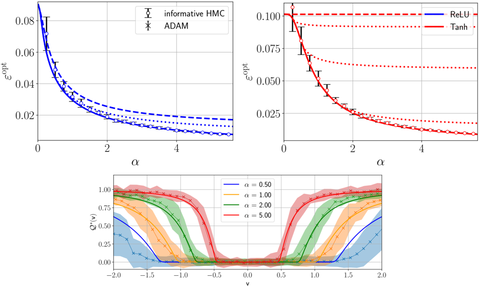
## Composite Technical Figure: Optimization and Activation Function Analysis
### Overview
This image is a composite of three separate plots arranged in a 2x1 grid (two plots on top, one spanning the bottom). The figure presents a technical analysis comparing optimization algorithms and activation functions, likely in the context of machine learning or statistical physics. The top two plots compare the optimal error (`ε_opt`) as a function of a parameter `α` for different methods. The bottom plot shows the behavior of a function `Q^α(v)` across a range of `v` values for different fixed `α` parameters.
### Components/Axes
The figure is segmented into three distinct regions:
1. **Top-Left Plot:** A line chart comparing two optimization algorithms.
2. **Top-Right Plot:** A line chart comparing two activation functions.
3. **Bottom Plot:** An area/line chart showing function profiles for different parameter values.
**Common Elements:**
* All plots have a white background with a light gray grid.
* Axes are labeled with mathematical symbols.
* Legends are present within each plot's frame.
### Detailed Analysis
#### **Top-Left Plot: Algorithm Comparison**
* **Chart Type:** Line chart with error bars.
* **X-Axis:** Label: `α`. Scale: Linear, from 0 to approximately 5. Major ticks at 0, 2, 4.
* **Y-Axis:** Label: `ε_opt`. Scale: Linear, from 0.00 to 0.08. Major ticks at 0.00, 0.02, 0.04, 0.06, 0.08.
* **Legend:** Located in the top-right corner of the plot.
* `informative HMC`: Represented by a solid blue line with open circle markers (`○`).
* `ADAM`: Represented by a dashed blue line with 'x' markers (`×`).
* **Data Series & Trends:**
* **Trend Verification:** Both lines show a clear downward, decaying trend as `α` increases. The `informative HMC` line is consistently below the `ADAM` line.
* **Data Points (Approximate):**
* At `α ≈ 0`: `ε_opt` is at its maximum, ~0.08 for both.
* At `α = 2`: `informative HMC` ≈ 0.02, `ADAM` ≈ 0.025.
* At `α = 4`: `informative HMC` ≈ 0.01, `ADAM` ≈ 0.018.
* **Error Bars:** Vertical error bars are present on the `informative HMC` data points, indicating variability or confidence intervals. The bars are larger at low `α` and shrink as `α` increases.
#### **Top-Right Plot: Activation Function Comparison**
* **Chart Type:** Line chart with error bars.
* **X-Axis:** Label: `α`. Scale: Identical to the top-left plot (0 to ~5).
* **Y-Axis:** Label: `ε_opt`. Scale: Linear, from 0.000 to 0.100. Major ticks at 0.000, 0.025, 0.050, 0.075, 0.100.
* **Legend:** Located in the top-right corner of the plot.
* `ReLU`: Represented by a solid blue line.
* `Tanh`: Represented by a dashed red line.
* **Data Series & Trends:**
* **Trend Verification:** Both lines show a downward, decaying trend as `α` increases. The `Tanh` line starts at a higher `ε_opt` and decays more steeply than the `ReLU` line, eventually converging to a similar low value.
* **Data Points (Approximate):**
* At `α ≈ 0`: `Tanh` ≈ 0.100, `ReLU` ≈ 0.090.
* At `α = 2`: `Tanh` ≈ 0.025, `ReLU` ≈ 0.030.
* At `α = 4`: Both are very close, approximately 0.010.
* **Error Bars:** Vertical error bars are present on both lines, with markers (diamonds for `Tanh`, circles for `ReLU`). The bars are most significant at low `α`.
#### **Bottom Plot: Function Profile `Q^α(v)`**
* **Chart Type:** Combined line and area chart.
* **X-Axis:** Label: `v`. Scale: Linear, from -2.0 to 2.0. Major ticks at -2.0, -1.5, -1.0, -0.5, 0.0, 0.5, 1.0, 1.5, 2.0.
* **Y-Axis:** Label: `Q^α(v)`. Scale: Linear, from 0.00 to 1.00. Major ticks at 0.00, 0.25, 0.50, 0.75, 1.00.
* **Legend:** Located in the top-right corner of the plot.
* `α = 0.50`: Solid blue line with 'x' markers, blue shaded area.
* `α = 1.00`: Solid orange line with 'x' markers, orange shaded area.
* `α = 2.00`: Solid green line with 'x' markers, green shaded area.
* `α = 5.00`: Solid red line with 'x' markers, red shaded area.
* **Data Series & Trends:**
* **Trend Verification:** All functions are symmetric around `v=0`. They exhibit a "double-well" or "bimodal" shape, with high values near `v = ±2.0` and a minimum at `v=0`. As `α` increases, the transition from high to low values becomes sharper (steeper slopes), and the central minimum becomes wider and flatter.
* **Key Features (Approximate):**
* **At `v = ±2.0`:** `Q^α(v)` approaches 1.0 for all `α`.
* **At `v = 0`:** `Q^α(v)` is near 0.0 for all `α`.
* **Width of Central Valley:** The region where `Q^α(v) < 0.25` widens significantly with increasing `α`. For `α=0.50`, it's roughly between `v=-0.7` and `v=0.7`. For `α=5.00`, it's roughly between `v=-1.2` and `v=1.2`.
* **Shaded Areas:** The colored shaded regions around each line likely represent confidence intervals, standard deviations, or the range of multiple runs. The shading is widest for `α=0.50` and narrowest for `α=5.00`.
### Key Observations
1. **Consistent Decay:** In both top plots, the optimal error `ε_opt` decreases monotonically with the parameter `α`.
2. **Algorithm Performance:** The `informative HMC` method consistently achieves a lower `ε_opt` than `ADAM` across the entire range of `α` shown.
3. **Activation Function Behavior:** The `Tanh` activation results in a higher initial error than `ReLU` at low `α`, but its performance improves more rapidly, matching `ReLU` at high `α`.
4. **Parameter `α` Controls Sharpness:** The bottom plot demonstrates that `α` acts as a sharpness or temperature parameter. Higher `α` leads to a more decisive, step-like transition in the function `Q^α(v)`, effectively widening the basin of attraction around `v=0`.
5. **Uncertainty Correlates with `α`:** In the top plots, error bars (uncertainty) are largest at small `α`. In the bottom plot, the shaded uncertainty bands are widest for the smallest `α` (`0.50`), suggesting the system's behavior is more variable or less constrained at low `α`.
### Interpretation
This figure likely comes from a study on the theoretical limits of learning or optimization in neural networks. The parameter `α` could represent a measure of system capacity, signal-to-noise ratio, or the number of parameters relative to samples.
* **Top Plots (Peircean Abduction):** The data suggests that having more "information" (higher `α`) reduces the fundamental limit of error (`ε_opt`). The `informative HMC` algorithm, which presumably uses more sophisticated sampling, is better at approaching this theoretical limit than the standard `ADAM` optimizer. The comparison between `ReLU` and `Tanh` suggests their theoretical performance limits converge in the high-capacity (`α` → ∞) regime.
* **Bottom Plot (Peircean Deduction):** The function `Q^α(v)` may represent a posterior distribution, an overlap function, or a measure of stability. The sharpening of the profile with increasing `α` indicates that with more capacity or information, the system can more clearly distinguish between states (high `Q` at `|v|≈2`) and settle into a stable, low-error state (low `Q` at `v≈0`). The widening of the central minimum suggests that higher `α` creates a larger, more robust region of stability.
* **Overall Synthesis:** The figure connects a macroscopic performance metric (`ε_opt`) to a microscopic functional behavior (`Q^α(v)`). It argues that increasing the parameter `α` not only lowers the achievable error but also fundamentally changes the landscape of the solution space, making the desired solution (at `v=0`) more stable and easier to find, albeit with different characteristics depending on the algorithm or activation function used. The presence of error bars and uncertainty bands highlights that these are statistical or averaged results, not deterministic certainties.
DECODING INTELLIGENCE...