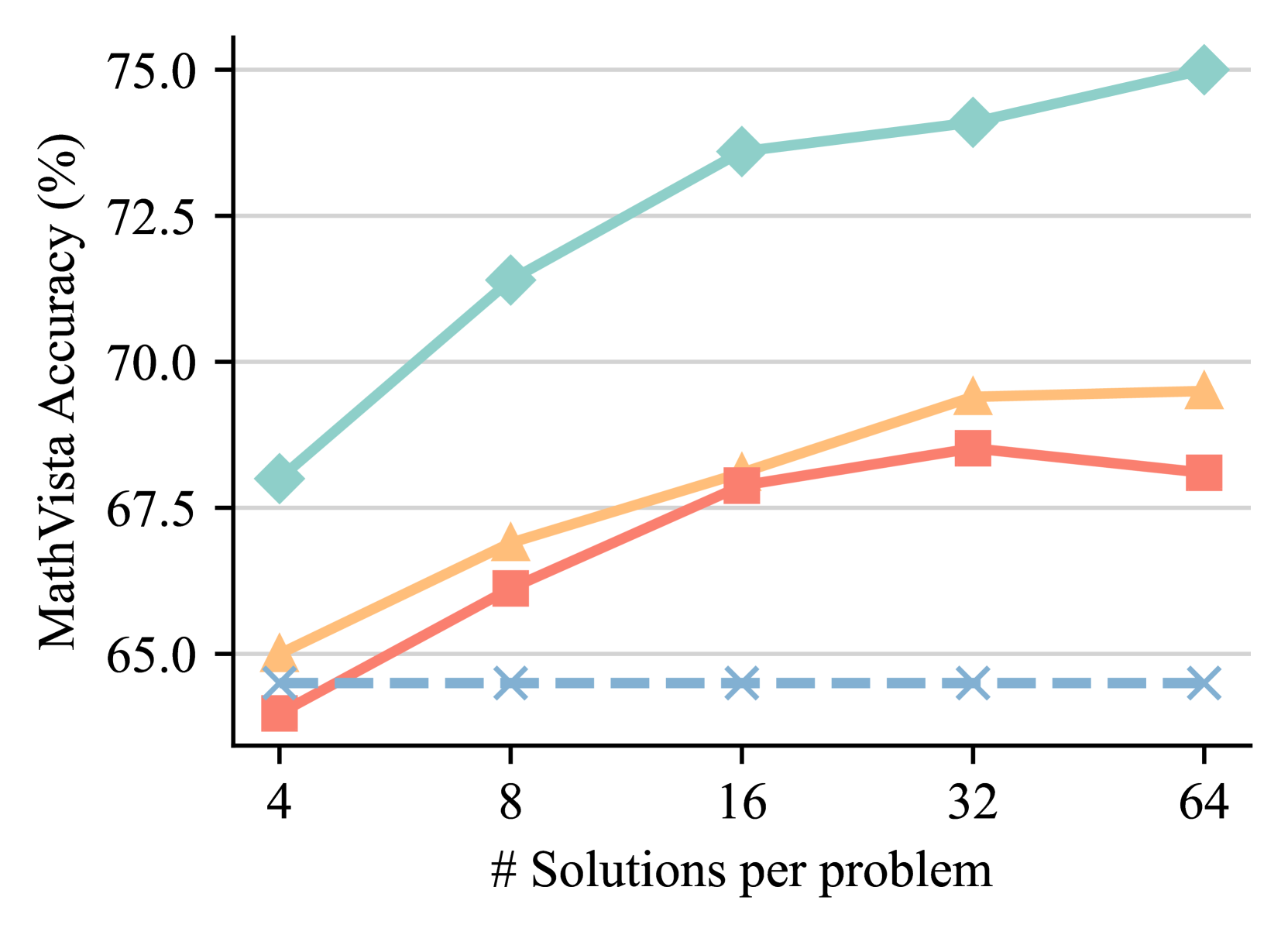
## Line Chart: MathVista Accuracy vs. Number of Solutions per Problem
### Overview
The chart illustrates the relationship between the number of solutions per problem and MathVista accuracy (%), with three distinct data series represented by different markers and colors. The x-axis (logarithmic scale) shows the number of solutions per problem (4, 8, 16, 32, 64), while the y-axis (linear scale) represents accuracy from 65% to 75%. A constant blue dashed line at 65% serves as a baseline.
### Components/Axes
- **X-axis**: "# Solutions per problem" (logarithmic scale: 4, 8, 16, 32, 64).
- **Y-axis**: "MathVista Accuracy (%)" (linear scale: 65% to 75%).
- **Legend**:
- **Teal diamonds**: Line 1 (highest accuracy).
- **Orange triangles**: Line 2 (middle accuracy).
- **Red squares**: Line 3 (lowest accuracy).
- **Blue dashed line**: Constant baseline at 65%.
### Detailed Analysis
1. **Teal Diamonds (Line 1)**:
- Starts at **68%** for 4 solutions.
- Increases to **71.5%** at 8 solutions.
- Rises to **73.5%** at 16 solutions.
- Peaks at **74%** for 32 solutions.
- Reaches **75%** at 64 solutions.
- **Trend**: Steep initial growth, then plateaus.
2. **Orange Triangles (Line 2)**:
- Begins at **65%** for 4 solutions.
- Increases to **67%** at 8 solutions.
- Rises to **68.5%** at 16 solutions.
- Peaks at **69.5%** for 32 solutions.
- Slightly declines to **69.5%** at 64 solutions.
- **Trend**: Gradual, steady increase with a minor plateau.
3. **Red Squares (Line 3)**:
- Starts at **64%** for 4 solutions.
- Increases to **66%** at 8 solutions.
- Rises to **68%** at 16 solutions.
- Peaks at **68.5%** for 32 solutions.
- Declines to **67.5%** at 64 solutions.
- **Trend**: Rapid initial growth, then a slight drop at 64 solutions.
4. **Blue Dashed Line**:
- Constant at **65%** across all solution counts.
- **Trend**: Flat, no variation.
### Key Observations
- **Teal Line (Line 1)** consistently outperforms other series, showing the highest accuracy.
- **Orange Line (Line 2)** demonstrates a moderate improvement, with a slight plateau at 64 solutions.
- **Red Line (Line 3)** exhibits the most variability, with a notable drop at 64 solutions.
- The **blue baseline (65%)** acts as a reference point, indicating that all series exceed this minimum accuracy.
### Interpretation
The data suggests that increasing the number of solutions per problem generally improves MathVista accuracy, but the rate of improvement varies by series.
- **Teal Line (Line 1)**: Likely represents the most effective method, with a strong correlation between solution count and accuracy.
- **Orange Line (Line 2)**: Indicates a balanced approach, with consistent gains but limited by a plateau.
- **Red Line (Line 3)**: Shows initial promise but may suffer from diminishing returns or inefficiencies at higher solution counts (e.g., the drop at 64 solutions).
- The **blue baseline** highlights that even the lowest-performing series (red) exceeds the minimum threshold, suggesting room for optimization across all methods.
**Notable Anomaly**: The red line’s drop at 64 solutions (67.5% vs. 68.5% at 32) could indicate a regression or a limitation in scaling the method for larger problem sets. Further investigation into the methodology or data collection for this series is warranted.