TECHNICAL ASSET FINGERPRINT
c7d1d323eaffb33094a83043
Click to view fullscreen
Press ESC or click to close
FOUND IN PAPERS
EXPERT: healer-alpha-free VERSION 1
RUNTIME: free/openrouter/healer-alpha
INTEL_VERIFIED
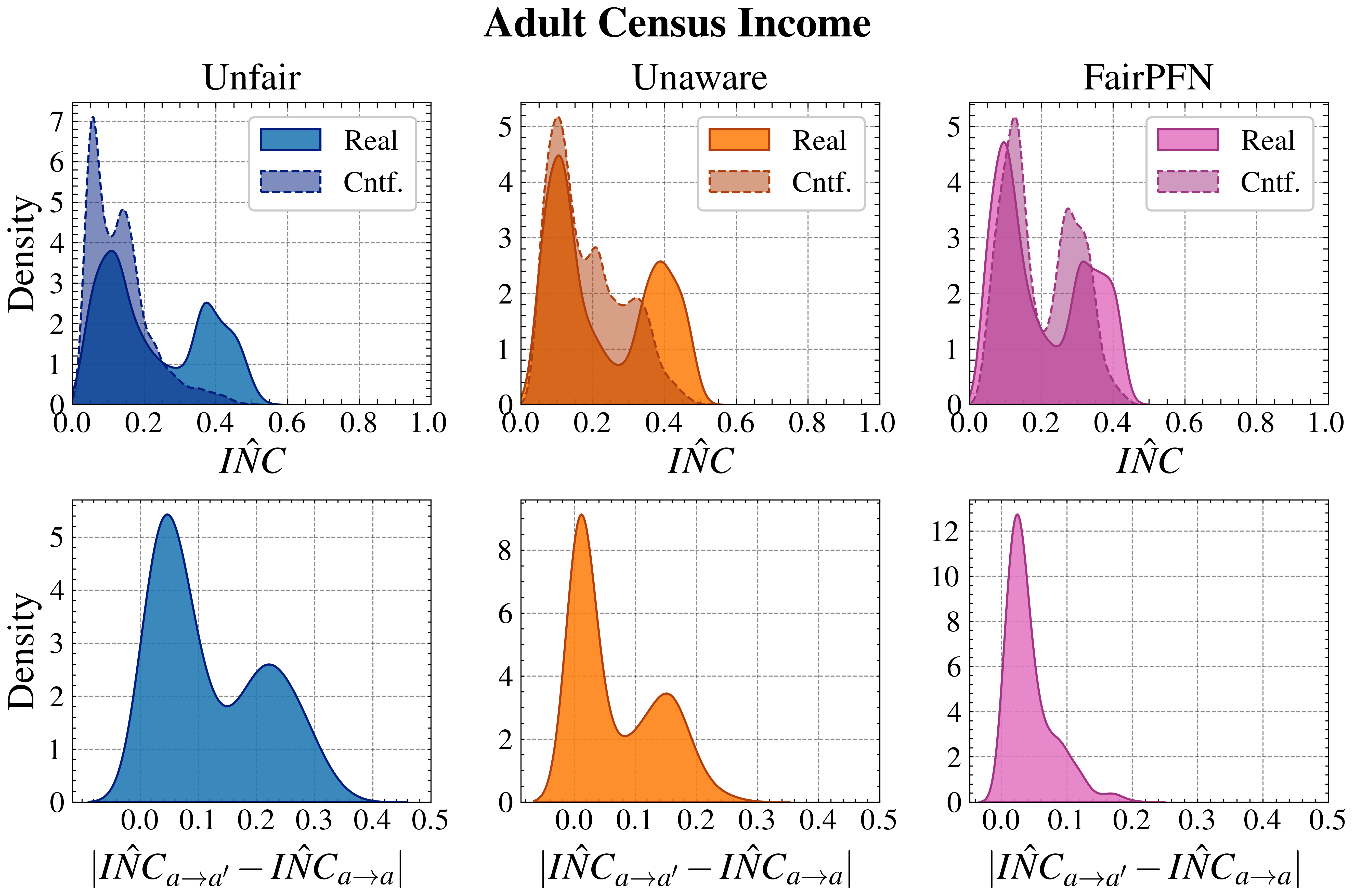
## Density Plots: Adult Census Income Fairness Metrics
### Overview
The image displays a 2x3 grid of kernel density estimation plots analyzing fairness metrics on the "Adult Census Income" dataset. The plots compare the distribution of a metric called `IÑC` (top row) and the absolute difference in `IÑC` between counterfactual and real groups (bottom row) across three different modeling approaches: "Unfair," "Unaware," and "FairPFN." Each subplot contains two distributions: one for "Real" data (solid fill) and one for "Cntf." (Counterfactual) data (dashed outline with lighter fill).
### Components/Axes
* **Overall Title:** "Adult Census Income" (centered at the top).
* **Column Headers (Top Row):** "Unfair" (left), "Unaware" (center), "FairPFN" (right).
* **Y-Axis (All Plots):** Labeled "Density." The scale varies per plot.
* **X-Axis (Top Row):** Labeled `IÑC`. Scale ranges from 0.0 to 1.0.
* **X-Axis (Bottom Row):** Labeled `|IÑC_{a→a'} - IÑC_{a→a}|`. Scale ranges from 0.0 to 0.5.
* **Legends:** Located in the top-right corner of each top-row subplot.
* **Unfair (Blue):** "Real" (solid dark blue), "Cntf." (dashed outline, light blue fill).
* **Unaware (Orange):** "Real" (solid dark orange), "Cntf." (dashed outline, light orange fill).
* **FairPFN (Pink/Magenta):** "Real" (solid magenta), "Cntf." (dashed outline, light pink fill).
* **Grid:** Light gray dashed grid lines are present in all subplots.
### Detailed Analysis
**Top Row: Distribution of `IÑC`**
* **Unfair (Left, Blue):**
* **Real Distribution:** Bimodal. Primary peak at `IÑC ≈ 0.1` (Density ~3.8). Secondary, smaller peak at `IÑC ≈ 0.4` (Density ~2.5). Distribution spans roughly 0.0 to 0.6.
* **Cntf. Distribution:** Unimodal and sharply peaked. Peak at `IÑC ≈ 0.05` (Density ~7.0). Much narrower spread than the Real distribution, concentrated below 0.2.
* **Trend:** The counterfactual distribution is shifted significantly left (lower `IÑC`) and is more concentrated compared to the real data.
* **Unaware (Center, Orange):**
* **Real Distribution:** Bimodal. Primary peak at `IÑC ≈ 0.1` (Density ~4.5). Secondary peak at `IÑC ≈ 0.4` (Density ~2.6). Similar shape to the "Unfair" Real distribution.
* **Cntf. Distribution:** Broader and more complex. Has a peak near `IÑC ≈ 0.1` (Density ~5.2) and a secondary shoulder/peak around `IÑC ≈ 0.25` (Density ~2.8). Overlaps more with the Real distribution than in the "Unfair" case.
* **Trend:** The counterfactual distribution is less sharply peaked and shows more overlap with the real data compared to the "Unfair" model.
* **FairPFN (Right, Pink):**
* **Real Distribution:** Bimodal. Primary peak at `IÑC ≈ 0.1` (Density ~4.8). Secondary peak at `IÑC ≈ 0.35` (Density ~2.6).
* **Cntf. Distribution:** Bimodal, closely mirroring the Real distribution. Peaks at `IÑC ≈ 0.1` (Density ~5.2) and `IÑC ≈ 0.3` (Density ~3.5).
* **Trend:** The counterfactual and real distributions are very similar in shape and location, indicating high alignment.
**Bottom Row: Distribution of `|IÑC_{a→a'} - IÑC_{a→a}|` (Absolute Difference)**
* **Unfair (Left, Blue):**
* Distribution is bimodal. Primary peak at a difference of `≈ 0.05` (Density ~5.5). Secondary peak at `≈ 0.25` (Density ~2.6). Shows a significant mass of data points with a large difference in `IÑC` between counterfactual and real groups.
* **Unaware (Center, Orange):**
* Distribution is bimodal. Primary peak at a difference of `≈ 0.05` (Density ~9.0). Secondary peak at `≈ 0.15` (Density ~3.5). The secondary peak is at a lower difference value than in the "Unfair" plot.
* **FairPFN (Right, Pink):**
* Distribution is strongly unimodal and sharply peaked near zero. Peak at a difference of `≈ 0.02` (Density ~12.5). The distribution decays rapidly, with very little mass beyond a difference of 0.1.
* **Trend:** This plot shows the most concentrated distribution near zero, indicating minimal difference between counterfactual and real `IÑC` values.
### Key Observations
1. **Consistent Real Data Shape:** The "Real" data distribution (solid fill) for `IÑC` (top row) is consistently bimodal across all three models, suggesting an inherent structure in the dataset's fairness metric.
2. **Counterfactual Alignment:** The alignment between "Real" and "Cntf." distributions improves dramatically from left to right: "Unfair" (large shift) -> "Unaware" (partial overlap) -> "FairPFN" (high similarity).
3. **Difference Metric Convergence:** The bottom row shows the distribution of the absolute difference metric collapsing toward zero from "Unfair" to "FairPFN." The "FairPFN" model produces a very sharp peak near zero, indicating its counterfactual predictions are very close to the real ones for this metric.
4. **Peak Density Values:** The maximum density values increase in the bottom row from left to right (Unfair: ~5.5, Unaware: ~9.0, FairPFN: ~12.5), reflecting the increasing concentration of the difference metric near zero.
### Interpretation
This visualization demonstrates the effectiveness of the "FairPFN" method in achieving fairness on the Adult Census Income dataset, as measured by the `IÑC` metric.
* **What the data suggests:** The `IÑC` metric likely measures some form of influence or inconsistency related to protected attributes (denoted by `a`). The "Unfair" model shows a large discrepancy between real and counterfactual `IÑC` values, meaning changing protected attributes would drastically alter the model's behavior. The "Unaware" model reduces this discrepancy but does not eliminate it. The "FairPFN" model successfully aligns the real and counterfactual distributions, meaning the model's behavior is consistent regardless of the protected attribute value.
* **How elements relate:** The top row shows the *absolute values* of the metric, while the bottom row shows the *magnitude of change* when flipping the protected attribute. The progression from left to right across columns tells a story of improving fairness: the counterfactual distribution moves to match the real one (top row), and the difference between them shrinks to near zero (bottom row).
* **Notable Anomalies/Trends:** The most striking trend is the transformation of the bottom-row distribution from a broad, bimodal shape ("Unfair") to a sharp, zero-centered spike ("FairPFN"). This is a direct visual indicator of reduced unfairness. The bimodality in the "Real" `IÑC` distributions (top row) is an important baseline characteristic of the data that the fairness interventions must account for.
DECODING INTELLIGENCE...