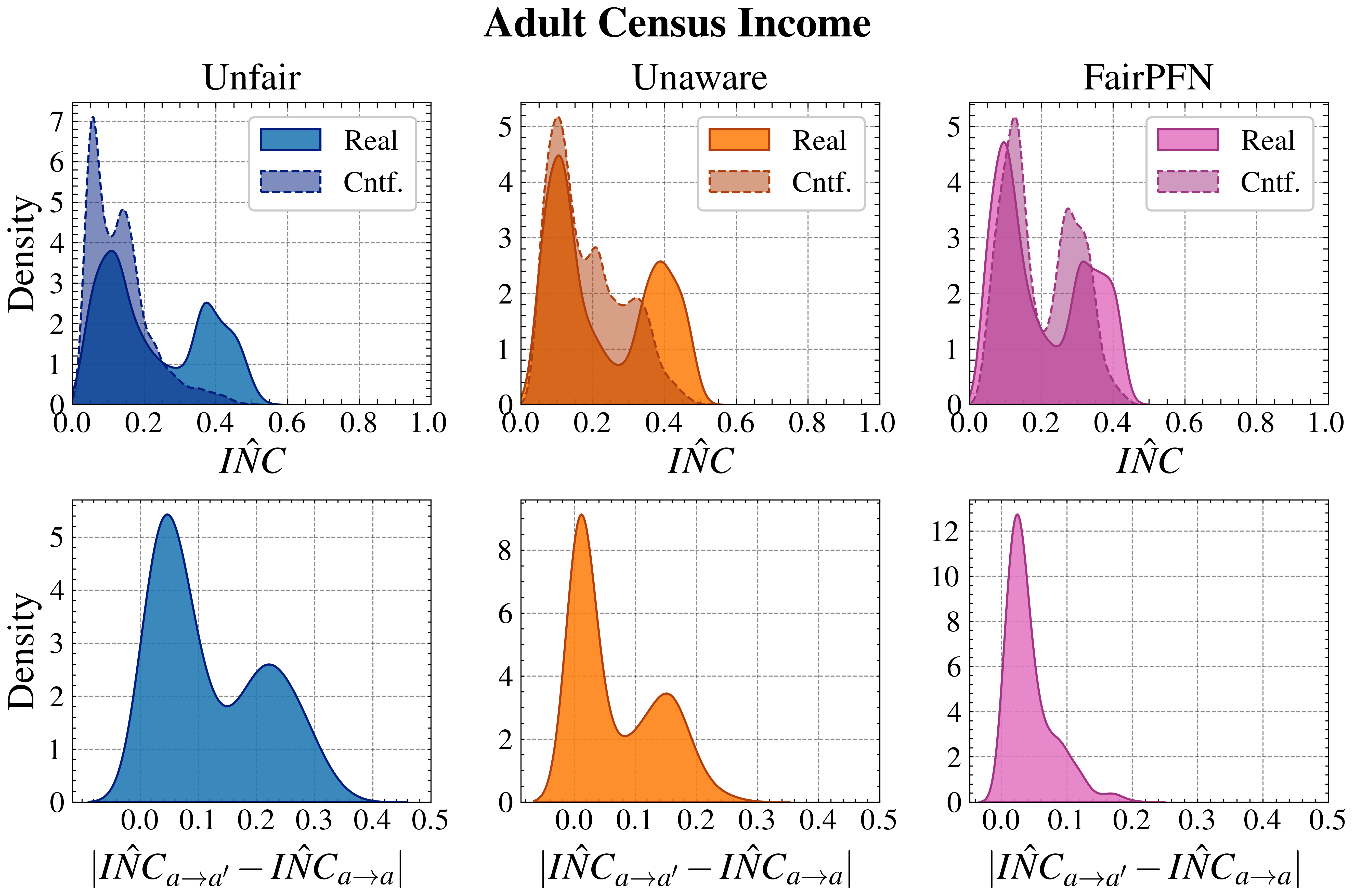
## Chart/Diagram Type: Density Plots of Adult Census Income Metrics
### Overview
The image contains six density plots arranged in a 3x2 grid, comparing "Real" and "Counterfactual" (Cntf.) distributions across different fairness metrics ("Unfair," "Unaware," "FairPFN") and an "INC" metric. Each plot uses distinct colors for Real and Cntf. lines, with x-axes representing normalized values (0–1) and y-axes showing density. The bottom row focuses on absolute differences in "ÎNC" values.
### Components/Axes
1. **Top Row Plots**:
- **X-axis**: "ÎNC" (0–1) for Unfair, Unaware, FairPFN.
- **Y-axis**: Density (0–8).
- **Legends**:
- **Unfair**: Blue (Real), Gray (Cntf.).
- **Unaware**: Orange (Real), Brown (Cntf.).
- **FairPFN**: Pink (Real), Purple (Cntf.).
- **Positioning**: Legends in top-right corner of each plot.
2. **Bottom Row Plots**:
- **X-axis**: Absolute difference "|ÎNC_{a→a'} − ÎNC_{a→a}|" (0–0.5).
- **Y-axis**: Density (0–12).
- **Colors**:
- First plot: Blue (Real).
- Second plot: Orange (Real).
- Third plot: Pink (Real).
### Detailed Analysis
#### Top Row Trends:
1. **Unfair (Top Left)**:
- Real (blue) peaks at ~0.2 (density ~5), with a secondary peak at ~0.4 (density ~3).
- Cntf. (gray) peaks at ~0.3 (density ~4), with a smaller peak at ~0.5 (density ~2).
2. **Unaware (Top Middle)**:
- Real (orange) peaks at ~0.1 (density ~5), with a secondary peak at ~0.4 (density ~3).
- Cntf. (brown) peaks at ~0.3 (density ~4), with a smaller peak at ~0.5 (density ~2).
3. **FairPFN (Top Right)**:
- Real (pink) peaks at ~0.1 (density ~5), with a secondary peak at ~0.4 (density ~3).
- Cntf. (purple) peaks at ~0.3 (density ~4), with a smaller peak at ~0.5 (density ~2).
#### Bottom Row Trends:
1. **First INC Plot (Blue)**:
- Peaks at ~0.1 (density ~5) and ~0.3 (density ~3).
2. **Second INC Plot (Orange)**:
- Single peak at ~0.1 (density ~8).
3. **Third INC Plot (Pink)**:
- Sharp peak at ~0.1 (density ~12), tapering off rapidly.
### Key Observations
1. **Peak Consistency**:
- Cntf. lines consistently peak near 0.3–0.5 across Unfair, Unaware, and FairPFN plots.
- Real lines peak earlier (0.1–0.4) but with varying secondary peaks.
2. **Density Disparities**:
- The third INC plot (pink) has the highest density (~12), suggesting a concentrated distribution of absolute differences.
3. **Color-Legend Alignment**:
- All legend colors match their respective lines (e.g., blue = Real in Unfair plot).
### Interpretation
- **Fairness Metrics**:
- The Real and Cntf. distributions differ significantly across metrics. For example, FairPFN’s Real line shows a sharper secondary peak at 0.4 compared to Unfair’s broader distribution.
- Cntf. lines (gray, brown, purple) suggest counterfactual scenarios often shift toward higher ÎNC values (0.3–0.5).
- **INC Metric**:
- The absolute difference plots (bottom row) highlight variability in ÎNC changes. The third plot’s sharp peak at 0.1 indicates a high frequency of small absolute differences, while the second plot’s single peak suggests a more uniform distribution.
- **Implications**:
- The data may reflect trade-offs between fairness metrics and income-related outcomes. For instance, FairPFN’s distribution could indicate better alignment with desired fairness criteria compared to Unfair or Unaware.
- The INC plots emphasize the magnitude of changes in ÎNC, with the third plot’s high density suggesting most differences are minor.
- **Anomalies**:
- The Unfair plot’s Real line has a bimodal distribution, which may indicate distinct subgroups in the data.
- The third INC plot’s extreme density (~12) contrasts with others, warranting further investigation into its underlying causes.