## Line Charts: Accuracy vs. Number of Samples
### Overview
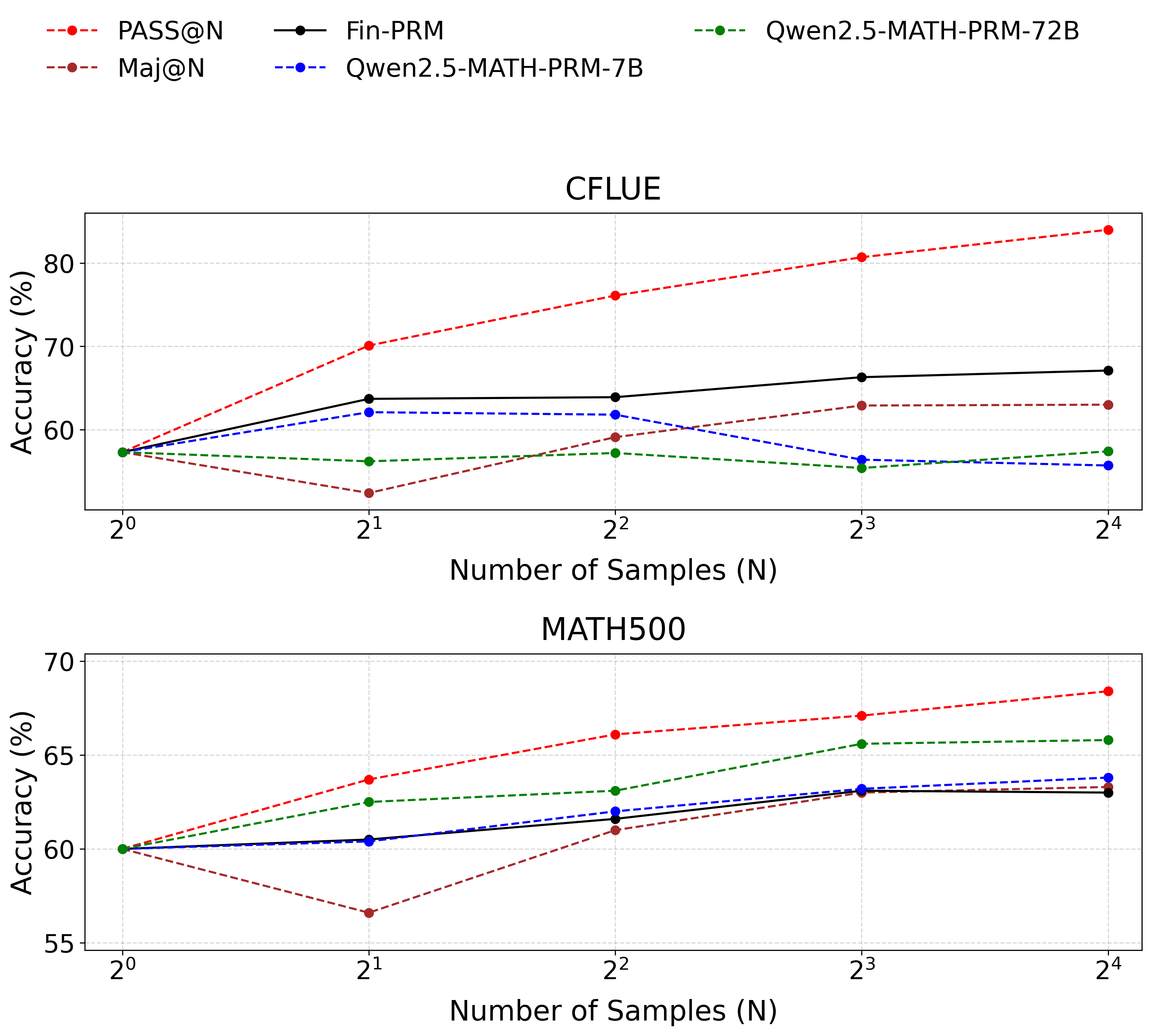
The image contains two line charts comparing the accuracy of different models (PASS@N, Maj@N, Fin-PRM, Qwen2.5-MATH-PRM-7B, and Qwen2.5-MATH-PRM-72B) against the number of samples used. The top chart displays results for the "CFLUE" dataset, while the bottom chart shows results for the "MATH500" dataset. The x-axis represents the number of samples (N) on a logarithmic scale (base 2), and the y-axis represents the accuracy in percentage.
### Components/Axes
**Legend (Top-Left):**
* **PASS@N:** Red dashed line with circular markers.
* **Maj@N:** Brown dashed line with circular markers.
* **Fin-PRM:** Black solid line with circular markers.
* **Qwen2.5-MATH-PRM-7B:** Blue dashed line with circular markers.
* **Qwen2.5-MATH-PRM-72B:** Green dashed line with circular markers.
**Top Chart (CFLUE):**
* **Title:** CFLUE
* **X-axis:** Number of Samples (N), with markers at 2<sup>0</sup>, 2<sup>1</sup>, 2<sup>2</sup>, 2<sup>3</sup>, and 2<sup>4</sup>.
* **Y-axis:** Accuracy (%), with markers at 60, 70, and 80.
**Bottom Chart (MATH500):**
* **Title:** MATH500
* **X-axis:** Number of Samples (N), with markers at 2<sup>0</sup>, 2<sup>1</sup>, 2<sup>2</sup>, 2<sup>3</sup>, and 2<sup>4</sup>.
* **Y-axis:** Accuracy (%), with markers at 55, 60, 65, and 70.
### Detailed Analysis
**Top Chart (CFLUE):**
* **PASS@N (Red dashed line):** Shows an upward trend.
* 2<sup>0</sup>: ~58%
* 2<sup>1</sup>: ~71%
* 2<sup>2</sup>: ~77%
* 2<sup>3</sup>: ~80%
* 2<sup>4</sup>: ~83%
* **Maj@N (Brown dashed line):** Shows a downward trend.
* 2<sup>0</sup>: ~58%
* 2<sup>1</sup>: ~50%
* 2<sup>2</sup>: ~52%
* 2<sup>3</sup>: ~63%
* 2<sup>4</sup>: ~64%
* **Fin-PRM (Black solid line):** Shows a slight upward trend, almost flat.
* 2<sup>0</sup>: ~58%
* 2<sup>1</sup>: ~63%
* 2<sup>2</sup>: ~64%
* 2<sup>3</sup>: ~66%
* 2<sup>4</sup>: ~67%
* **Qwen2.5-MATH-PRM-7B (Blue dashed line):** Shows a slight downward trend.
* 2<sup>0</sup>: ~58%
* 2<sup>1</sup>: ~63%
* 2<sup>2</sup>: ~61%
* 2<sup>3</sup>: ~57%
* 2<sup>4</sup>: ~57%
* **Qwen2.5-MATH-PRM-72B (Green dashed line):** Shows a slight downward trend.
* 2<sup>0</sup>: ~58%
* 2<sup>1</sup>: ~55%
* 2<sup>2</sup>: ~56%
* 2<sup>3</sup>: ~56%
* 2<sup>4</sup>: ~63%
**Bottom Chart (MATH500):**
* **PASS@N (Red dashed line):** Shows an upward trend.
* 2<sup>0</sup>: ~60%
* 2<sup>1</sup>: ~64%
* 2<sup>2</sup>: ~66%
* 2<sup>3</sup>: ~67%
* 2<sup>4</sup>: ~68%
* **Maj@N (Brown dashed line):** Shows a downward trend.
* 2<sup>0</sup>: ~60%
* 2<sup>1</sup>: ~58%
* 2<sup>2</sup>: ~61%
* 2<sup>3</sup>: ~63%
* 2<sup>4</sup>: ~63%
* **Fin-PRM (Black solid line):** Shows a slight upward trend, almost flat.
* 2<sup>0</sup>: ~60%
* 2<sup>1</sup>: ~62%
* 2<sup>2</sup>: ~62%
* 2<sup>3</sup>: ~63%
* 2<sup>4</sup>: ~63%
* **Qwen2.5-MATH-PRM-7B (Blue dashed line):** Shows a slight upward trend, almost flat.
* 2<sup>0</sup>: ~60%
* 2<sup>1</sup>: ~61%
* 2<sup>2</sup>: ~61%
* 2<sup>3</sup>: ~63%
* 2<sup>4</sup>: ~63%
* **Qwen2.5-MATH-PRM-72B (Green dashed line):** Shows a slight upward trend.
* 2<sup>0</sup>: ~60%
* 2<sup>1</sup>: ~63%
* 2<sup>2</sup>: ~64%
* 2<sup>3</sup>: ~65%
* 2<sup>4</sup>: ~66%
### Key Observations
* **PASS@N** consistently improves in accuracy as the number of samples increases for both datasets.
* **Maj@N** shows a decrease in accuracy with an increasing number of samples for the CFLUE dataset, but a slight increase for the MATH500 dataset.
* **Fin-PRM** shows a relatively stable performance across different sample sizes for both datasets.
* **Qwen2.5-MATH-PRM-7B** shows a slight decrease in accuracy with an increasing number of samples for the CFLUE dataset, but a slight increase for the MATH500 dataset.
* **Qwen2.5-MATH-PRM-72B** shows a slight increase in accuracy with an increasing number of samples for both datasets.
### Interpretation
The charts illustrate the performance of different models on two datasets, CFLUE and MATH500, as the number of samples varies. The PASS@N model demonstrates a clear benefit from increased sample sizes, suggesting it can effectively leverage more data to improve accuracy. In contrast, the Maj@N model's performance either decreases or remains relatively flat with more samples, indicating it might not be as efficient in utilizing additional data or may be overfitting. Fin-PRM and the Qwen models show relatively stable performance, with slight improvements or declines depending on the dataset. The differences in trends between the datasets suggest that the models' performance is also influenced by the specific characteristics of the dataset.