## Line Chart: Accuracy vs. Number of Samples for Different Models
### Overview
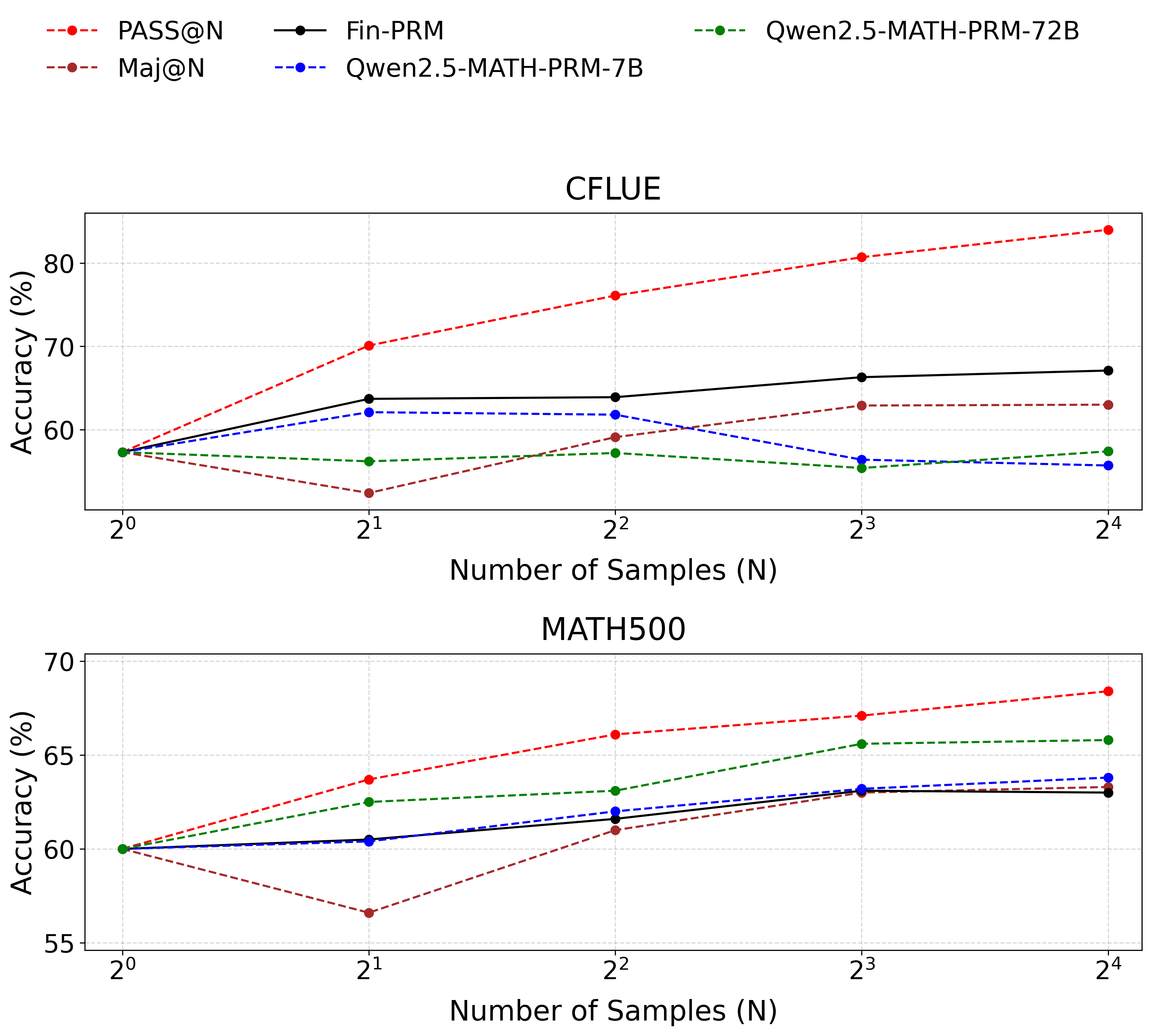
This image presents two line charts comparing the accuracy of several language models (PASS@N, Maj@N, Fin-PRM, Qwen2.5-MATH-PRM-7B, and Qwen2.5-MATH-PRM-72B) across varying numbers of samples (N). The top chart focuses on the CFLUE dataset, while the bottom chart focuses on the MATH500 dataset. Accuracy is measured in percentage (%).
### Components/Axes
* **X-axis:** Number of Samples (N), labeled with powers of 2: 2⁰, 2¹, 2², 2³, 2⁴. The scale is logarithmic.
* **Y-axis:** Accuracy (%), ranging from approximately 55% to 85%.
* **Legend (Top-Right):**
* PASS@N (Red Dashed Line)
* Maj@N (Orange Dashed Line)
* Fin-PRM (Black Solid Line)
* Qwen2.5-MATH-PRM-7B (Blue Dashed Line)
* Qwen2.5-MATH-PRM-72B (Green Dotted Line)
* **Titles:**
* Top Chart: CFLUE
* Bottom Chart: MATH500
* **Gridlines:** Present on both charts, aiding in value estimation.
### Detailed Analysis or Content Details
**CFLUE Chart (Top)**
* **PASS@N (Red Dashed):** Starts at approximately 62% at N=2⁰, steadily increases to approximately 83% at N=2⁴. The line is consistently upward sloping.
* **Maj@N (Orange Dashed):** Starts at approximately 60% at N=2⁰, increases to approximately 66% at N=2⁴. The line is consistently upward sloping, but less steep than PASS@N.
* **Fin-PRM (Black Solid):** Starts at approximately 64% at N=2⁰, fluctuates around 68-70% between N=2¹ and N=2³, and ends at approximately 71% at N=2⁴. The line is relatively flat with slight upward trend.
* **Qwen2.5-MATH-PRM-7B (Blue Dashed):** Starts at approximately 58% at N=2⁰, increases to approximately 63% at N=2⁴. The line is consistently upward sloping, but less steep than PASS@N and Maj@N.
* **Qwen2.5-MATH-PRM-72B (Green Dotted):** Starts at approximately 55% at N=2⁰, increases to approximately 60% at N=2⁴. The line is consistently upward sloping, but the least steep of all models.
**MATH500 Chart (Bottom)**
* **PASS@N (Red Dashed):** Starts at approximately 66% at N=2⁰, steadily increases to approximately 72% at N=2⁴. The line is consistently upward sloping.
* **Maj@N (Orange Dashed):** Starts at approximately 62% at N=2⁰, decreases to approximately 58% at N=2⁴. The line is consistently downward sloping.
* **Fin-PRM (Black Solid):** Starts at approximately 63% at N=2⁰, increases to approximately 66% at N=2⁴. The line is consistently upward sloping.
* **Qwen2.5-MATH-PRM-7B (Blue Dashed):** Starts at approximately 61% at N=2⁰, increases to approximately 64% at N=2⁴. The line is consistently upward sloping, but less steep than PASS@N.
* **Qwen2.5-MATH-PRM-72B (Green Dotted):** Starts at approximately 59% at N=2⁰, increases to approximately 66% at N=2⁴. The line is consistently upward sloping, and steeper than Qwen2.5-MATH-PRM-7B.
### Key Observations
* In the CFLUE dataset, PASS@N consistently outperforms all other models across all sample sizes.
* In the MATH500 dataset, PASS@N also shows the highest accuracy, while Maj@N exhibits a decreasing accuracy with increasing sample size.
* The larger model (Qwen2.5-MATH-PRM-72B) generally performs better than the smaller model (Qwen2.5-MATH-PRM-7B) in both datasets, but the difference is more pronounced in the MATH500 dataset.
* Fin-PRM shows relatively stable performance in the CFLUE dataset, while it improves with sample size in the MATH500 dataset.
### Interpretation
The charts demonstrate the impact of sample size on the accuracy of different language models on two distinct datasets (CFLUE and MATH500). The consistent upward trend of PASS@N in both datasets suggests its robustness and ability to leverage larger sample sizes for improved performance. The contrasting trend of Maj@N in the MATH500 dataset is an anomaly, potentially indicating a limitation of this model in handling complex mathematical problems or a bias in the dataset.
The performance difference between the 7B and 72B versions of the Qwen models highlights the benefits of model scaling. The larger model's increased capacity allows it to capture more nuanced patterns in the data, leading to higher accuracy.
The datasets themselves appear to elicit different behaviors from the models. CFLUE seems to benefit all models with increased sample size, while MATH500 shows more varied responses, with some models improving and others declining. This suggests that the datasets have different characteristics and require different modeling approaches. The charts provide valuable insights into the strengths and weaknesses of each model and can inform model selection and training strategies.