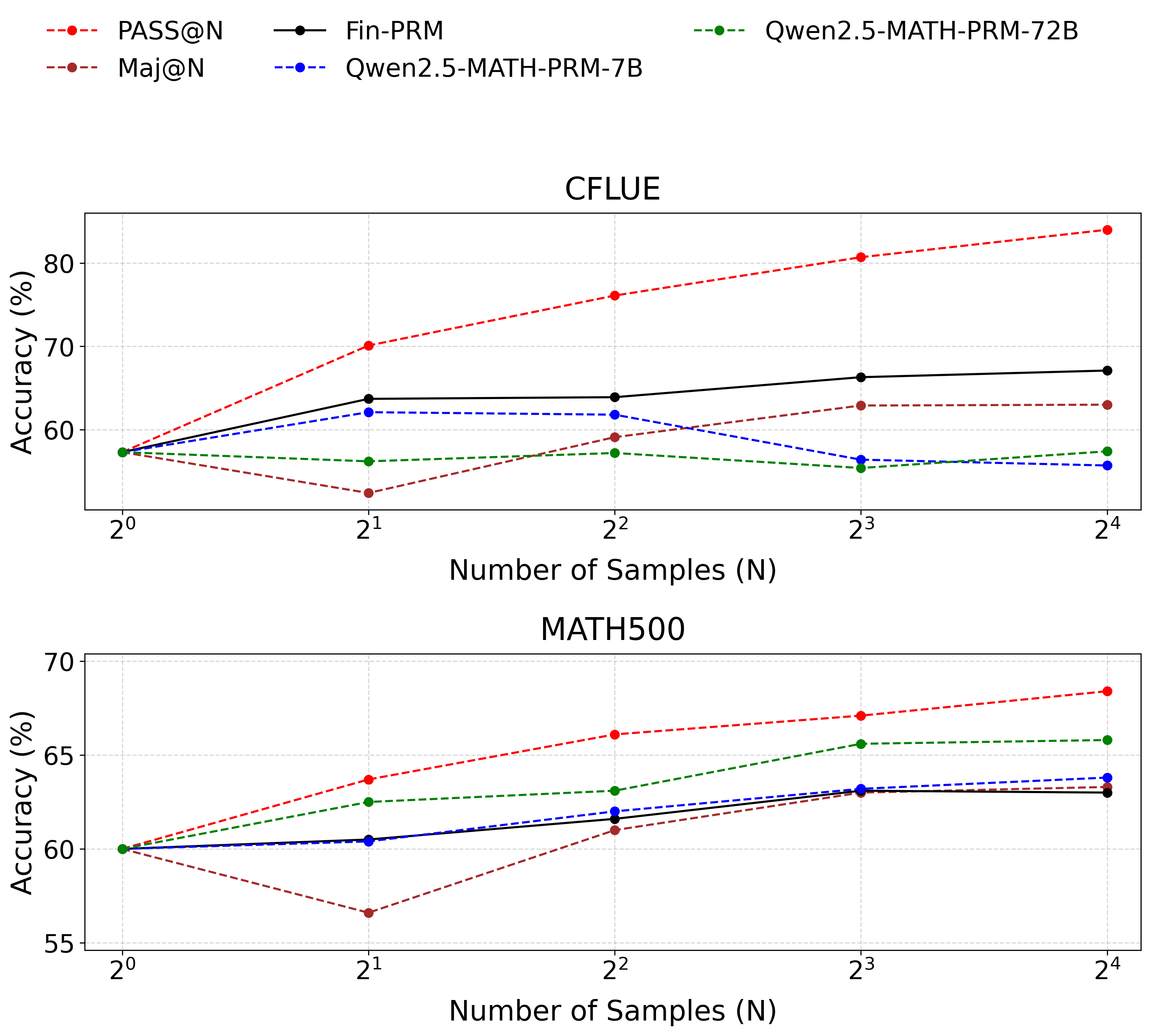
## Line Graphs: Accuracy vs. Number of Samples (N) for CFLUE and MATH500
### Overview
The image contains two line graphs comparing the accuracy of different models (PASS@N, Fin-PRM, Maj@N, Qwen2.5-MATH-PRM-7B, Qwen2.5-MATH-PRM-72B) across two datasets: **CFLUE** (top graph) and **MATH500** (bottom graph). The x-axis represents the number of samples (N) on a logarithmic scale (2⁰ to 2⁴), and the y-axis represents accuracy in percentage. Each model is represented by a distinct line style and color, as defined in the legend.
---
### Components/Axes
- **X-axis**: "Number of Samples (N)" with ticks at 2⁰ (1), 2¹ (2), 2² (4), 2³ (8), 2⁴ (16).
- **Y-axis**: "Accuracy (%)" with ranges:
- **CFLUE**: 55% to 80%
- **MATH500**: 55% to 70%
- **Legends**:
- **CFLUE**:
- Red dashed line: PASS@N
- Black solid line: Fin-PRM
- Brown dashed line: Maj@N
- Blue dashed line: Qwen2.5-MATH-PRM-7B
- Green dashed line: Qwen2.5-MATH-PRM-72B
- **MATH500**: Same legend as CFLUE.
---
### Detailed Analysis
#### **CFLUE Graph**
1. **PASS@N (Red Dashed Line)**:
- Starts at ~58% (2⁰) and increases steadily to ~83% (2⁴).
- **Trend**: Strong upward slope, indicating consistent improvement with more samples.
2. **Fin-PRM (Black Solid Line)**:
- Starts at ~58% (2⁰), rises to ~68% (2¹), then plateaus with minor fluctuations (~66–68%) at 2²–2⁴.
- **Trend**: Initial sharp increase, followed by stabilization.
3. **Maj@N (Brown Dashed Line)**:
- Starts at ~58% (2⁰), drops to ~54% (2¹), then rises to ~63% (2⁴).
- **Trend**: Initial dip, followed by gradual recovery.
4. **Qwen2.5-MATH-PRM-7B (Blue Dashed Line)**:
- Starts at ~58% (2⁰), peaks at ~62% (2¹), then declines to ~58% (2⁴).
- **Trend**: Initial rise, followed by a decline.
5. **Qwen2.5-MATH-PRM-72B (Green Dashed Line)**:
- Starts at ~58% (2⁰), rises to ~57% (2¹), then fluctuates between ~57–60% (2²–2⁴).
- **Trend**: Slight improvement but no significant growth.
#### **MATH500 Graph**
1. **PASS@N (Red Dashed Line)**:
- Starts at ~60% (2⁰), increases to ~68% (2⁴).
- **Trend**: Steady upward trajectory.
2. **Fin-PRM (Black Solid Line)**:
- Starts at ~60% (2⁰), rises to ~63% (2³), then plateaus at ~63% (2⁴).
- **Trend**: Gradual improvement with stabilization.
3. **Maj@N (Brown Dashed Line)**:
- Starts at ~60% (2⁰), drops to ~57% (2¹), then rises to ~64% (2⁴).
- **Trend**: Initial dip, followed by recovery.
4. **Qwen2.5-MATH-PRM-7B (Blue Dashed Line)**:
- Starts at ~60% (2⁰), rises to ~64% (2⁴).
- **Trend**: Consistent upward trend.
5. **Qwen2.5-MATH-PRM-72B (Green Dashed Line)**:
- Starts at ~60% (2⁰), rises to ~66% (2³), then plateaus at ~66% (2⁴).
- **Trend**: Strong improvement, followed by stabilization.
---
### Key Observations
1. **PASS@N** consistently outperforms other models in both datasets, showing the most significant improvement with increased samples.
2. **Maj@N** exhibits a temporary dip at 2¹ in both graphs but recovers by 2⁴.
3. **Qwen2.5-MATH-PRM-72B** (green dashed line) performs best in **MATH500**, surpassing other models at higher sample sizes.
4. **Qwen2.5-MATH-PRM-7B** (blue dashed line) shows mixed performance: a decline in CFLUE but steady growth in MATH500.
5. **Fin-PRM** (black solid line) demonstrates stability in both datasets but lacks the growth seen in PASS@N.
---
### Interpretation
- **PASS@N** is the most effective model for improving accuracy with more samples, suggesting it is optimized for scalability.
- **Qwen2.5-MATH-PRM-72B** excels in **MATH500**, indicating its architecture is particularly suited for mathematical reasoning tasks.
- The **Maj@N** dip at 2¹ may reflect overfitting or inefficiencies at smaller sample sizes, which are mitigated at larger scales.
- **Qwen2.5-MATH-PRM-7B** underperforms in CFLUE but shows promise in MATH500, highlighting dataset-specific model effectiveness.
- All models improve with more samples, but the rate of improvement varies, emphasizing the importance of model selection based on task requirements.
---
### Spatial Grounding & Color Verification
- **Legends**: Positioned at the top of each graph, with colors matching the corresponding lines (e.g., red dashed = PASS@N).
- **Data Points**: Confirmed alignment with legend colors (e.g., green dashed line = Qwen2.5-MATH-PRM-72B).
---
### Final Notes
The graphs demonstrate that **PASS@N** and **Qwen2.5-MATH-PRM-72B** are the most scalable models, with performance gains directly tied to the number of samples. The data underscores the need for task-specific model selection, as performance varies significantly across datasets.