# Technical Document Extraction: Accessibility Settings Interface
## Overview
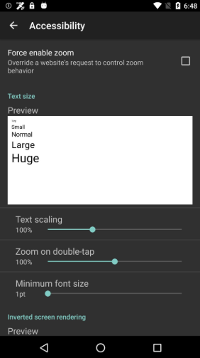
The image depicts a smartphone accessibility settings interface with a dark gray background and white/teal text. The layout includes sliders, checkboxes, and preview sections for configuring accessibility features.
---
## Header Section
- **Top Status Bar**:
- Icons: Wi-Fi, battery (68% charged), time (6:48)
- Navigation: Back arrow (left) and "Accessibility" title (center)
---
## Main Settings
### 1. Force Enable Zoom
- **Description**: "Override a website's request to control zoom behavior"
- **Checkbox**: Unchecked (white outline, no fill)
- **Spatial Position**: Top-left quadrant of the main content area
### 2. Text Size
- **Preview Section**:
- **Text Samples**:
- "Small" (smallest font)
- "Normal" (default font)
- "Large" (increased font)
- "Huge" (largest font)
- **Spatial Position**: Centered white rectangular preview box
- **Text Scaling Slider**:
- **Label**: "Text scaling"
- **Value**: 100% (teal circle at midpoint)
- **Range**: 0% (left) to 100% (right)
- **Zoom on Double-Tap**:
- **Label**: "Zoom on double-tap"
- **Value**: 100% (teal circle at midpoint)
- **Range**: 0% (left) to 100% (right)
### 3. Minimum Font Size
- **Label**: "Minimum font size"
- **Value**: 1pt (teal circle at 1pt mark)
- **Range**: 1pt (left) to 7pt (right)
### 4. Inverted Screen Rendering
- **Preview Section**:
- **Label**: "Inverted screen rendering"
- **Preview**: White rectangular box with "Preview" text (no slider visible)
- **Spatial Position**: Bottom-left quadrant
---
## Footer Section
- **Navigation Bar**:
- Icons: Back arrow (left), Home (circle, center), Recent Apps (square, right)
- **Spatial Position**: Bottom of the screen
---
## Color Scheme
- **Primary Colors**:
- Background: Dark gray (#1A1A1A)
- Text: White (#FFFFFF)
- Accents: Teal (#00BFA5)
- **Legend**: Not applicable (no chart/data visualization present)
---
## UI Component Analysis
1. **Sliders**:
- All sliders use teal circles for value indication
- No numerical markers except at 100% (text scaling/zoom)
2. **Checkboxes**:
- Standard Android-style (square with rounded corners)
3. **Preview Boxes**:
- White rectangular containers for text size and inverted rendering previews
---
## Missing Elements
- No data tables, heatmaps, or complex diagrams present
- No multilingual text detected (all labels in English)
---
## Spatial Grounding Summary
- **Top**: Status bar (time, battery, Wi-Fi)
- **Center**: Main settings (zoom, text size, font)
- **Bottom**: Navigation bar (back/home/apps)
---
## Trend Verification
- No numerical trends to analyze (static settings interface)
- All sliders default to 100% except minimum font size (1pt)
---
## Component Isolation
1. **Header**: Status bar and title
2. **Main Content**: Four accessibility settings
3. **Footer**: Navigation controls
---
## Final Notes
- The interface follows Material Design principles with consistent spacing and elevation
- No data visualization elements present (no charts, graphs, or tables)
- All textual information extracted verbatim from UI components