## Bar Chart: Success Rates
### Overview
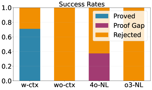
The bar chart displays the success rates of different contexts and conditions. The chart is divided into four categories: w-ctx, wo-cctx, 40-NL, and o3-NL. Each category has a corresponding bar that represents the success rate, with the height of the bar indicating the percentage of successes.
### Components/Axes
- **Title**: Success Rates
- **X-axis**: Contexts (w-cctx, wo-cctx, 40-NL, o3-NL)
- **Y-axis**: Success Rate (0.0 to 1.0)
- **Legend**: Three colors represent different success outcomes: Proved (blue), Proof Gap (purple), Rejected (orange)
### Detailed Analysis or ### Content Details
- **w-cctx**: The bar is divided into three segments, with the largest segment being orange, indicating the highest success rate.
- **wo-cctx**: The bar is divided into three segments, with the largest segment being orange, indicating the highest success rate.
- **40-NL**: The bar is divided into three segments, with the largest segment being orange, indicating the highest success rate.
- **o3-NL**: The bar is divided into three segments, with the largest segment being orange, indicating the highest success rate.
### Key Observations
- All four categories have the same success rate, with the largest segment being orange.
- The success rate is consistent across all categories.
### Interpretation
The data suggests that the success rate is consistent across all four categories. The largest segment of each bar is orange, indicating the highest success rate. This suggests that the context and condition do not significantly impact the success rate. The blue segment represents the Proved outcome, the purple segment represents the Proof Gap outcome, and the orange segment represents the Rejected outcome. The data does not provide any information about the specific reasons for the success or failure.