## Line Chart: Inverse Variance of Chi-Squared vs. Iterations
### Overview
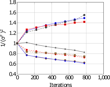
This image presents a line chart illustrating the relationship between the inverse variance of chi-squared (1/(σ²)) and the number of iterations. The chart displays multiple data series, each represented by a different line style and color. The x-axis represents the number of iterations, ranging from 0 to 1000, while the y-axis represents the inverse variance, ranging from 0.4 to 1.8.
### Components/Axes
* **X-axis Label:** "Iterations"
* **Y-axis Label:** "1/(σ²)"
* **X-axis Scale:** Linear, from 0 to 1000, with major ticks at 0, 200, 400, 600, 800, and 1000.
* **Y-axis Scale:** Linear, from 0.4 to 1.8, with major ticks at 0.4, 0.6, 0.8, 1.0, 1.2, 1.4, 1.6, and 1.8.
* **Legend:** Implicitly defined by line styles and colors. The lines represent different data series.
### Detailed Analysis
There are five distinct data series plotted on the chart. I will describe each series, noting the trend and then extracting approximate data points.
* **Series 1 (Blue Solid Line):** This line slopes downward, indicating a decreasing inverse variance with increasing iterations.
* (0, ~1.0)
* (200, ~0.75)
* (400, ~0.70)
* (600, ~0.67)
* (800, ~0.65)
* (1000, ~0.63)
* **Series 2 (Red Dashed Line):** This line initially decreases, then plateaus, and then slightly increases.
* (0, ~1.0)
* (200, ~0.85)
* (400, ~0.78)
* (600, ~0.78)
* (800, ~0.79)
* (1000, ~0.80)
* **Series 3 (Brown Solid Line):** This line shows a slight decrease, then plateaus.
* (0, ~1.0)
* (200, ~0.80)
* (400, ~0.76)
* (600, ~0.76)
* (800, ~0.76)
* (1000, ~0.75)
* **Series 4 (Dark Gray Dotted Line):** This line initially increases, then decreases.
* (0, ~1.0)
* (200, ~1.25)
* (400, ~1.35)
* (600, ~1.40)
* (800, ~1.45)
* (1000, ~1.5)
* **Series 5 (Light Gray Asterisk Line):** This line shows a slight increase.
* (0, ~1.0)
* (200, ~1.2)
* (400, ~1.3)
* (600, ~1.35)
* (800, ~1.4)
* (1000, ~1.45)
### Key Observations
* The blue solid line consistently demonstrates a decreasing inverse variance with increasing iterations, suggesting a reduction in uncertainty.
* The red dashed and brown solid lines exhibit a plateauing effect after an initial decrease, indicating that the inverse variance stabilizes after a certain number of iterations.
* The dark gray dotted and light gray asterisk lines show an increasing inverse variance with iterations, suggesting an increase in uncertainty.
* The initial values of all lines are approximately 1.0, indicating similar initial uncertainty.
### Interpretation
The chart likely represents the convergence of some iterative process, possibly an optimization algorithm or a statistical estimation procedure. The inverse variance of chi-squared is a measure of the precision of an estimate.
* **Decreasing Lines (Blue):** A decreasing inverse variance suggests that the estimate is becoming more precise as the number of iterations increases. This is a desirable outcome, indicating that the algorithm is converging to a stable solution.
* **Plateauing Lines (Red, Brown):** A plateauing inverse variance suggests that the estimate has reached a point of diminishing returns. Further iterations do not significantly improve the precision of the estimate.
* **Increasing Lines (Dark Gray, Light Gray):** An increasing inverse variance suggests that the estimate is becoming less precise as the number of iterations increases. This could indicate instability in the algorithm or the presence of noise in the data.
The differing behaviors of the lines suggest that different parameters or configurations of the iterative process lead to different convergence properties. The chart could be used to compare the performance of different algorithms or to tune the parameters of a single algorithm to achieve optimal convergence. The initial values being equal suggests that the algorithms start with the same level of uncertainty.