## Network Diagram: Interconnected Nodes
### Overview
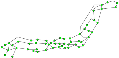
The image is a network diagram consisting of green nodes connected by gray lines. The overall structure resembles a geographical region, possibly a country or a region within a country, with a denser network of nodes in the central and eastern areas.
### Components/Axes
* **Nodes:** Represented by green circles. These likely represent locations, stations, or points of interest within the network.
* **Edges:** Represented by gray lines. These indicate connections or routes between the nodes.
* **Spatial Arrangement:** The nodes and edges are arranged in a way that suggests a geographical layout.
### Detailed Analysis
The network can be roughly divided into three regions:
1. **Western Region:** This region has a sparser network with fewer nodes and longer edges. The nodes are distributed along three main lines that run roughly parallel to each other.
2. **Central Region:** This region is more densely populated with nodes and edges. The connections are more complex, with multiple routes between nodes.
3. **Eastern Region:** This region has a complex network with a high density of nodes and edges. The network appears to branch out towards the northeast.
Specific observations:
* The western region has three distinct lines of nodes, suggesting three primary routes or pathways.
* The central region shows a higher degree of interconnectedness, indicating a more complex network with multiple options for routing.
* The eastern region has a dense cluster of nodes, suggesting a major hub or metropolitan area.
* The lines connecting the nodes are mostly straight, suggesting direct routes between locations.
### Key Observations
* The network density varies significantly across the region, with the central and eastern areas being much more densely connected than the western area.
* The network appears to follow a geographical layout, suggesting that the nodes represent real-world locations.
* The presence of multiple routes between nodes in the central region indicates a more robust and resilient network.
### Interpretation
The network diagram likely represents a transportation, communication, or infrastructure network within a specific geographical region. The varying density of connections suggests different levels of development or importance across the region. The presence of multiple routes in the central region indicates a more developed and resilient network, while the sparser network in the western region may indicate a less developed or less populated area. The diagram could be used to analyze network connectivity, identify potential bottlenecks, or plan for future network expansion.