## Line Chart: Scaling Laws: First Pit
### Overview
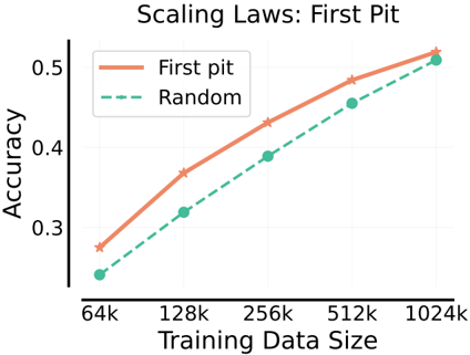
The image is a line chart titled "Scaling Laws: First Pit". It plots the relationship between "Training Data Size" on the x-axis and "Accuracy" on the y-axis for two different methods or conditions: "First pit" and "Random". The chart demonstrates how accuracy scales with increasing amounts of training data for these two approaches.
### Components/Axes
* **Title:** "Scaling Laws: First Pit" (centered at the top).
* **Y-Axis:**
* **Label:** "Accuracy" (rotated vertically on the left side).
* **Scale:** Linear scale.
* **Markers:** Major tick marks are visible at 0.3, 0.4, and 0.5.
* **X-Axis:**
* **Label:** "Training Data Size" (centered at the bottom).
* **Scale:** Logarithmic scale (base 2), as the intervals between markers represent doublings.
* **Markers:** Major tick marks are labeled at 64k, 128k, 256k, 512k, and 1024k.
* **Legend:**
* **Position:** Top-left corner of the plot area.
* **Items:**
1. "First pit": Represented by a solid, light orange/salmon-colored line with star-shaped markers.
2. "Random": Represented by a dashed, teal/green-colored line with circular markers.
### Detailed Analysis
The chart contains two data series, each with five data points corresponding to the x-axis markers.
**1. Data Series: "First pit" (Solid Orange Line, Star Markers)**
* **Trend:** The line slopes consistently upward from left to right, indicating a positive correlation between training data size and accuracy.
* **Approximate Data Points:**
* At 64k: Accuracy ≈ 0.28
* At 128k: Accuracy ≈ 0.37
* At 256k: Accuracy ≈ 0.43
* At 512k: Accuracy ≈ 0.49
* At 1024k: Accuracy ≈ 0.52
**2. Data Series: "Random" (Dashed Green Line, Circle Markers)**
* **Trend:** The line also slopes consistently upward from left to right, showing a positive correlation similar to the "First pit" series.
* **Approximate Data Points:**
* At 64k: Accuracy ≈ 0.24
* At 128k: Accuracy ≈ 0.32
* At 256k: Accuracy ≈ 0.39
* At 512k: Accuracy ≈ 0.46
* At 1024k: Accuracy ≈ 0.51
**Spatial & Visual Cross-Reference:**
* The legend in the top-left correctly identifies the solid orange line with stars as "First pit" and the dashed green line with circles as "Random".
* At every data point (64k, 128k, 256k, 512k, 1024k), the orange star marker is positioned vertically higher than the corresponding green circle marker. This confirms that the "First pit" method achieves higher accuracy than the "Random" method at all tested data scales.
### Key Observations
1. **Consistent Superiority:** The "First pit" method consistently outperforms the "Random" method across the entire range of training data sizes shown (64k to 1024k).
2. **Parallel Scaling:** Both lines follow a very similar, nearly parallel upward trajectory on this log-linear plot. This suggests that the *rate* of accuracy improvement per doubling of data is similar for both methods.
3. **Narrowing Gap:** The absolute difference in accuracy between the two methods appears to narrow slightly as the training data size increases. The gap is largest at 64k (≈0.04) and smallest at 1024k (≈0.01).
4. **Diminishing Returns:** Both curves show signs of flattening (diminishing returns) as data size increases, which is characteristic of scaling laws. The improvement from 512k to 1024k is smaller than the improvement from 64k to 128k for both series.
### Interpretation
This chart visualizes a classic scaling law relationship in machine learning or a similar empirical science context. It demonstrates that increasing the volume of training data leads to better model performance (accuracy), but with diminishing marginal returns.
The key finding is the performance delta between the two conditions. "First pit" represents a specific, presumably non-random initialization, strategy, or data selection method that provides a consistent accuracy advantage over a "Random" baseline. The fact that the advantage persists across scales indicates it is a robust effect, not an artifact of small data.
The narrowing performance gap at larger data scales could imply one of two things: (1) The "Random" method begins to catch up as data abundance compensates for its suboptimal strategy, or (2) The "First pit" method is approaching a performance ceiling (asymptote) more quickly. The chart alone cannot distinguish between these hypotheses, but it strongly suggests that the benefit of the "First pit" strategy, while always present, may become less critical in very data-rich regimes. This has practical implications for resource allocation: investing in the "First pit" method yields the highest relative benefit when training data is limited.