## Chart: Probability Distribution and Loss vs. Training Step
### Overview
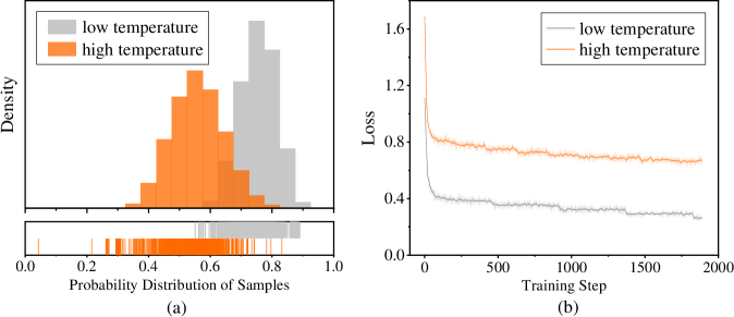
The image presents two charts side-by-side. The left chart (a) displays the probability distribution of samples at low and high temperatures using histograms and rug plots. The right chart (b) shows the loss function's behavior during training steps for both low and high temperatures.
### Components/Axes
**Chart (a): Probability Distribution of Samples**
* **Y-axis:** Density
* **X-axis:** Probability Distribution of Samples
* Scale: 0.0 to 1.0, with markers at 0.0, 0.2, 0.4, 0.6, 0.8, and 1.0.
* **Legend (top-left):**
* Gray: low temperature
* Orange: high temperature
* **Plot Type:** Histogram and Rug Plot
* Histogram: Shows the distribution of samples for low and high temperatures.
* Rug Plot: Displays individual sample points along the x-axis.
**Chart (b): Loss vs. Training Step**
* **Y-axis:** Loss
* Scale: 0.0 to 1.6, with markers at 0.0, 0.4, 0.8, 1.2, and 1.6.
* **X-axis:** Training Step
* Scale: 0 to 2000, with markers at 0, 500, 1000, 1500, and 2000.
* **Legend (top-right):**
* Gray: low temperature
* Orange: high temperature
* **Plot Type:** Line Plot
### Detailed Analysis
**Chart (a): Probability Distribution of Samples**
* **Low Temperature (Gray):** The distribution is centered around 0.8, with a range from approximately 0.6 to 1.0.
* **High Temperature (Orange):** The distribution is centered around 0.5, with a range from approximately 0.3 to 0.7.
* **Rug Plot:** The rug plot shows the individual sample points for each temperature. The gray (low temperature) samples are concentrated towards the higher end of the probability distribution, while the orange (high temperature) samples are concentrated towards the middle.
**Chart (b): Loss vs. Training Step**
* **Low Temperature (Gray):** The loss starts at approximately 0.8 and decreases rapidly in the initial training steps. It then plateaus around 0.35 after approximately 500 training steps, with minor fluctuations.
* **High Temperature (Orange):** The loss starts at approximately 1.6 and decreases rapidly in the initial training steps. It then plateaus around 0.7 after approximately 500 training steps, with minor fluctuations.
### Key Observations
* The probability distributions for low and high temperatures are distinct, with low temperature samples having a higher probability distribution.
* The loss decreases more rapidly for low temperature in the initial training steps.
* Both low and high temperature losses plateau after approximately 500 training steps, indicating convergence.
* The final loss for low temperature is significantly lower than that for high temperature.
### Interpretation
The probability distribution chart (a) indicates that the model can differentiate between low and high temperature samples based on their probability distributions. The loss chart (b) suggests that the model learns more effectively at low temperatures, achieving a lower final loss compared to high temperatures. This could be due to the characteristics of the data or the model's architecture, which might be better suited for learning patterns associated with low temperatures. The rapid decrease in loss during the initial training steps indicates efficient learning, while the plateau suggests that the model has reached a point of diminishing returns, where further training does not significantly reduce the loss.