\n
## Charts: Temperature vs. Probability Distribution & Loss
### Overview
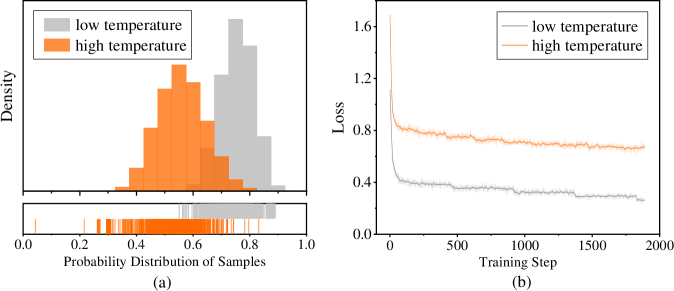
The image presents two charts, labeled (a) and (b). Chart (a) is a histogram showing the probability distribution of samples for "low temperature" and "high temperature" settings. Chart (b) displays the loss function over training steps, also for "low temperature" and "high temperature".
### Components/Axes
**Chart (a):**
* **X-axis:** "Probability Distribution of Samples" ranging from 0.0 to 1.0.
* **Y-axis:** "Density" (no scale provided).
* **Legend:**
* "low temperature" (represented by a light gray color)
* "high temperature" (represented by an orange color)
* A small tick plot is shown below the histogram.
**Chart (b):**
* **X-axis:** "Training Step" ranging from 0 to 2000.
* **Y-axis:** "Loss" ranging from 0.0 to 1.6.
* **Legend:**
* "low temperature" (represented by a light gray color)
* "high temperature" (represented by an orange color)
### Detailed Analysis or Content Details
**Chart (a): Probability Distribution**
The "low temperature" distribution (gray) is centered around approximately 0.8, with a density peak around 0.85. The distribution is relatively narrow, indicating a concentrated probability around this value. The distribution extends from approximately 0.65 to 0.95.
The "high temperature" distribution (orange) is centered around approximately 0.55, with a density peak around 0.5. The distribution is wider than the "low temperature" distribution, extending from approximately 0.3 to 0.7. The tick plot below the histogram shows individual sample points, confirming the shape of the distributions.
**Chart (b): Loss Function**
The "low temperature" loss (gray) starts at approximately 1.5 and rapidly decreases to around 0.3 by training step 500. It continues to decrease slowly, reaching a value of approximately 0.25 by training step 2000. The line is relatively smooth.
The "high temperature" loss (orange) also starts at approximately 1.5 and decreases initially, but at a slower rate than the "low temperature" loss. By training step 500, it reaches a value of approximately 0.8. It then plateaus and fluctuates around a value of approximately 0.75 to 0.85 for the remainder of the training steps. The line is more erratic than the "low temperature" line.
### Key Observations
* The "low temperature" setting results in a more concentrated probability distribution and a lower loss function during training.
* The "high temperature" setting leads to a wider probability distribution and a higher, more fluctuating loss function.
* The loss function for "low temperature" converges more quickly and to a lower value than the "high temperature" setting.
### Interpretation
These charts likely represent the results of a machine learning training process, where "temperature" is a hyperparameter controlling the randomness of the model's predictions.
* **Low Temperature:** A low temperature encourages the model to be more confident in its predictions, leading to a sharper probability distribution and faster convergence to a lower loss. This suggests the model is learning a more deterministic mapping from inputs to outputs.
* **High Temperature:** A high temperature introduces more randomness, resulting in a wider probability distribution and slower convergence. This indicates the model is exploring a broader range of possible solutions, potentially avoiding local optima but also struggling to settle on a single, optimal solution.
The difference in loss curves suggests that a lower temperature setting is more effective for this particular training task, leading to a more accurate and stable model. The wider distribution for high temperature could indicate a more diverse set of predictions, but at the cost of overall accuracy (higher loss). The plateauing of the high temperature loss suggests the model has reached a point where further training does not significantly improve performance.