TECHNICAL ASSET FINGERPRINT
c8a505811232152b5b1312be
Click to view fullscreen
Press ESC or click to close
FOUND IN PAPERS
EXPERT: healer-alpha-free VERSION 1
RUNTIME: free/openrouter/healer-alpha
INTEL_VERIFIED
\n
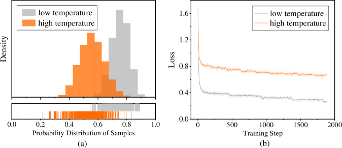
## Histogram and Line Chart: Temperature Effects on Probability Distribution and Training Loss
### Overview
The image contains two side-by-side subplots, labeled (a) and (b), comparing the effects of "low temperature" and "high temperature" on two different metrics. Subplot (a) is a histogram with an accompanying rug plot showing probability distributions. Subplot (b) is a line graph tracking loss over training steps. Both plots use a consistent color scheme: gray for "low temperature" and orange for "high temperature."
### Components/Axes
**Subplot (a) - Left:**
* **Chart Type:** Histogram with a rug plot below.
* **X-axis Label:** "Probability Distribution of Samples"
* **X-axis Scale:** Linear, from 0.0 to 1.0, with major ticks at 0.0, 0.2, 0.4, 0.6, 0.8, 1.0.
* **Y-axis Label:** "Density"
* **Y-axis Scale:** Linear, with ticks visible but unlabeled. The highest density bar reaches approximately 1.6 on the implied scale.
* **Legend:** Located in the top-left corner. Contains two entries:
* A gray square labeled "low temperature"
* An orange square labeled "high temperature"
* **Rug Plot:** Positioned directly below the histogram, sharing the same x-axis. It displays vertical tick marks representing individual data points, colored gray and orange.
**Subplot (b) - Right:**
* **Chart Type:** Line graph.
* **X-axis Label:** "Training Step"
* **X-axis Scale:** Linear, from 0 to 2000, with major ticks at 0, 500, 1000, 1500, 2000.
* **Y-axis Label:** "Loss"
* **Y-axis Scale:** Linear, with ticks visible but unlabeled. The loss ranges from approximately 0.25 to 1.6.
* **Legend:** Located in the top-left corner. Contains two entries:
* A gray line labeled "low temperature"
* An orange line labeled "high temperature"
###### Detailed Analysis
**Subplot (a) - Probability Distribution:**
* **High Temperature (Orange):** The distribution is roughly unimodal and centered. The peak density occurs at a probability value of approximately 0.55. The distribution spans from about 0.3 to 0.75, with the bulk of the mass between 0.4 and 0.7. The rug plot shows a dense cluster of orange ticks in this central region.
* **Low Temperature (Gray):** The distribution is also unimodal but shifted to the right compared to the high-temperature distribution. Its peak density is at a probability value of approximately 0.75. The distribution spans from about 0.5 to 0.9, with the bulk of the mass between 0.65 and 0.85. The rug plot shows gray ticks concentrated in this higher probability range.
* **Relationship:** The two distributions overlap significantly between probability values of 0.5 and 0.75. The low-temperature distribution is clearly skewed toward higher probability values.
**Subplot (b) - Training Loss:**
* **High Temperature (Orange Line):** The loss starts very high, at approximately 1.6 at step 0. It drops sharply within the first ~100 steps to about 0.8. After this initial drop, the loss continues to decrease very gradually, exhibiting minor fluctuations. By step 2000, the loss is approximately 0.65. The overall trend is a steep initial descent followed by a long, slow, noisy plateau.
* **Low Temperature (Gray Line):** The loss starts lower than the high-temperature line, at approximately 0.4 at step 0. It also drops sharply in the initial steps, reaching about 0.3 by step 100. It then continues a slow, steady decline with very minor fluctuations. By step 2000, the loss is approximately 0.25. The line is consistently below the high-temperature line throughout the entire training process.
* **Relationship:** There is a clear and consistent gap between the two lines. The low-temperature condition results in significantly lower loss at all training steps shown. Both curves follow a similar shape: rapid initial improvement followed by diminishing returns.
### Key Observations
1. **Distinct Distributions:** The "low temperature" setting produces model outputs (or samples) with a probability distribution centered at a higher value (~0.75) compared to the "high temperature" setting (~0.55).
2. **Loss Performance:** The "low temperature" setting achieves and maintains a substantially lower training loss throughout the 2000 steps shown. The gap between the two conditions is large and persistent.
3. **Convergence Behavior:** Both settings show classic learning curves with rapid early improvement. However, the "high temperature" loss appears to plateau at a higher value and exhibits slightly more noise or variance in its trajectory after the initial drop.
4. **Visual Confirmation:** The color coding in the legends (gray=low, orange=high) is consistently applied across both subplots, allowing for direct comparison of the same experimental conditions on different metrics.
### Interpretation
This data suggests a fundamental trade-off controlled by the "temperature" parameter, likely in a machine learning or probabilistic modeling context.
* **Temperature and Uncertainty:** In such contexts, "temperature" often controls the randomness or entropy of a model's output distribution. A **high temperature** increases randomness, flattening the probability distribution. This is reflected in subplot (a), where the orange distribution is broader and centered at a lower probability value, indicating less confident, more exploratory predictions. Conversely, a **low temperature** makes the model more deterministic and confident, sharpening the distribution around higher probability values, as seen in the gray histogram.
* **Impact on Optimization:** Subplot (b) demonstrates that this increase in confidence (low temperature) correlates with better optimization, as measured by lower training loss. The model converges to a better solution on the training data. The high-temperature model's higher loss suggests its increased randomness hinders its ability to fit the training data as precisely.
* **The Trade-off:** The charts together illustrate a potential tension between **exploration** (high temperature, broader distributions, higher loss) and **exploitation/confidence** (low temperature, peaked distributions, lower loss). The choice of temperature would depend on the goal: for tasks requiring diverse, creative outputs, a higher temperature might be preferred despite higher loss; for tasks requiring precise, accurate fits to known data, a lower temperature is superior. The data does not show validation or test performance, so it's unclear which setting generalizes better.
DECODING INTELLIGENCE...