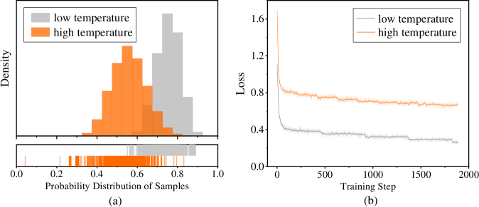
## Histogram and Line Graph: Probability Distribution and Training Loss
### Overview
The image contains two subplots:
1. **(a)** A histogram comparing probability distributions of samples under "low temperature" (gray) and "high temperature" (orange).
2. **(b)** A line graph showing training loss over steps for the same temperature conditions.
### Components/Axes
#### Subplot (a): Histogram
- **X-axis**: "Probability Distribution of Samples" (0.0 to 1.0).
- **Y-axis**: "Density" (no explicit scale, but bars represent relative density).
- **Legend**: Top-left corner, labels:
- Gray: "low temperature"
- Orange: "high temperature"
- **Bottom histogram**: Discrete sample probabilities (0.0 to 1.0) with vertical lines for individual samples.
#### Subplot (b): Line Graph
- **X-axis**: "Training Step" (0 to 2000).
- **Y-axis**: "Loss" (0.0 to 1.6).
- **Legend**: Top-left corner, labels:
- Gray: "low temperature"
- Orange: "high temperature"
### Detailed Analysis
#### Subplot (a): Histogram
- **High temperature (orange)**:
- Dominant peak at ~0.5 probability.
- Secondary peaks at ~0.3 and ~0.7.
- Density decreases sharply beyond 0.8.
- **Low temperature (gray)**:
- Flatter distribution, spread between 0.4 and 0.9.
- No distinct peaks; density tapers gradually.
- **Bottom histogram**:
- Orange samples cluster tightly around 0.5–0.7.
- Gray samples are more dispersed, with outliers near 0.0 and 1.0.
#### Subplot (b): Line Graph
- **High temperature (orange)**:
- Initial loss: ~1.6 at step 0.
- Rapid decline to ~0.8 by step 500.
- Stabilizes with minor fluctuations (~0.8–0.9) after step 1000.
- **Low temperature (gray)**:
- Initial loss: ~1.2 at step 0.
- Gradual decline to ~0.4 by step 1000.
- Fluctuates slightly (~0.35–0.45) after step 1500.
### Key Observations
1. **Probability Distribution**:
- High temperature samples are more concentrated (peak at 0.5), while low temperature samples are dispersed.
- Outliers in low temperature samples suggest potential instability or noise.
2. **Training Loss**:
- High temperature achieves lower loss faster but plateaus at a higher value (~0.8).
- Low temperature converges more slowly but reaches a lower final loss (~0.4).
### Interpretation
- **High temperature**:
- Likely encourages exploration (wider initial distribution) but risks overfitting (higher final loss).
- The sharp peak at 0.5 suggests strong clustering around a specific probability, possibly indicating biased sampling.
- **Low temperature**:
- Favors exploitation (narrower distribution) and better generalization (lower final loss).
- The gradual convergence implies stable but slower optimization.
- **Convergence Behavior**:
- Both conditions stabilize after ~1000 steps, but high temperature retains higher loss, indicating suboptimal performance.
- The divergence in loss trends highlights the trade-off between exploration (high temp) and precision (low temp).
- **Anomalies**:
- Gray histogram outliers near 0.0 and 1.0 may represent rare but extreme samples, potentially skewing results.
- Orange line’s plateau at ~0.8 suggests a local minimum in the loss landscape, possibly due to hyperparameter choices.